The Single Biggest Problem with Design Feedback
Most website design feedback is vague, contradictory, and late. That is the uncomfortable truth behind the majority of redesign projects that go over budget or deliver something nobody is happy with. Useful feedback is specific, grounded in objectives, and delivered at the right stage of the process. If you learn nothing else from this article, learn that.
The good news is that giving genuinely helpful feedback on a website design is a skill, not a talent. You do not need to be a designer. You do not need to know what a serif is or have opinions about whitespace. What you need is a structured approach, the right vocabulary, and an understanding of what kind of feedback is useful at each stage. In our projects, we see a clear pattern: teams that follow a few simple principles produce feedback that actually moves the project forward, while teams that wing it create loops of revisions that burn time and goodwill.
This guide walks you through exactly how to give feedback that designers can act on, that your colleagues will rally around, and that results in a website you are genuinely proud of.
Understand What Stage You Are Reviewing
The most common feedback mistake is giving the wrong type of feedback at the wrong time. A website design project typically moves through distinct stages: strategy and content planning, wireframes or prototypes, visual design concepts, and then detailed page designs. Each stage requires a different lens.
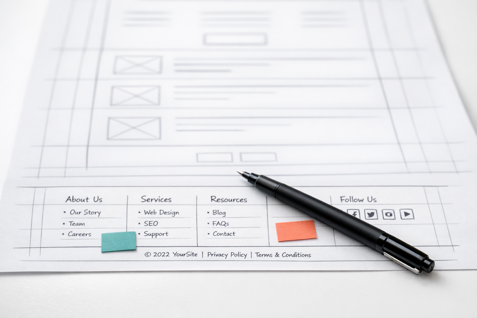
When you are looking at a wireframe or low-fidelity prototype, your feedback should focus on structure, flow, and content hierarchy. Does the page guide the user toward the right action? Is the information in the right order? Are the right elements present? This is not the time to comment on colour choices or font sizes, because those decisions have not been made yet. Raising visual concerns at this stage actively derails the conversation.
When you move into visual design, that is when brand expression, colour, typography, and imagery become relevant. And when you are reviewing a near-final build, your focus should shift to polish: spacing inconsistencies, broken interactions, copy errors, and responsive behaviour.
Before you start any review, ask the designer or project lead one simple question: “What kind of feedback is most useful at this stage?” That question alone will save hours of misaligned effort. At NexusBond, we make this explicit at the start of every review session, framing exactly what is on the table and what is not. It sounds basic, but it eliminates roughly half of the unproductive feedback we would otherwise receive.
Separate Your Personal Taste from the User’s Needs
This is where most feedback goes sideways. You are not the target audience. Or more precisely, even if you happen to be part of the target audience, your role in the review is not to react as a consumer. Your role is to evaluate whether the design serves the people it was built for and achieves the business objectives it was designed around.
Feedback like “I don’t like the blue” or “this feels too modern” is almost always personal taste dressed up as a design critique. Compare that to: “Our audience skews toward CFOs in their 50s who expect a conservative, high-trust visual language. The bright colour palette and playful typography might undermine credibility with that group.” The second version gives the designer something they can actually work with. It identifies the concern, explains who it affects, and explains why it matters.
A useful mental exercise before giving any piece of feedback is to ask yourself: “Would a user in our target segment notice or care about this?” If the answer is no, park it. If the answer is yes, articulate why. The why is everything.
The “I’ll Know It When I See It” Trap
Some stakeholders struggle to articulate what they want but feel confident they will recognise it when it appears. This approach is a project killer. It turns the design process into a guessing game where the team produces option after option, hoping to stumble onto something that clicks.
If you find yourself in this position, the most productive thing you can do is gather examples of websites or designs you respond positively to and explain what specifically you like about each one. Is it the sense of space? The photography style? The way information is layered? Concrete reference points give the design team a shared vocabulary to work from, even when you cannot precisely describe what you are after.
Be Specific About the Problem, Not the Solution
Describe what is not working, not what to change. This is the golden rule of design feedback, and it applies whether you are a marketing manager reviewing a homepage concept or a CEO looking at a prototype for the first time.
When you say “make the logo bigger,” you are prescribing a solution. When you say “the brand does not feel prominent enough on this page,” you are identifying a problem. The difference matters enormously. A skilled designer might solve brand prominence through logo size, or they might do it through colour, positioning, whitespace, or a dozen other approaches that produce a better result than simply scaling up a logo.
Here are some examples of how to reframe solution-based feedback into problem-based feedback:
- Instead of: “Move the testimonials above the fold.” Try: “Social proof feels like it comes too late on this page. By the time someone scrolls to testimonials, they may have already left.”
- Instead of: “Use a darker background.” Try: “This section does not feel distinct enough from the one above it. It all blends together.”
- Instead of: “Add a video here.” Try: “This section is copy-heavy and I worry users will not engage with it. Is there a way to make it easier to digest?”
Problem-based feedback respects the designer’s expertise while giving them a clear target. It also opens up conversations instead of shutting them down. In our experience, teams that adopt this habit cut revision rounds by 30 to 40 percent, because the designer addresses the actual concern on the first attempt instead of implementing a surface-level fix that does not resolve the underlying issue.

Reference the Agreed Strategy
Every website project should have some form of documented strategy: a brief, a set of personas, key user journeys, conversion goals, or brand guidelines. Your feedback becomes dramatically more useful when you anchor it to these shared reference points.
Instead of “this page feels off,” try “the brief identified lead generation as the primary goal for this page, but the form is buried below three content blocks and two image sections. Can we test whether bringing the form higher improves conversion?” That is feedback a designer can act on immediately because it is tied to a measurable objective that everyone agreed on at the start.
If your project does not have a documented strategy, that is a red flag worth raising before you get deep into design reviews. Reviewing a design without agreed objectives is like navigating without a map. Every person in the room will evaluate the work against their own internal criteria, and you will end up in circular debates with no way to resolve them. This is one of the core reasons we advocate for a prototype-first approach, where structure and priorities are validated before visual design begins. You can read more about this in our prototype-first guide.
Give Feedback on the Right Things
Not all feedback carries equal weight. The elements that have the greatest impact on whether a website succeeds or fails are, in order: content structure, user flow, calls to action, page hierarchy, and then visual design. Most review sessions spend 80 percent of the time on visual design and 20 percent on everything else. That ratio should be inverted, particularly in early and mid-stage reviews.
Content and Messaging
Does the headline communicate the core value proposition within five seconds? Does the page answer the questions a first-time visitor would have, in the order they would have them? Is the copy written for the audience, or is it written in internal jargon? These are the questions that determine whether a page converts, and they deserve the bulk of your attention.
User Flow and Navigation
Can a user get from the homepage to their goal in three clicks or fewer? Are the navigation labels clear and unambiguous? Does the page guide attention toward the desired action, or does it present too many competing options? A beautifully designed page with a confusing flow will underperform a plain page with a clear one, every time.
Visual Design
Visual feedback absolutely matters, but it should focus on whether the design supports the content and flow, not whether it matches your personal aesthetic. Ask questions like: does the visual hierarchy draw the eye to the most important elements first? Does the design feel consistent with the brand’s positioning? Are interactive elements (buttons, links, form fields) immediately recognisable as clickable?
Consolidate Before You Send
Fragmented, drip-fed feedback is one of the most demoralising things a design team can receive. When five stakeholders each send separate emails with different priorities, overlapping concerns, and contradictory suggestions, the designer spends more time reconciling the feedback than acting on it.
Before feedback goes to the design team, it should be consolidated into a single document or thread. This does not mean one person filters out everyone else’s input. It means someone takes responsibility for gathering all feedback, identifying conflicts, resolving them internally, and presenting a coherent set of notes.
In practice, this works best when one person is designated as the feedback lead. Their job is to collect input from all reviewers, flag any contradictions (“marketing wants more copy on this page, but the CEO wants it shorter”), resolve those conflicts through internal discussion, and then deliver a unified set of feedback. This single change to your review process will accelerate your project more than almost any other.
How to Structure Your Feedback Document
A well-organised feedback document makes life easier for everyone. Group your notes by page or section, prioritise them clearly, and label each item by type. A simple structure that works well:
- Must fix: Issues that block the project from moving forward. Incorrect content, broken functionality, missing sections that were in the brief.
- Should address: Concerns that meaningfully affect quality or performance. Hierarchy problems, unclear messaging, flow issues.
- Nice to have: Minor polish items or suggestions for consideration. Alternative image options, small wording tweaks, spacing refinements.
This tiered approach helps the design team allocate their effort correctly and avoids the common scenario where a designer spends two hours perfecting a micro-interaction while a critical structural problem sits unaddressed because it was buried at the bottom of a long email.
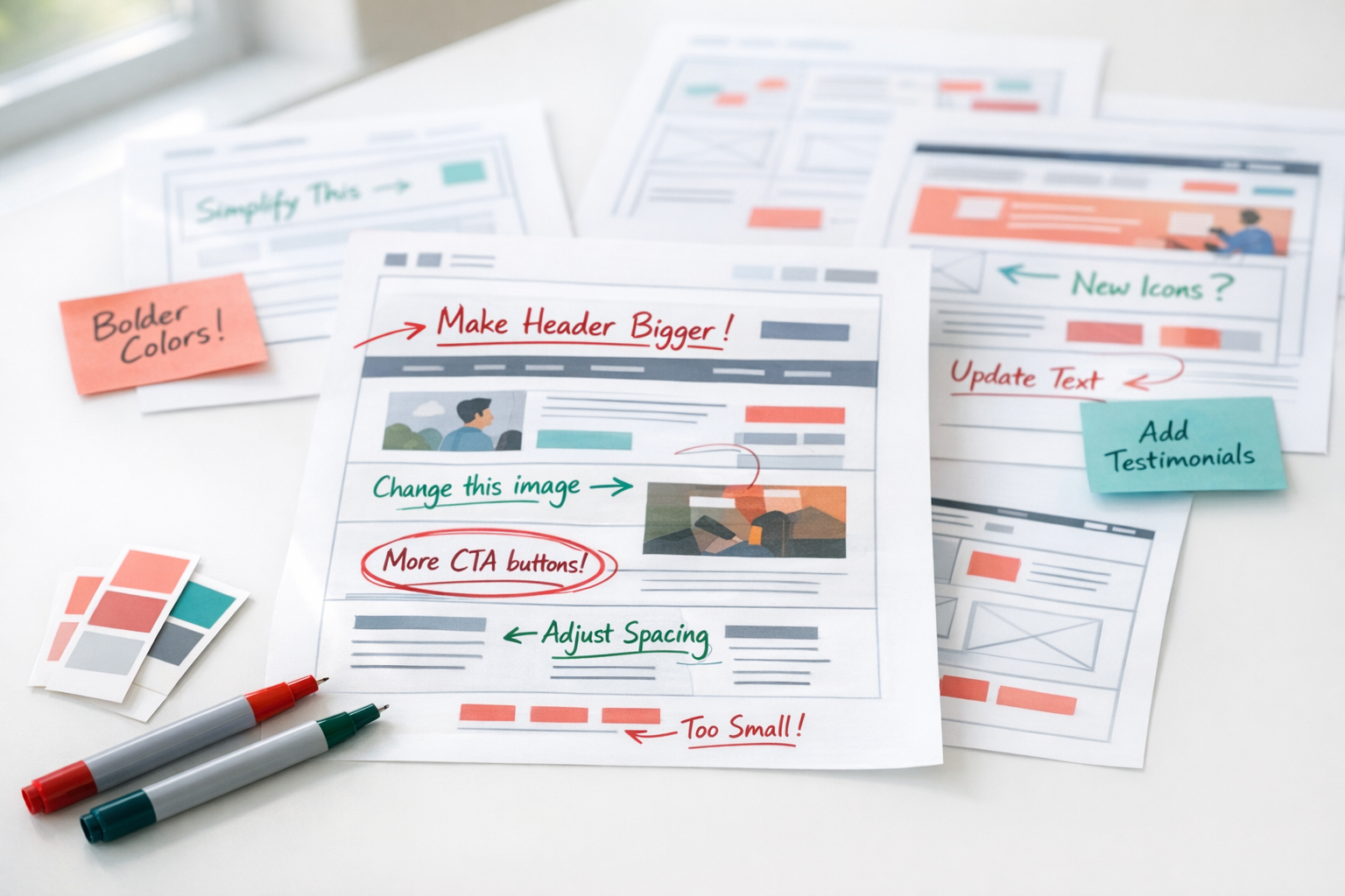
Use Annotations, Not Paragraphs
Wherever possible, pin your feedback directly to the element you are discussing. Tools like Figma’s commenting feature, InVision, or even a simple screenshot with numbered callouts are far more effective than a paragraph describing “the section about halfway down the page with the icons.”
Ambiguity is the enemy of efficient feedback. When a designer has to spend five minutes figuring out which element you are referring to, that is five minutes wasted. And when they guess wrong, you end up with changes applied to the wrong section, which creates even more revision cycles.
If your design team is working in a tool that supports inline commenting, use it. If not, take a screenshot, annotate it with numbered callouts using any basic image editor, and pair each number with a short, clear note. This takes you an extra ten minutes but saves the project hours.
Ask Questions Before Making Declarations
Sometimes, what looks like a design problem is actually a deliberate decision you are not aware of. Before declaring that something needs to change, ask why it is the way it is. “I noticed the pricing section uses a different layout from the rest of the page. Was that intentional?” is a more productive opening than “the pricing section layout is wrong.”
This approach accomplishes two things. First, you might learn something that changes your perspective. Perhaps that layout tested better with users, or it was designed to accommodate a content type that the other sections do not have. Second, even if you still disagree after hearing the rationale, the conversation starts from a place of mutual respect rather than correction.
What we see across client projects is that the best feedback conversations happen when reviewers treat the design as a hypothesis rather than a deliverable. When both sides approach the review as a collaborative investigation into what works best, the output improves dramatically.

Do Not Redesign by Committee
The more people involved in a design review, the more likely you are to end up with a watered-down compromise that serves nobody well. Limit your core review group to three to five people, ideally representing distinct perspectives: someone who owns the business objectives, someone who understands the audience, and someone with brand or marketing authority.
Larger stakeholder groups can and should have visibility into the process, but their input should be filtered through the core reviewers rather than delivered directly to the design team. This is not about excluding people. It is about maintaining coherence. A homepage designed to satisfy twelve different opinions will have twelve competing focal points and zero clarity.
If your organisation’s culture requires broader input, consider a structured approach: circulate the design for comment with a clear set of questions (“Does this page communicate our three key differentiators? Is the call to action clear?”) rather than an open invitation to critique anything. Guided reviews produce focused feedback. Open-ended reviews produce noise.
Feedback on Mobile Is Not Optional
A surprising number of design reviews happen exclusively on desktop, even though mobile traffic accounts for 50 to 70 percent of visits for most B2B websites. If you are only reviewing the desktop layout, you are only reviewing half the experience.
Ask to see mobile layouts alongside desktop from the earliest stages. Pay particular attention to how content stacks on smaller screens, whether buttons and form fields are easy to tap, and whether the page length feels manageable. A section that works beautifully as a three-column layout on desktop might become an endless scroll on mobile, burying your call to action below content that most users will never reach.
When giving mobile-specific feedback, be precise about the device or viewport size you are reviewing. “This looks cramped on my phone” is less useful than “on an iPhone 14 in portrait mode, the hero section headline breaks across four lines and pushes the CTA below the fold.”
Set a Feedback Deadline and Honour It
Late feedback is expensive feedback. Every day a design sits waiting for review is a day the project timeline extends. And feedback that arrives after the team has moved on to the next phase is not just late; it is disruptive. It forces rework on something that was considered complete, which cascades into delays on everything downstream.
Agree on a review window at the start of the project and stick to it. Two to three business days is reasonable for most review rounds. If someone cannot review within that window, their input gets folded into the next round rather than holding up the current one. This sounds strict, but it is the single most effective scheduling discipline you can adopt on a website project.
What Good Feedback Sounds Like
To bring all of this together, here is what a strong piece of design feedback looks like in practice:
“On the Services page, the three service cards in the middle section all have the same visual weight, but our analytics show that Service A generates 60 percent of our qualified leads. Can we explore ways to give Service A more prominence, perhaps through size, position, or visual treatment, so it draws the eye first?”
That single comment identifies the specific page and section, explains the business context, describes the problem without prescribing a rigid solution, and invites the designer to bring their expertise to bear. Compare that to “make Service A stand out more,” which gives the designer nothing to work with beyond a vague direction.
Making Feedback Part of Your Process
Giving useful design feedback is not a one-off skill you deploy during a website project and then forget. It is a communication discipline that improves every aspect of working with creative teams, from brand campaigns to product interfaces.
The principles are simple. Review at the right stage. Anchor feedback to objectives. Describe problems, not solutions. Consolidate before sending. Prioritise what matters most. Be specific, be kind, and be on time. Teams that build these habits into their process consistently produce better websites in fewer rounds with less frustration on all sides.
If you take away just one thing, let it be this: the quality of your feedback directly determines the quality of your website. Designers cannot read your mind, and they should not have to. The more clearly you communicate what is working, what is not, and why, the faster you will arrive at a design that genuinely serves your business and your users.