Prototype-First Websites: The Fastest Way to Align Stakeholders and De-risk Big Decisions

- Marco Navarro, Managing Partner
Share
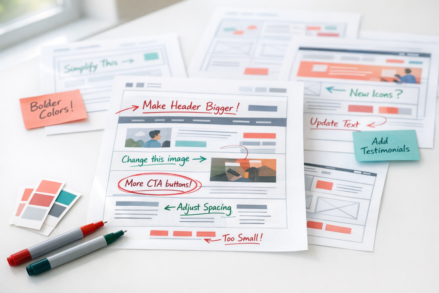
Prototypes turn concepts into a visual experience you can click and interact with, so decisions get made early, with less politics and less rework. When stakeholders debate abstract concepts, meetings multiply. When they interact with a clickable representation of the solution, alignment can happen in hours instead of weeks.
This guide is written for CMOs, marketing leads, and CEOs in mid-market teams where website decisions are shared, time is limited, and a wrong build is expensive.
A prototype isn’t design theatre. It’s a decision-forcing mechanism that converts opinions into evidence, assumptions into testable flows, and “I’ll know it when I see it” into documented choices.
This guide covers:
- Why teams get stuck in endless discussions, and how prototypes break the cycle
- What prototypes actually validate beyond aesthetics
- A framework for building decision-grade prototypes that translate into build-ready direction
- An executive checklist to evaluate prototype readiness before development starts
Click & Jump To:
Why Teams Get Stuck (And Why “Just Discussing It” Doesn’t Work)
Website projects stall not because teams lack ideas, but because they lack shared understanding. Everyone agrees the site should be “modern,” “conversion-focused,” and “simple.” But those words mean different things to different people, and no amount of discussion resolves the gap.
The “Words vs Visuals” Failure Pattern
Language is imprecise. When the CMO says “premium,” they might mean minimalist typography and generous whitespace. When the sales director hears “premium,” they picture bold claims and aggressive CTAs. When the CEO says “simple,” they mean fewer pages. When the UX lead hears “simple,” they mean clearer hierarchy.
These interpretations never surface in strategy meetings. They surface during design review, when the first mockups arrive and everyone realises they were imagining different outcomes. By then, weeks of work need revision.
If everyone can click the same thing, “premium” and “simple” stop being adjectives and start being decisions.
Mid-Market Reality: Too Many Stakeholders, Too Little Shared Context
In organisations with 20-250 employees, website decisions involve marketing, leadership, sales, operations, and IT. Each group has legitimate input. None has complete context. And rarely does anyone have dedicated time for digital product ownership.
The result: decisions get made in fragments. Marketing approves messaging. Sales wants different emphasis. Leadership questions the structure. IT raises technical concerns late. Each review cycle adds weeks and erodes confidence.
Without a shared artifact, alignment is theoretical. Everyone agrees on principles; nobody agrees on implementation.
Prototyping Is a Shortcut to Alignment
Instead of debating ideas, you test representations of ideas. A prototype forces specificity. It answers “what do you mean by modern?” with something clickable. It replaces “I think users will understand” with observable behaviour.
Imagine your team disagrees on whether pricing should be visible on the homepage. Sales wants it hidden until qualification. Marketing wants transparency to filter low-intent enquiries. Leadership wants “competitive positioning.” In a meeting, this debate can run for weeks. With a prototype, you create both versions, and decide based on evidence.
This is the “bias toward action” that defines effective design thinking: quickly and scrappily prototyping and testing ideas rather than endlessly debating them.1 The alternative, perfecting strategy documents before anyone sees a screen, optimises for the wrong thing.
Key insight: A prototype doesn’t end debate by being right. It ends debate by making disagreement visible and testable.
What Prototypes Actually Validate (Beyond “Does It Look Good?”)
The perception that prototypes are “design fluff” comes from prototypes that only test aesthetics. Decision grade prototypes validate the things that determine whether the website works, not just whether it looks acceptable.
Journey Logic: Can Users Complete What Matters?
Primary journeys drive business outcomes: inquiry submission, demo booking, checkout completion, account onboarding. A prototype tests whether users can navigate these paths without confusion.
Where does hesitation occur? What “next step” cues work? Where do users look for information that isn’t there? These questions have answers, but only if you build something to test.
Information Hierarchy: Do Users Instantly Understand Value and Next Action?
Above-the-fold comprehension determines whether visitors engage or bounce. A prototype tests:
- Can users articulate what you do within 10 seconds?
- Is the primary action obvious?
- Does section order match user intent?
- Is proof placed where doubt occurs?
These aren’t subjective questions. They’re observable in testing. Users either understand or they don’t. They either click or they don’t.
Content Requirements: What You Need to Say, and What You Can Cut
Prototypes surface content gaps before they become launch blockers. When you build a testimonials section, you discover whether testimonials exist. When you prototype a pricing page, you discover whether pricing is actually defined. When you add a “results proof” band, you find out whether the metrics, certifications, or partner logos are ready.
This clarity helps marketing teams plan content production realistically. It’s easier to write content when you know exactly what’s needed, where it appears, and how much space it has.
Analytics and Measurement Requirements
Prototypes reveal what events and conversions you must track. When you map a journey from landing page to form submission, you identify the micro-conversions that matter: scroll depth, CTA visibility, form field completion, abandonment points.
This surfaces analytics requirements early, before developers build pages without tracking infrastructure. It’s far easier to implement measurement when it’s specified upfront than to retrofit it after launch.
Objections and Trust Gaps
Where do users hesitate? What reassurance do they need? Prototypes reveal:
- Pricing clarity requirements (do users need to see prices early or late?)
- Process transparency (do users need to understand what happens after they submit?)
- Risk reversal (do users need guarantees, refund policies, security cues?)
- Credibility signals (where do users look for proof?)
These trust gaps are invisible in wireframes and strategy documents. They become obvious when real users interact with a prototype.
Operational Implications: What the Prototype Reveals About Complexity
You can’t validate backend feasibility fully in a prototype. But you can expose unknowns earlier and document them clearly. When the prototype includes a “check availability” feature, someone has to ask: what system provides availability data? How current must it be? What happens when the API is slow?
These questions surface during prototype review rather than during development, when answering them is far more expensive.
A prototype doesn’t solve technical complexity. It makes technical complexity visible before you’ve committed budget to building around assumptions.
Why Figma-First Works (And Why “A PDF Design” Isn’t Enough)
Static mockups and PDF designs fail as decision tools because they require imagination. Stakeholders must mentally simulate how pages connect, how interactions feel, how journeys flow. That mental simulation varies by person, which means alignment remains theoretical.
Interactive Flows Create Real Decision Context
Figma prototypes allow interactive flows that help teams explore how users interact with designs.2 Clicking through a journey is fundamentally different from looking at a page. It reveals friction, confusion, and missing steps that static designs hide.
When a stakeholder clicks “Add to Cart” and nothing happens, the question “what should happen here?” becomes urgent and specific. When they navigate from homepage to service page to contact form, they experience the journey as a user would.
What Prototypes Are Not
Figma explicitly describes prototypes as “fantastic” for:2
Previewing how users move through flows
Iterating quickly on interaction patterns
Gathering feedback from collaborators
Testing designs with real users
Presenting to stakeholders for approval
The tool is built for the messy reality of multi-stakeholder decisions. Comments attach to specific screens. Versions track changes. Multiple reviewers can interact asynchronously. This infrastructure matters because website decisions involve people who aren’t in the same room, don’t have the same availability, and need to provide input on their own schedule.
“Multiple Flows” Means You Can Prototype the Journeys That Drive Revenue
Figma supports multiple flows within a single prototype: account creation, add-to-cart, checkout, onboarding, support request.8 This maps directly to conversion-focused website strategy.
Instead of prototyping “the homepage,” you prototype “the journey from ad click to demo booking.” Instead of designing “the product page,” you design “the path from product discovery to purchase completion.” Journeys, not pages, drive outcomes.
Prototype vs Blueprint: Two Ways to Buy Clarity
Blueprint-first and Prototype-first aren’t competing approaches. They’re different tools for different problems, with the same aim: reduce uncertainty before committing significant budget.
Blueprint-First: Documentation-Led Clarity
A Blueprint excels when complexity is primarily structural: scope definition, integration requirements, stakeholder governance, technical architecture. It answers “what exactly are we building?” through documented specifications, decision rights, and risk registers.
Blueprint-first is the right choice when:
- Integrations and migrations are the biggest risk
- Requirements are fuzzy across departments
- Technical constraints drive architecture decisions
- Scope boundaries need formal agreement
Prototype-First: Artifact-Led Clarity
A Prototype excels when complexity is primarily experiential: positioning, hierarchy, user flows, persuasion mechanics, UX decisions. It answers “what should this feel like?” through interactive artifacts that stakeholders can click, test, and react to.
Prototype-first is the right choice when:
- Stakeholders disagree on “what it should be”
- You need to validate journeys quickly
- You need a shared visual to stop debate
- The biggest risk is building something users don’t understand
Which One Should You Choose?
| Primary Risk | Best Starting Point |
|---|---|
| Stakeholder alignment on experience | Prototype-first |
| Journey and conversion validation | Prototype-first |
| Integration complexity | Blueprint-first |
| Scope and requirements ambiguity | Blueprint-first |
| Complex technical architecture decisions | Blueprint-first |
| Positioning and messaging validation | Prototype-first |
Sometimes you need both. A complex e-commerce replatforming might need Blueprint-first for integrations and Prototype-first for the customer experience. The sequence depends on where uncertainty is highest.
The honest answer: Neither approach is universally “first.” The right choice depends on what’s most likely to derail your project.
The Prototype Proof Framework: 6 Steps to Decision-Grade Clarity
A prototype that doesn’t drive decisions is expensive theatre. The Prototype Proof Framework ensures every prototype answers specific questions and produces documented outcomes.
Framework at a glance:
Define the decisions (not the screens)
Choose fidelity intentionally
Build conversion-critical flows first
Test early and iterate fast
Lock decisions and produce the Prototype Pack
Translate to build readiness
Output: A Prototype Pack that translates debate into build-ready direction.
Step 1: Define the Decisions, Not “The Screens”
Before opening Figma, list the decisions the prototype must answer:
- What is the primary CTA and who is it for?
- What are the key journeys that drive revenue?
- What proof is required to overcome objections?
- What pages and features are mandatory vs optional?
- What content must exist for the experience to work?
This list becomes the success criteria. A prototype is complete when these decisions are made, not when a certain number of screens exist.
Step 2: Choose Fidelity Intentionally
Low fidelity tests structure: does the hierarchy make sense? Do users understand the flow? High fidelity tests persuasion: does the messaging land? Does the design feel credible?
The goal is “minimum clickable reality”: enough realism to test meaningful questions, not so much polish that iteration becomes expensive. Pixel-perfect prototypes before structural decisions are locked waste effort on details that will change.
Step 3: Build the Conversion-Critical Flows First
Start with the journeys that drive outcomes:
- Homepage → Service → Proof → CTA
- Product → Cart → Checkout
- Landing Page → Form → Confirmation
- Pricing → Comparison → Purchase
These flows reveal whether the site works. Secondary pages (About, Blog, Careers) can wait. If the conversion paths don’t function, nothing else matters.
Step 4: Test Early and Iterate Fast
Early testing is valuable because rapid iteration lets teams refine designs before costly rework later.1 Short feedback cycles reduce the average cost of change; the longer issues remain undiscovered, the more expensive they become to fix.3
Test with stakeholders first (do they agree this represents what they want?), then with users (do they understand and complete the journey?). Each round of testing should close decisions, not just generate opinions.
What to measure in testing:
- Task success: Can users complete the journey without assistance?
- Time to comprehension: Can users explain what you do within 10 seconds?
- Points of confusion: Where do users hesitate, backtrack, or ask questions?
- Objection prompts: “What would stop you from taking this action?”
These metrics convert “I think it works” into “we observed that it works.”
Step 5: Lock Decisions and Produce the Prototype Pack
A prototype without documentation is a pretty picture. The Prototype Pack translates interactive exploration into build-ready direction:
What to measure in testing:
- Clickable Figma prototype: Core flows, interactive and testable
- Flow map: What paths exist and how they connect
- Content skeleton: What content is required per section, with word counts and content types
- Interaction notes: What happens on click, validation states, error handling, edge cases
- Decision log: What got decided, by whom, and what’s still open
- Risk and unknowns list: Technical and integration questions that need resolution
- Next-step recommendation: Scope options and sequencing for build phase
This pack ensures the prototype’s value survives beyond the review meeting. Decisions are documented. Gaps are visible. The build team inherits clarity, not assumptions.
The Prototype Pack checklist:
- Clickable Figma prototype (core flows)
- Flow map / journey map
- Content skeleton with requirements
- Interaction notes and edge cases
- Decision log (what’s locked, what’s open)
- Risk and unknowns list
- Section Inventory (see below)
- Next-step build recommendation
From Prototype to Build Plan: “Design Sections” (Scope by Components, Not Pages)
A modern website isn’t really “a set of pages.” It’s a set of reusable building blocks (modules, components, and sections) that get assembled into different layouts. Modular approaches explicitly describe websites as combinations of reusable units that can be developed and tested independently, then composed into pages.5
That matters because pages are a misleading unit of scope. A “homepage” might be 4 meaningful blocks or 14. Two “service pages” might look similar but have completely different complexity if one includes comparison logic, dynamic FAQs, filters, or embedded forms.
So instead of scoping by page count, we scope by Design Sections.
What We Mean by a “Design Section”
Why “Sections” Give Executives Better Clarity Than “Screens” or “Pages”
- How big is this, really? Unique sections, not vague “pages”
- Where does complexity live? Interactive/data-driven sections vs static
- What will slow us down? Dependencies, content readiness, approvals
- What can be reused? Design once, deploy across multiple pages
A 12-page website with 18 unique sections is a fundamentally different project from a 12-page website with 45 unique sections. Page count hides that difference. Section count reveals it.
The Section Inventory: The Missing Bridge Between Prototype and Build
Your prototype shouldn’t just show screens. It should produce a Section Inventory: a list of every unique section required to deliver the conversion-critical journeys, plus what makes each one simple or complex.
What we capture per Design Section:
- Purpose: What decision, question, or objection this section resolves
- Content type: Copy-only / media-heavy / data-driven
- Interaction complexity: Static / states (hover/expand) / forms / filtering / multi-step
- Variants: How many versions are needed (e.g., 1 hero reused vs 4 unique heroes)
- Dependencies: CMS fields, APIs, authentication, payments, third-party scripts
- Quality constraints: Performance sensitivity, accessibility requirements, analytics events
This is how prototype-first becomes build-ready direction without pretending the prototype is a full technical spec.
How the Section Inventory Fits Into the Prototype Pack
When you can point to “28 unique sections across 6 journeys (8 interactive, 5 system-driven),” stakeholders stop debating in abstractions and start making real decisions about scope, priority, and sequencing.
The Section Inventory becomes the bridge between “here’s what we want” and “here’s what it takes to build.” It gives development teams the granularity they need to estimate accurately, and gives executives the visibility they need to make trade-offs intelligently.
Step 6: Translate to Build Readiness (Without Pretending It’s Full Specs)
A prototype proves experience decisions. It doesn’t prove backend feasibility, integration viability, or performance characteristics. Build readiness still requires technical validation.
But: the Prototype Pack massively reduces ambiguity and rework. Development teams know what they’re building, why, and what questions remain. That clarity is worth weeks of avoided confusion.
The prototype answers “what should users experience?” The Blueprint answers “how do we build it reliably?” Both questions need answers. The prototype ensures you’re building the right thing before you optimise how to build it.
What Prototyping Can’t Do (And How Smart Teams Handle That)
Prototypes are powerful, but they’re not magic. Understanding their limits prevents overpromising and ensures appropriate expectations.
Prototypes Don’t Prove Backend Feasibility
A clickable “check availability” button doesn’t validate that the inventory API can return data in under 200ms. A prototype can include a personalised dashboard without proving the data architecture supports personalisation.
What prototypes do: reveal where backend questions exist. That visibility is valuable. It surfaces technical risks early, even if it doesn’t resolve them.
They Don’t Solve Content Production
Prototypes clarify what content is required, who owns it, and by when. They don’t write the content. A prototype with placeholder text still needs someone to produce the real copy, testimonials, and imagery.
What prototypes do: make content requirements concrete and unavoidable. It’s harder to ignore “we need 6 testimonials and 4 results metrics” when there are empty slots in the prototype.
They Don’t Replace Governance
If decision rights are unclear, the best prototype still stalls. If three executives each believe they have final approval, a prototype gives them something specific to disagree about, but it doesn’t resolve the underlying authority question.
What prototypes do: make governance failures visible faster. Stalled prototype approval is a symptom of unclear ownership, surfaced early rather than during development.
They Don’t Confirm Performance or Security Constraints
A prototype can feel fast because it’s static. It doesn’t prove the real site will load in under 2 seconds with live data, third-party scripts, and authenticated sessions. Similarly, a prototype doesn’t validate security architecture, data encryption, or compliance requirements.
What prototypes do: surface where performance and security requirements must be defined. These constraints should be documented as non-negotiable standards before build begins, not discovered during QA.
Common Prototyping Traps (And How to Avoid Them)
Trap: “Pixel Perfection Before Decisions”
Teams spend weeks polishing visual details before structural decisions are made. Then feedback requires reworking everything.
Fix: Decide structure and message hierarchy first. Visual refinement comes after flow validation. Low fidelity for structure, high fidelity for persuasion.
Trap: “Prototype the Whole Site”
Attempting to prototype every page creates a massive artifact that’s expensive to iterate and impossible to test coherently.
Fix: Prototype the flows that drive outcomes. Journeys matter more than pages. A complete checkout flow is more valuable than a pixel-perfect About page.
Trap: “Stakeholder Feedback as Opinions”
Review sessions become opinion-sharing exercises. “I don’t like the blue” carries the same weight as “users can’t find the CTA.”
Fix: Ask decision questions. Test flows. Constrain feedback to goals. “Does this help users complete the journey?” is a better question than “what do you think?”
Trap: “No Decision Log”
Multiple review rounds happen. Feedback accumulates. But nobody tracks what actually got decided. The same debates recur.
Fix: Every iteration closes decisions, not just adds comments. The decision log is a required output, not an optional extra.
Trap: “Prototype as Final Design”
Stakeholders treat the prototype as the finished product. Any deviation during build feels like regression.
Fix: Set expectations early. Prototypes prove concepts and flows. Build implementation may differ in details as technical realities emerge. The prototype is a decision tool, not a pixel-perfect specification.
Executive Checklist: 15 Questions That Expose Hidden Risks
Use this checklist to evaluate whether your prototype has achieved decision-grade clarity.
Clarity Checks
- Can you explain the value proposition in one sentence? If stakeholders articulate it differently, alignment isn’t complete.
- Is the primary CTA defined and agreed? What action do you most want users to take? Who is it for?
- Is there a defined “happy path” journey? The ideal user flow from entry to conversion should be documented and tested.
- Do stakeholders agree this prototype represents what they want? Silence isn’t agreement. Explicit sign-off is required.
Journey Checks
- Does the prototype include the top 2-3 conversion-critical journeys? Not every page, but every path that drives revenue.
- Are error and edge states considered? Empty states, validation failures, unavailable options. What happens when things go wrong?
- Has the prototype been tested with real users? Stakeholder approval isn’t user validation. Both matter.
Content Checks
- Do you know what content is required? Section by section, what copy, images, proof, and data must exist?
- Is content ownership assigned? Who writes it? Who approves it? By when?
- Are proof assets identified? Testimonials, results metrics, partner logos, credibility signals. Do they exist or need creation?
Build-Readiness Checks
- Are open technical questions listed? Not hidden, not assumed resolved. Documented and assigned.
- Are integrations identified with ownership? What systems connect? Who owns each integration? What happens if they fail?
- Are performance expectations stated? Page load targets, mobile requirements, accessibility standards. Defined now, not “fixed later.”
- Is there a decision log? What got decided, by whom, and what remains open?
- Does a Prototype Pack exist? Clickable prototype, flow map, content skeleton, interaction notes, risk list, next-step recommendation.
What Prototype-First Gives You (By Role)
A prototype isn’t “design progress.” It’s decision progress. Done properly, it reduces rework by shortening feedback cycles and surfacing issues earlier, when changes are cheaper and less disruptive. It also makes strategy tangible, which is why prototyping is widely used to build alignment and confidence across stakeholders.1
For the CMO
A faster path to alignment: fewer opinion loops because people react to the same clickable artifact, not different mental pictures. The prototype becomes something you can share with the CEO or CFO as “here’s what we’re building and why” rather than a vague deck or a list of requirements.
You also de-risk launch messaging by validating hierarchy, proof placement, and journey logic before spending months producing content or scaling paid traffic. And because journeys are mapped, analytics becomes part of the plan from day one, not bolted on later.
For Marketing Managers and Heads of Marketing
Content clarity without guesswork. Prototypes make content gaps obvious (“we need proof here,” “we need answers here”), so you can plan assets and copy realistically. You know what’s needed, where it appears, and how much space it has.
Fewer redesign cycles because you iterate early and quickly. Prototypes are built for collaboration, feedback, and iteration.2 The Prototype Pack (flows, content skeleton, interaction notes, decision log) becomes a working reference for the team, not a collection of disconnected screenshots.
For CEOs and Founders
A way to answer critical business questions fast. Prototype-first compresses uncertainty into a short cycle of prototyping and user testing (the same logic behind sprint-style approaches). You surface issues earlier, reducing the chance you discover fundamental problems just before launch.
You also get cleaner trade-offs: you can see scope and complexity before you commit major budget. “28 unique sections, 5 system-driven” is a more honest conversation than “12 pages.”
Even If the Full Project Isn’t Approved Yet
- It captures stakeholder assumptions and turns them into testable hypotheses
- It produces an artifact you can use to secure budget (“this is the plan we want to fund”)
- It reduces the chance you approve a build based on opinions rather than evidence
One-line summary: Prototype-first creates an asset you can use to align stakeholders, validate direction, and justify investment, whether you build now or later.
Next Step: From Debate to Direction
Prototyping isn’t about creating pretty pictures. It’s about forcing decisions, testing assumptions, and building shared understanding before the expensive work begins.
The executive checklist above provides a starting point for evaluating whether your current approach has the clarity required for success. If you can’t answer those questions confidently, you’re not ready to build.
Option A
Run a Prototype Review Internally
Choose one journey. Map it. Prototype it in whatever tool your team uses. Test it with stakeholders and users. Iterate until decisions are locked. Document what you learned.
This works when you have internal design capability, stakeholder availability, and the discipline to close decisions rather than accumulate feedback.
Option B
When Blueprint-First Is the Better Choice
If your biggest risks are integrations, scope ambiguity, or requirements clarity, prototype-first may not address your core uncertainty. Start with Blueprint-first instead.
The goal is clarity. The path depends on where uncertainty lives.
Option C
Run a Prototype Sprint
A Prototype Sprint compresses weeks of internal debate into 48-72 hours of focused, facilitated work. The output:
- A decision-grade clickable prototype of your key conversion journeys
- A complete Prototype Pack with documented decisions, content requirements, and open questions
- Clear next-step recommendations for build phase
References
1 IDEO U. “What is Design Thinking?” IDEO U. Design thinking includes a “bias toward action: quickly and scrappily prototyping and testing ideas” rather than endlessly debating them. Prototyping builds alignment and confidence across stakeholders by making abstract ideas tangible and testable.
2 Figma. “Prototype.” Figma Help Center. Figma describes prototypes as “fantastic” for previewing how users move through flows, iterating quickly on interaction patterns, gathering feedback from collaborators, testing designs with real users, and presenting to stakeholders. Multiple flows can be created within a single file to map different user journeys.
3 Project Management Institute. “Cost of Change on Software Teams.” PMI.org. Reducing feedback cycles helps identify changes sooner and reduce the average cost to make changes. The cost of fixing defects rises exponentially the later they are discovered in the project lifecycle.
4 Interaction Design Foundation. “Prototyping.” IxDF. Rapid prototyping helps teams build tangible artifacts quickly, test them with users, learn from feedback, and iterate. This approach reduces risk by validating assumptions early rather than discovering problems during development.
5 HubSpot. “Modular Design.” HubSpot Blog. Modern web development increasingly treats websites as systems of reusable modules and components that can be developed, tested, and maintained independently, then composed into pages as needed.
6 Brad Frost. “Atomic Design.” Atomic Design Methodology. Design systems break interfaces into smaller, reusable components (atoms, molecules, organisms, templates, pages) that can be combined consistently across a site, improving maintainability and scalability.
7 Mountain Goat Software. “Story Points and Estimation.” Mountain Goat Software. Agile estimation methods favour relative sizing (story points, t-shirt sizes) over hour-based estimates because they better account for complexity, uncertainty, and risk. These factors make precise time predictions unreliable for knowledge work.
8 Figma. “Prototype Flows.” Figma Help Center. Figma supports multiple flows within a single prototype, allowing teams to map different user journeys (e.g., account creation, checkout, onboarding) and test them independently or as connected experiences.
Related