The Line Between Helpful and Decorative Is Sharper Than You Think
Most website animation falls into one of two categories: it either guides the user toward a decision, or it entertains the person who designed it. The difference matters enormously because decorative animation actively harms performance, accessibility, and conversion rates, while purposeful animation can improve all three. If you’re planning a website redesign or evaluating your current site, understanding this distinction will save you from spending budget on motion that looks impressive in a stakeholder presentation but quietly undermines your business goals.
We see this pattern constantly across client projects. A marketing team requests “something more dynamic” or “a bit more wow factor,” and the development team interprets that as parallax scrolling, elaborate loading sequences, and elements that bounce into view on every scroll. Six months later, the site feels slow, analytics show high bounce rates on key pages, and nobody can pinpoint why. The answer is almost always the same: the animation is working against the user rather than for them.
What Helpful Animation Actually Does
Functional animation serves the user’s mental model. It answers questions like “where did that element go?”, “what just happened?”, and “what should I do next?” without requiring the user to consciously process what’s occurring. When you click a mobile menu icon and the navigation slides in from the left, that slide tells your brain where the menu lives spatially. Without it, the menu would simply appear, and you’d need an extra cognitive beat to orient yourself. That saved beat, multiplied across every interaction on your site, is the difference between an experience that feels effortless and one that feels slightly exhausting.
There are a handful of specific jobs that animation does well, and they’re worth understanding individually because each one has different implementation considerations.
Communicating State Changes
When a user submits a form, adds an item to a cart, or toggles a filter, the interface has changed state. Animation bridges that transition so the user doesn’t lose context. A classic example: when a user adds a product to a basket, a small animation showing the item thumbnail flying toward the basket icon confirms the action was successful. Without that motion, you need a text confirmation, a colour change, or some other static indicator. The animation communicates the same information faster and with less conscious effort from the user.
What makes this helpful rather than decorative is duration and purpose. The animation should last 200 to 350 milliseconds. Anything shorter feels abrupt; anything longer feels like it’s wasting the user’s time. It should draw the eye to exactly one thing: the confirmation that their action worked. If you find yourself adding easing curves, secondary bounces, or particle effects to a state change animation, you’ve crossed from functional into decorative.
Establishing Spatial Relationships
Tabs, accordions, carousels, modals, and drawers all benefit from animation that shows where content lives in relation to other content. When a tab panel slides left to reveal the next panel, the user understands they can slide back. When a modal fades and scales up from the centre, the user intuitively knows the page content is “behind” it. These spatial cues reduce the learning curve for your interface and make navigation feel predictable.
We prototype these transitions early in our projects specifically because the spatial logic of your interface needs to be established before visual design begins. If your prototype’s navigation feels disorienting without animation, that’s a structural problem, not a polish problem. Adding animation later won’t fix a confusing information architecture. It will just make it confusing with motion.
Directing Attention
The human eye is hardwired to track movement. This makes animation a powerful tool for drawing attention to a specific element at a specific moment. A subtle pulse on a primary CTA after a user has scrolled through a pricing table, a gentle highlight appearing on the next step in a multi-step form, or a notification badge that briefly scales up when a new message arrives. These are all examples of animation directing attention purposefully.
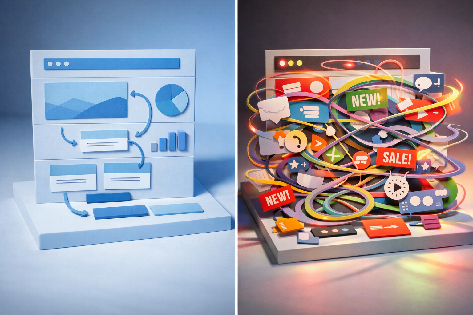
The key word is “specific.” When everything on the page moves, nothing stands out. This is the single most common mistake we see on sites that overuse animation: every section has a scroll-triggered entrance, every icon has a hover effect, every heading fades up from below. The result is visual noise. The user’s eye has nowhere to rest and no clear signal about what matters most. If more than 20% of your visible page elements animate on any given scroll position, you’ve almost certainly passed the threshold where motion helps.
What “Cool” Animation Typically Looks Like
Decorative animation is easy to recognise once you know what to look for. It’s animation that exists to demonstrate capability rather than solve a user problem. It shows up in award-winning portfolio sites, agency homepages, and redesign pitch decks. It’s impressive when you first see it. It becomes tiresome by the second visit.
A few common examples that we regularly advise clients to reconsider:
- Full-page loading animations that play a branded sequence for 3 to 5 seconds before showing content. Your user came for information. Making them wait while your logo assembles itself from geometric shapes is prioritising your brand vanity over their time.
- Parallax scrolling on every section. One or two parallax elements on a page can add depth. When every background image, text block, and decorative element moves at a different speed, the page feels like a theme park ride that nobody asked to be on.
- Text that types itself out letter by letter. This forces the user to read at your speed rather than theirs. Fast readers are frustrated. Screen reader users get nothing useful. It works in exactly one context: a hero section with a very short phrase that changes to show multiple value propositions. Everywhere else, it’s a vanity choice.
- Scroll-hijacking that overrides the browser’s native scroll behaviour to create a “storytelling” experience. This is almost universally despised by users. It breaks expectations, interferes with accessibility tools, and makes the page feel unpredictable. Even beautifully executed scroll-hijacking tends to increase bounce rates.
- Hover effects on every element. When cards flip, icons spin, and backgrounds shift on hover across the entire page, the user feels like they’re navigating a minefield. Every mouse movement triggers a reaction, and the cognitive load of all that feedback actually slows decision-making rather than supporting it.
None of these are inherently wrong in every context. A creative agency’s portfolio might legitimately use scroll-triggered animation as part of its product demonstration. But for a B2B company trying to generate leads, book demos, or explain a complex service, these patterns typically reduce conversion rates by 10 to 25% in our experience, primarily because they increase page load time and distract from the core message.

The Performance Tax Nobody Talks About
Every animation on your page has a cost. That cost is measured in kilobytes of JavaScript, GPU rendering cycles, and cumulative layout shift. Google’s Core Web Vitals now directly penalise sites with excessive layout shift, and complex animations are one of the most common culprits.
Here’s a practical example. A client came to us with a marketing site that scored 38 on Google’s PageSpeed Insights for mobile. The site used a popular animation library that added 48KB of minified JavaScript, triggered animations on 23 separate elements during scroll, and caused measurable layout shift as elements moved into their final positions. After we stripped the animations back to only functional transitions (navigation, form interactions, and one hero section animation), the score jumped to 82 and the page load time dropped by 1.8 seconds on a 4G connection.
The business impact was immediate. Organic traffic increased by 15% within two months as search rankings improved, and the conversion rate on the primary CTA went up by 8%. The page didn’t look “worse.” It looked cleaner, felt faster, and communicated the same brand personality through typography, colour, and layout rather than motion.
This is a pattern we’ve seen repeatedly. Teams underestimate the cumulative weight of animation because each individual effect seems lightweight. But twenty lightweight effects running simultaneously on a mid-range Android phone create a noticeably janky experience. Your designers and developers are testing on high-end MacBooks with fast connections. Your actual users often aren’t.
How to Evaluate Animation Decisions During a Project
The best time to make animation decisions is during prototyping, not during visual design or development. In our prototype-first guide, we explain how testing structure and flow early helps teams align before expensive decisions get locked in. Animation decisions work the same way. If you prototype key interactions with basic transitions, you can test whether the motion helps users navigate before anyone spends time perfecting easing curves or building complex scroll-triggered sequences.
When evaluating any proposed animation, ask these four questions:
1. What User Question Does This Answer?
Every helpful animation answers an implicit question. A loading spinner answers “is something happening?” A slide transition answers “where did the old content go?” A progress bar animation answers “how much longer will this take?” If you cannot articulate the specific question an animation answers, it’s decorative. That doesn’t mean you must remove it, but you should acknowledge it as a brand investment rather than a UX investment and weigh it against the performance cost accordingly.
2. What Happens If We Remove It?
Try turning the animation off and testing the interaction without it. If the experience is equally clear, the animation was cosmetic. If the experience becomes confusing or disorienting, the animation was functional. This test is surprisingly effective and takes minutes to perform in most prototyping tools. We run this test on every client project, and it consistently reveals that about 60% of proposed animations are removable without any loss of usability.
3. Does It Respect the User’s Time?
Functional animation is fast. Google’s Material Design guidelines recommend 200ms for simple transitions and up to 500ms for complex, full-screen transitions. Apple’s Human Interface Guidelines are similar. If your animation takes longer than half a second, there needs to be a very strong reason. Users perceive delays over 400ms as sluggish, and anything over one second feels broken. The “cool” animations that win design awards often run 2 to 5 seconds. That’s an eternity in interaction design terms.
4. Does It Work Without Motion?
Roughly 30% of users have some form of motion sensitivity, and many enable the “prefers-reduced-motion” setting in their operating system. Your site needs to function perfectly with all animation disabled. If removing animation breaks the experience, you’ve used motion as a structural element rather than an enhancement, and that’s a design flaw. Every animation should be an enhancement layer on top of a fully functional static interface.

Animation Patterns That Consistently Earn Their Place
After working on dozens of website projects, certain animation patterns prove their value so reliably that we recommend them as defaults for most B2B sites.
Micro-interactions on form elements are worth the investment almost every time. A text input that subtly highlights on focus, a submit button that transitions to a loading state and then a success state, error messages that slide into view with a gentle shake. These animations reduce form abandonment because they provide continuous feedback. The user never wonders “did that work?” or “did I click the right thing?”
Navigation transitions between pages or sections reduce cognitive load measurably. When your mega-menu opens with a short, smooth reveal rather than snapping into view, users orient faster. When page transitions include a brief cross-fade, the context switch feels less jarring. These transitions add perhaps 150 to 250 milliseconds to the interaction, but they save the user significantly more time in mental reorientation.
Data visualisation animation is another area where motion genuinely aids comprehension. Charts and graphs that draw progressively help users understand relationships between data points. A bar chart where bars grow from zero communicates magnitude more effectively than a static chart. This is one of the few contexts where slightly longer animation durations (600ms to 1 second) are justified because the motion itself is the communication.
Scroll-triggered reveals on long-form pages can work well when used sparingly. The operative word is sparingly. One or two sections that fade into view as the user scrolls to them can create a sense of progression and prevent the page from feeling like an endless wall of content. But the animation should be subtle: a gentle fade and slight upward movement over 300ms, not a dramatic entrance from the side with rotation and scaling.
What to Watch Out for When Working with Designers and Developers
Animation decisions often fall into a gap between design and development. Designers specify motion in tools like Figma or After Effects, but the implementation in code can differ dramatically from the original concept. A smooth 60fps animation in After Effects might become a stuttery, layout-shifting mess when built with CSS transforms and JavaScript event listeners on a real web page.
This gap is why we insist on prototyping animations in the browser as early as possible rather than relying on design tool mockups. What feels elegant in a screen recording at 60fps on a designer’s 120Hz display might feel sluggish and heavy on a user’s three-year-old laptop. The only reliable way to evaluate animation is to experience it in the actual medium.
Watch out for scope creep in animation specifications. A designer might create a beautiful interaction concept that requires three to four days of development time. If that animation is decorative, those days could be better spent on almost anything else: improving mobile responsiveness, adding structured data for SEO, or building a more robust form validation experience. When we help clients prioritise their development backlog, we often find 15 to 20% of the estimated budget allocated to animation that won’t measurably improve outcomes.
Also be wary of animation libraries that get added to the project for a single effect. We’ve seen sites loading 50KB+ animation libraries to power a single scroll-triggered fade. A developer can typically write a lightweight CSS transition that achieves the same result in a fraction of a kilobyte. Ask your development team whether each animation library is justified by the number of effects that use it.
Building an Animation Strategy That Serves Your Business
Rather than making animation decisions effect by effect, it pays to establish a simple animation strategy at the start of your project. This doesn’t need to be a lengthy document. A single page covering four things will suffice:
- Animation purpose categories: Define which types of animation your site uses (state changes, navigation transitions, attention direction, data visualisation) and which it doesn’t (decorative entrances, parallax backgrounds, scroll-hijacking).
- Timing standards: Set default durations for each category. For example, micro-interactions at 150 to 250ms, navigation transitions at 250 to 400ms, and data visualisation at 500ms to 1 second.
- Easing curves: Pick two or three easing functions and use them consistently. Ease-out for elements entering the viewport, ease-in for elements leaving, and ease-in-out for elements that move within the viewport. Consistency in easing creates a cohesive feel without requiring elaborate effects.
- Reduced motion behaviour: Specify what happens for every animation when the user has prefers-reduced-motion enabled. Typically, transitions are replaced with instant state changes and entrance animations are removed entirely.
This strategy becomes part of your design system and ensures consistency whether you’re building the initial site or adding pages twelve months later. It also gives you a clear framework for evaluating new animation requests: if a proposed effect doesn’t fit within the defined purpose categories, it either gets reconsidered or the strategy is deliberately updated to accommodate it.
Making the Right Call for Your Next Project
Animation is a tool with genuine power to improve usability, but that power is routinely squandered on effects that serve the creator’s portfolio rather than the user’s needs. The sites that perform best, both in user satisfaction and business metrics, tend to use less animation than their competitors but use it more precisely.
Start by auditing what you have. Disable all animation on your current site and navigate through your key user journeys. Note every point where the experience becomes confusing or disorienting without motion. Those are the places where animation earns its keep. Everything else is decoration, and decoration has a cost that should be weighed against the performance, accessibility, and development budget it consumes.
When you prototype your next site, build the functional animations into the prototype early and leave the decorative ones for later consideration. You’ll almost certainly find that a clean, fast, well-structured site with subtle, purposeful motion outperforms a visually spectacular site that makes users wait, wonder, and work harder than they should.