You don’t have a messaging problem. You have a systems problem. When conversion rates stall, the instinct is to rewrite headlines, test button colours, or hire a copywriter. But most conversion failures happen downstream of copy: checkout flows that create friction, journeys that lose intent, and trust gaps that make visitors hesitate at the moment of commitment.
This guide is for CMOs, marketing leads, and digital directors in mid-market organisations who are spending on traffic but not seeing proportional returns. The problem isn’t usually the traffic. It’s what happens after the click.
Consider the last time you abandoned a purchase online. It probably wasn’t because the headline failed to persuade you. More likely: shipping costs appeared at the last moment, or the site demanded you create an account, or the checkout asked for information you didn’t want to give. You wanted to buy. The system got in the way. That’s the pattern this guide addresses.
Why they came (traffic quality, message-market fit)
Do they understand what to do next?
Steps, fields, errors, time
Trust, price surprises, policy ambiguity
This lens applies to every conversion point. When conversion stalls, one of these four factors is the bottleneck.
We’ll look at where conversion actually breaks (the checkout evidence), how journeys leak intent at every stage, and the five sub-systems that drive conversion outcomes. There’s a diagnostic checklist at the end you can use before spending more on ads.
When conversion rates disappoint, the first response is usually creative: new headlines, different value propositions, more compelling CTAs. This feels productive because it’s visible and controllable. But it misses where most conversion actually fails.
Messaging matters. But messaging operates at the top of a system. If the system underneath is broken, no headline will save you. A checkout that surprises visitors with fees will lose them regardless of how compelling the product page was. A form that demands 14 fields will be abandoned no matter how persuasive the landing page copy. A journey that loses trust at the payment step will fail even if the ad that brought them was perfectly targeted.
What “system” means here: The end-to-end path from entry to proof to action to confirmation to follow-up, including all the constraints that shape it: payments, CRM, inventory, policies, compliance, measurement. System failures beat copy every time, because they kill intent at the moment of commitment.
Think of conversion as a stack. At the top: traffic quality and message-market fit. These get most of the attention. But below them sit journey coherence, friction mechanics, and trust architecture. Layers 3, 4, and 5 are where the money leaks out. You can have perfect traffic and perfect messaging, and still lose the sale because checkout required account creation, or shipping costs appeared at the last moment, or the form had 14 fields. The visitor was ready to convert. The system stopped them.
Conversion isn’t persuasion. It’s friction removal. The visitor already wants what you’re offering. Your job is to stop getting in the way.
Checkout is the most studied conversion flow. Baymard Institute’s research, combining quantitative benchmarks and large-scale usability testing, provides the clearest picture of where conversion fails.
Baymard reports average cart abandonment of 70.19% across 50 studies.1 Seven out of ten people who add items to a cart leave without completing purchase. The causes are overwhelmingly process, surprise, and trust. Not copy.
Baymard’s usability research identifies three consistent patterns: surprise (costs revealed late, policies unclear), friction (too many steps, forced account creation, complex forms), and trust gaps (security concerns, missing social proof, no visible contact options). Notice what’s not on this list: “The headline wasn’t compelling enough.” These are systems problems, not messaging problems.
Enterprise companies have dedicated conversion rate optimisation teams, sophisticated A/B testing infrastructure, and the resources to fix these issues systematically. Mid-market organisations typically don’t. The result: mid-market sites often have the same friction problems as enterprise sites, but without the resources to identify or fix them. Checkout flows are inherited from platform defaults. Forms are designed by developers, not UX specialists. Trust signals are afterthoughts. Meanwhile, you’re spending on traffic that leaks out through preventable friction.
The material opportunity: A significant share of abandonments stem from process complexity and surprise costs. These are fixable without spending another pound on traffic. The ROI on friction removal compounds with every visitor you send.
Checkout friction is the final leak, but conversion problems often start earlier. The funnel (the journey from first touch to conversion) can fail at multiple stages, and optimising only the end misses where the real drop-offs occur.
The traditional funnel metaphor (awareness to consideration to decision) suggests a smooth, linear progression. Reality is messier. Visitors enter at different stages with different intent levels. They leave and return multiple times before converting. They compare alternatives, get distracted, forget, and rediscover. The “funnel” is really a web of touchpoints with varying influence, and treating it as a simple linear path leads to optimising the wrong things.
This matters because the highest-intent visitors (the ones closest to conversion) are also the ones most damaged by friction. A visitor who has already decided to buy and then encounters a 5-step checkout with forced registration isn’t going to be persuaded by better copy. They’re going to leave. The closer someone is to conversion, the more every obstacle costs you.
Here’s what the failure chain typically looks like. It starts at entry: the ad promises one thing, the landing page delivers another. Visitors arrive with expectations that aren’t met, and they leave immediately. Those who stay move into consideration, but they’re not ready to commit. They need more information, social proof, or time. If your only path is “buy now,” you lose everyone who isn’t ready today. The ones who do decide to buy now encounter the checkout flow, the form, the account creation requirement. Every obstacle at this stage has disproportionate impact because intent is highest. And even after the sale, the experience afterwards (confirmation, delivery communication, onboarding) determines whether they return or refer. Funnels that end at conversion miss the retention loop.
Conversion systems don’t end when the form submits. For mid-market teams, the biggest money leaks often happen in the handoff between marketing and operations. Faster lead response consistently outperforms slower response, yet most mid-market teams respond in hours or days. Leads arrive but sit unassigned in CRMs. “Someone will be in touch” loses to “Book a time now.” A generic thank-you page loses to clear next steps with timeline. If your conversion system stops at the thank-you page, you’re measuring the wrong endpoint. The real conversion is the meeting booked, the order fulfilled, the customer retained.
For B2B and lead generation sites, form friction deserves special attention because it’s where most lead-gen conversion dies. Nielsen Norman Group’s EAS framework provides a systematic approach: Eliminate fields that don’t directly serve the conversion goal, Automate what you can pre-fill or infer, and Simplify the cognitive load on remaining fields.2 Every field you add to a lead form has a cost. Name, email, and one qualifying question often outperform 10-field forms. The fields you think you need for lead scoring may be costing you the leads themselves.
A funnel isn’t something you build once. It’s something you instrument, observe, and continuously repair.
The patterns above repeat across industries and conversion types. This table consolidates them into a diagnostic model: each leak has a visible symptom, a fix class, and a metric to track improvement. Use it to identify where your system is failing before you start fixing.
| Leak | Symptom | Fix Class | What to Measure |
|---|---|---|---|
| Surprise costs | High cart abandonment at payment step | Policy/UX: show costs early | Drop-off rate at shipping/payment step |
| Forced account creation | Abandonment at registration prompt | Process: enable guest checkout | Registration step abandonment rate |
| Form overload | Low form start-to-complete ratio | Friction: reduce fields (EAS) | Field-level abandonment, completion rate |
| Validation errors | High error rates, rage clicks | Recovery: inline validation, clear messages | Error occurrence rate, recovery rate |
| Payment failure | Completed forms but failed transactions | Recovery: retry flows, alternative methods | Payment failure rate, recovery rate |
| Trust gaps | High bounce on checkout page | Trust: policies, proof, contact access | Checkout bounce rate, time on page |
| Intent mismatch | High bounce on landing page | Alignment: match ad to page content | Landing page bounce rate by source |
| Mobile friction | Lower mobile conversion vs desktop | Friction: mobile-specific UX audit | Conversion rate by device |
| No visibility | “We don’t know where they drop off” | Instrumentation: funnel tracking | Stage-by-stage progression rates |
| No ownership | Conversion decays over time | Governance: assign accountability | Conversion trend over time |
This framework provides a systematic approach to diagnosing and fixing conversion problems. It works for e-commerce checkout, lead generation forms, SaaS signups, and any process where you’re asking visitors to take action. The five sub-systems build on each other: alignment brings the right visitors, friction removal clears their path, recovery design catches failures, trust systems reduce hesitation, and visibility reveals where to focus next.
(landing → offer → proof)
(forms, steps, process)
(errors, failures, edge cases)
(policies, security cues, clarity)
(measurement that reveals leaks)
Output: A conversion system that compounds improvements over time.
We don’t start by changing UI. We start by identifying the one decision the user must make at each step, and what doubt prevents it.
Conversion starts before the conversion point. It starts with alignment between what the visitor expects and what they find. If the ad says “Free trial,” the landing page must lead with the free trial. If the search query is “pricing,” the page must show pricing. If the email promised a specific offer, that offer must be immediately visible. Every gap between expectation and reality costs you visitors who were ready to convert.
Once the visitor arrives, the offer must be clear within seconds. Can they understand what they’re getting, what it costs, and what they need to do? Ambiguity kills conversion. And once the offer is understood, the page must provide evidence that it works: testimonials, case studies, data points, trust badges. These aren’t decoration. They’re the bridge between interest and action.
Friction is anything that makes the desired action harder than it needs to be. Some friction is necessary: you need payment details to process a sale. Most friction is accidental: you don’t need their company size to send a quote, you don’t need their phone number to deliver a PDF, you don’t need account creation to complete a purchase.
Every field has a cost. Each additional field reduces completion rates. Every step creates drop-off: a 5-step checkout loses more people than a 2-step checkout. Account creation is a major friction point; guest checkout consistently outperforms forced registration. Field types matter too: dropdowns with 50 options are harder than text fields, date pickers that require clicking through months are harder than typing. The goal is to reduce the path to conversion to its minimum viable form.
Recovery Design is the sub-system that handles what happens when things go wrong. Most conversion flows are designed for the happy path: the user enters valid data, the payment succeeds, the product is in stock. But errors, failures, and edge cases are where intent dies.
Validation errors should appear inline as users type, not after they submit an entire form. Error messages should explain how to fix the problem, not just that there is one. User input should be preserved; never clear a form because one field failed validation. Payment failures should offer alternatives and retry options, not dead ends. Out-of-stock items should be flagged before checkout, not during. Cart and form state should persist across sessions, so users who leave and return don’t have to start over. In many funnels, the difference between a system that recovers gracefully and one that doesn’t can represent a significant share of otherwise-lost conversions.
Trust isn’t a feeling. It’s a system of signals that reduce perceived risk. At the moment of conversion, visitors are weighing the value of what they’re getting against the risk of what they’re giving up: money, data, time. Your job is to tip that balance by making the risk feel smaller.
Security signals are baseline expectations now: SSL certificates, payment provider logos, security badges. But policy clarity is where mid-market sites often fail. Return and refund policies should be visible before checkout, not buried in footer links. Shipping costs and timelines should be shown early, not revealed at the last step. Privacy policies should explain data use in plain language. Social proof (reviews, ratings, customer logos, testimonials) should appear near the conversion point, not just on the homepage. And contact accessibility matters: phone numbers, chat, or email visible during checkout reduces anxiety about what happens if something goes wrong.
You can’t improve what you don’t measure. But measuring everything creates noise. Visibility is about measuring the right things at the right points, so you can see where the leaks are.
| Tier | What It Reveals | Who Has It |
|---|---|---|
| Tier 1: Basic | Traffic, pageviews, final conversion | Most teams |
| Tier 2: Funnel | Stage progression, drop-off points | Many lack this |
| Tier 3: Micro | Form interactions, checkout steps, errors | Few teams |
| Tier 4: Qualitative | Session recordings, heatmaps, exit surveys | Rare |
Each tier reveals problems the previous tier hides. If you only have Tier 1, you know conversion is low but not why. Tier 2 shows where in the journey people leave. Tier 3 shows what specifically causes them to leave. Tier 4 shows why they say they left. Most mid-market teams are stuck at Tier 1, which means they’re optimising blind.
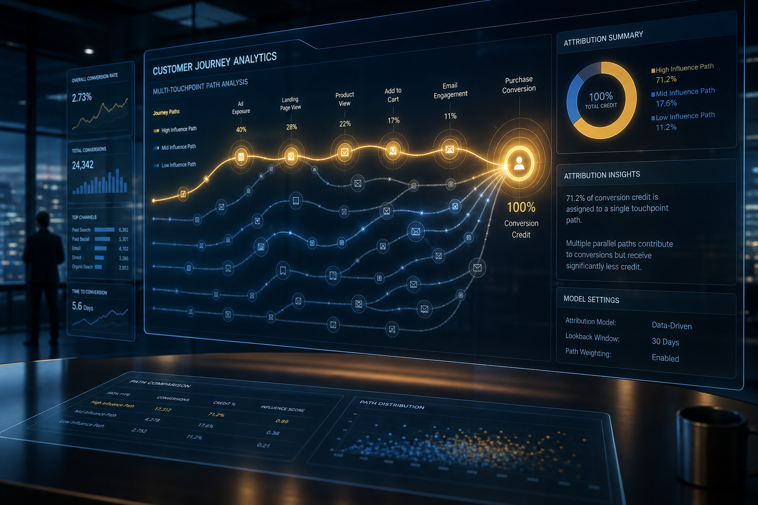
Attribution (understanding which touchpoints contributed to conversion) is genuinely hard. Multi-touch journeys, cross-device behaviour, and privacy changes have made it harder. For mid-market organisations, perfect attribution isn’t realistic. But directional attribution is achievable: which channels drive the most conversions, which content do converters engage with, what’s the typical time from first touch to conversion. Don’t let perfect be the enemy of useful.
Before increasing ad spend, work through this checklist. Each item represents a potential leak that more traffic will only amplify. Skim the bold questions first; dig into the details where you’re uncertain. This consolidates the diagnostic questions from the framework above into one place you can work through systematically.
The rule: Fix the leaks before you add more water. Every friction point you remove compounds with every visitor you send.
Red flag: If no one can answer “who owns conversion performance after launch,” you have a governance gap. Systems without owners decay.
Conversion optimisation isn’t a one-time project. It’s a continuous process of measurement, hypothesis, testing, and iteration. But you have to start somewhere.
Work through the buyer’s checklist above. Complete your own conversion flow on mobile as a new user. Identify the most obvious friction points and fix them. This works when you have internal capability and the friction points are clear.
Before fixing anything, instrument your funnel properly. Set up stage-by-stage tracking, form analytics, and checkout step measurement. Let the data show you where to focus. This works when you’re not sure where the problems are and want evidence before acting.
A 90-minute structured workshop that maps your conversion system end-to-end. You leave with a journey map showing drop-off points, a friction inventory prioritised by impact, recovery design gaps documented, a visibility plan with specific tracking recommendations, and a fix-first roadmap you can execute immediately. Not an audit. Not a CRO retainer. An executive clarity deliverable: you leave with a prioritised leak list, measurement plan, and fix-first roadmap.
Show shipping, taxes, and fees before checkout, not during.
Every required field and forced account creation costs you conversions.
Measure where people leave, not just whether they converted.
CMO / Marketing Director: Audit the gap between traffic spend and conversion return. Are you buying water for a leaky bucket? Ensure conversion ownership is assigned, not assumed. Align agency incentives with conversion outcomes, not just traffic delivery.
Marketing Manager / Digital Lead: Complete your own conversion flow on mobile, as a new user, this week. Implement stage-by-stage funnel tracking before your next campaign. Count your form fields and apply EAS: Eliminate, Automate, Simplify.
CEO / Managing Director: Ask: “Who owns conversion performance after launch?” If the answer is unclear, you have a governance gap. Review lead response time; if it’s measured in hours, you’re likely losing deals. Remember that conversion improvements compound: a 10% improvement affects every visitor you send, forever.
1 Baymard Institute. “50 Cart Abandonment Rate Statistics.” Baymard Institute. Aggregated research from 50 studies reporting average cart abandonment of 70.19%, with usability research identifying primary causes including surprise costs, forced account creation, and checkout complexity. https://baymard.com/lists/cart-abandonment-rate
2 Nielsen Norman Group. “How to Reduce Friction in Checkout Forms.” NN/g. Research on form design and the EAS (Eliminate, Automate, Simplify) framework for reducing form friction. https://www.nngroup.com/articles/checkout-forms/

Enter your email and we'll send the Ignite Alpha Phase Agreement. You'll add your name when you sign.