The Short Answer Most Teams Need
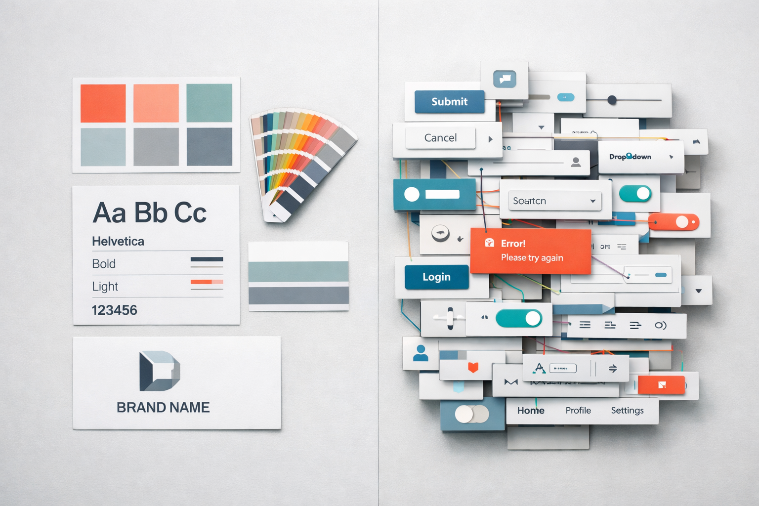
A style guide tells you what your brand looks like. A design system tells you how your product works. The style guide is a document; the design system is an infrastructure. If you’re planning a website redesign or building a new digital product, confusing these two things will cost you months of rework and tens of thousands in wasted development time. We see this confusion regularly across client projects, and it’s one of the most predictable sources of friction between marketing teams, designers, and developers.
The distinction matters because each solves a fundamentally different problem. A style guide addresses brand consistency: making sure your blue is the right blue, your logo has the right clearance space, and your headlines use the right typeface. A design system addresses product consistency and velocity: making sure a button behaves the same way everywhere, that form validation follows the same pattern across every page, and that a new feature can be built from existing components instead of starting from scratch. One is about appearance. The other is about behaviour, logic, and reuse.
What a Style Guide Actually Contains
A style guide, sometimes called a brand guide or brand book, is a reference document that defines the visual identity of your organisation. It typically covers:
- Logo usage, clearance zones, and acceptable variations
- Colour palettes with hex codes, RGB values, and Pantone references
- Typography choices including font families, weights, and sizing hierarchies
- Photography style, image treatment, and illustration guidelines
- Tone of voice and editorial guidelines
- Iconography style and usage rules
A good style guide is a PDF or a web page that a designer or marketing manager can open and immediately know how to represent the brand correctly. It’s static in nature. You update it when the brand evolves, which for most companies means every few years at most. Think of it as a rulebook for visual identity.
Where style guides fall short is at the boundary between design and interaction. A style guide will tell you that your primary button colour is #2563EB. It won’t tell you what happens when a user hovers over that button, what the loading state looks like, how the button scales on mobile, or how it behaves when placed inside a card component versus a full-width section. These are product decisions, and a style guide simply isn’t built to capture them.
What a Design System Actually Contains
A design system is a living collection of reusable components, patterns, standards, and documentation that enables teams to build consistent digital products at scale. It’s not a document you download and reference; it’s an actively maintained toolkit that designers and developers both draw from.
A mature design system typically includes several layers that work together:
Design Tokens
Design tokens are the atomic values that define the system: colours, spacing units, font sizes, border radii, shadow values, breakpoints, and animation timing. They’re named in a platform-agnostic way so that the same token can be used in a Figma file, a React codebase, or a native mobile app. Instead of hardcoding a colour as #2563EB in forty different places, every element references a token called something like color-primary-600. Change the token once, and it updates everywhere. This is the foundation that makes a design system scalable.
Component Library
This is where most people’s understanding of design systems begins and ends. The component library is a collection of UI building blocks: buttons, form inputs, modals, navigation bars, cards, tabs, accordions, and so on. Each component has defined properties (variants, sizes, states), clear documentation on when to use it, and coded implementations that match the design files pixel for pixel. The critical difference from a style guide is that these components are functional. They aren’t just pictures of what a button looks like; they’re working code that a developer drops into a page.
Pattern Library
Patterns sit above components. A pattern describes how components combine to solve a recurring user problem. For example, a “search with filters” pattern might combine a text input component, a dropdown component, a tag component, and a results list component into a prescribed layout with defined interaction rules. Patterns capture the logic of how things work together, not just how they look individually.
Documentation and Governance
A design system without documentation is just a messy Figma file. Proper documentation covers usage guidelines (when to use a modal versus inline expansion), accessibility requirements (minimum contrast ratios, keyboard navigation behaviour, ARIA labels), content guidelines for specific components, and contribution rules that define how new components get proposed, reviewed, and added. Governance is what separates a design system that stays useful from one that decays within six months.

Where the Confusion Causes Real Problems
The most common scenario we see is a company that has invested in a solid brand refresh, received a comprehensive style guide from their branding agency, and then handed it to a web team expecting it to serve as the foundation for their new website. It won’t. Not because the style guide is bad, but because it answers the wrong questions.
Here’s what happens in practice. The web designers interpret the style guide and create page mockups. They make dozens of micro-decisions about spacing, component behaviour, responsive layouts, and interaction patterns that the style guide never addressed. Different designers make different decisions. The developers then interpret the mockups and make their own micro-decisions about implementation. By the time the site launches, you have seven slightly different button styles, three inconsistent approaches to form validation, and a mobile experience that feels like it was designed by a different team. Because, in effect, it was.
This isn’t a failure of talent. It’s a failure of infrastructure. Without a design system defining the shared language between design and development, every handoff becomes an exercise in interpretation. And interpretation introduces drift.
The Cost of Not Having the Right Tool
We’ve audited websites where a 40-page site used 23 different font size combinations and 14 different shades of grey, none of which were in the brand palette. This isn’t unusual. It’s the natural consequence of building a website from a style guide alone. Each page was designed independently, each designer exercised reasonable judgement, and the cumulative effect was visual chaos.
The rework cost to fix this after launch is significant. You’re essentially retrofitting a design system onto an existing codebase, which typically takes 3-5 times longer than building with a system from the start. For a mid-market company running a site with 50-200 pages, we’ve seen this retrofitting process take 8-12 weeks of developer time. That’s time and budget that could have been avoided entirely.
When You Need a Style Guide, When You Need a Design System, and When You Need Both
Not every organisation needs a full design system. The right choice depends on your digital footprint, team size, and rate of change.
A style guide alone is sufficient if your website is relatively simple (under 20 pages), is maintained by a single designer or small team, changes infrequently, and doesn’t include complex interactive features. A brochure site for a professional services firm, for instance, can often get by with a solid style guide and a well-built WordPress theme.
A design system becomes necessary when multiple people are designing or building pages, when the site has interactive features like configurators, dashboards, or multi-step forms, when the product is evolving rapidly with frequent feature releases, or when consistency across multiple digital touchpoints (website, app, email, portal) is a priority. For most B2B companies with 20-500 employees, the trigger is usually a website redesign that will need to scale. If you’re planning to add pages, features, or integrations over the next 18 months, investing in a design system upfront will pay for itself within the first quarter of post-launch iteration.
Most mid-market companies need both. The style guide governs the brand across all channels, including print, events, and social media. The design system governs the digital product and inherits the brand values from the style guide while extending them into interactive, responsive, and coded specifications.
How a Design System Shapes the Prototyping Process
One of the most practical benefits of even a lightweight design system is how dramatically it accelerates prototyping. When our team builds interactive prototypes for clients, having a component library to work from means we can assemble realistic, testable page layouts in hours instead of days. Stakeholders see something that looks and feels like a real website, not a grey-boxed wireframe, and they can give feedback on structure, flow, and functionality with confidence.
Without a design system, prototyping becomes a slow, bespoke process. Every screen requires individual design decisions that should have been solved once at the system level. You end up debating button styles in a stakeholder review when you should be debating page hierarchy and user journeys. The design system handles the micro-decisions so that the prototype phase can focus on the macro-decisions that actually matter: does this page structure help the user accomplish their goal? Does this flow convert? Is this navigation intuitive?
This is why, in our projects, we often build a starter design system alongside the prototype rather than treating them as sequential phases. The prototype validates the structure and the system captures the decisions made during prototyping so they carry forward into development without degradation. If you’re interested in how this works in practice, our prototype-first guide walks through the full approach.

Building a Practical Design System for a Mid-Market Website
The phrase “design system” can sound intimidating. You might picture Google’s Material Design or Salesforce’s Lightning Design System, massive open-source projects maintained by dedicated teams of 20+ people. That’s not what you need. What works for a mid-market B2B company is something far more focused.
Start With What You Actually Use
Audit your current website and identify every distinct UI element. Group them into categories: typography, colour, buttons, form elements, cards, navigation, layout patterns, and page templates. You’ll likely find that your entire site can be described by 30-50 components at most. Many of those will be simple (a heading, a paragraph, a link). The complex ones, the ones worth documenting carefully, are usually fewer than 15.
Define Tokens Before Components
Before you design a single button, lock down your spacing scale (we typically use a 4px or 8px base unit), your type scale (a set of font sizes that work harmoniously), your colour palette (with semantic names like “primary”, “secondary”, “success”, “warning”, “neutral” in a range of shades), and your breakpoints for responsive design. These tokens are the DNA of your system. Get them right and every component you build will feel cohesive automatically.
Document States, Not Just Appearances
This is where most lightweight design systems fail. They show what a button looks like in its default state but ignore hover, focus, active, disabled, and loading states. They show a form field but not the error state, the help text, or the character count. Every interactive component needs its full state map documented. If you skip this, developers will improvise, and you’ll be back to inconsistency within weeks.
Keep It in the Tools Your Team Actually Uses
If your designers work in Figma, the design system lives in Figma as a shared library. If your developers work in React, the coded components live in a shared package or directory. The system fails if it exists in a format nobody opens. We’ve seen beautifully documented design systems built in tools the team abandoned three months later. The best design system is the one your team will actually maintain.
Common Mistakes When Organisations Attempt This
Building the system in isolation from a real project. A design system built in a vacuum, without the pressure of real content, real user requirements, and real stakeholder feedback, tends to be over-engineered in some areas and incomplete in others. The most effective approach is to build the system while building the first product that uses it. The website redesign becomes the proving ground for the system.
Treating the design system as a one-time deliverable. A design system is not a project with a start and end date. It’s a product. It needs ongoing maintenance, a clear owner, and a process for updates. If nobody is responsible for the system after launch, it will decay. Components will be forked, new patterns will be invented ad hoc, and within a year you’ll be back where you started.
Over-engineering for flexibility you don’t need. We’ve seen teams spend weeks building a button component that supports 47 combinations of size, colour, icon position, and border style. When you audit actual usage, they use three variants. Build for what you need today with a clear path to extend later. A focused system that covers 90% of use cases is infinitely more valuable than an exhaustive system that’s too complex for anyone to use correctly.
Forgetting accessibility. Your design system is the single best place to encode accessibility standards. If your button component has proper focus styles, ARIA attributes, and colour contrast built in, every instance of that button across your entire site is accessible by default. If accessibility is treated as an afterthought applied page by page, it will be inconsistent at best and missing at worst. Build accessibility into the system layer, and it scales with zero additional effort per page.
The Relationship Between Style Guides and Design Systems in Practice
Think of the relationship as a hierarchy. The brand strategy defines who you are and what you stand for. The style guide translates that into visual rules. The design system translates those visual rules into interactive, coded, reusable building blocks. Each layer inherits from the one above it and adds specificity.
In practice, this means the style guide informs the design tokens in your system. Your brand’s primary colour becomes the color-primary token. Your brand typeface becomes the font-family-heading token. But the design system extends far beyond what the style guide covers. It defines spacing, responsive behaviour, component composition, interaction patterns, animation standards, and accessibility requirements. None of these belong in a style guide because they’re digital-product concerns, not brand-identity concerns.
When both exist and are properly connected, something powerful happens. A designer can create a new page layout by assembling existing components, confident that everything aligns with both the brand and the product standards. A developer can build that page by importing existing coded components, confident that the implementation matches the design. A content editor can add a new section to a page using pre-defined patterns, confident that it will look professional without any design intervention. This is the operational efficiency that a design system delivers, and no style guide, however comprehensive, can replicate it.
What To Do From Here
If you’re about to start a website redesign or a new digital product, have the conversation early about which of these you have, which you need, and where the gaps are. Pull your existing style guide off the shelf and ask honestly: does this tell our web team how to build a consistent, interactive product, or does it just tell them what colour the logo is? If it’s the latter, you need a design system, even a lightweight one.
Start simple. Define your tokens. Document your most-used components with all their states. Put it in the tools your team already works with. Build it alongside your first real project so it’s tested against reality rather than theory. Assign an owner. Review it quarterly. A small, well-maintained design system will outperform an ambitious one that nobody updates every single time. The goal isn’t to build something impressive; it’s to build something your team reaches for every day because it makes their work faster, more consistent, and less stressful.


