The Short Answer
A clickable prototype is a working model of a website or digital product that looks and behaves like the real thing, but isn’t built with production code. You can tap buttons, navigate between pages, fill in forms, and experience the flow of a product before a single line of front-end or back-end code has been written. It’s the difference between pointing at a static screenshot and saying “imagine this works” versus actually using something that works.
For business decision-makers, a clickable prototype is the single most effective tool for answering the question: “Is this what we actually want?” before committing the budget to build it. In our projects, we’ve seen clickable prototypes catch fundamental navigation problems, misunderstood user journeys, and misaligned stakeholder assumptions weeks before they would have become expensive rework in development.
How a Clickable Prototype Differs from Other Deliverables
The terminology around prototypes, wireframes, and mockups gets muddled constantly. People use the words interchangeably, and it causes real confusion when teams are trying to agree on what they’re actually building. Here’s how a clickable prototype fits into the landscape of design deliverables.
A wireframe is a static, low-fidelity layout. Think of it as the blueprint of a single page. It shows where elements sit (navigation bar here, hero section there, form below the fold) but it doesn’t move, respond to clicks, or connect to other pages. Wireframes are useful for early-stage thinking, but they leave a lot to the imagination.
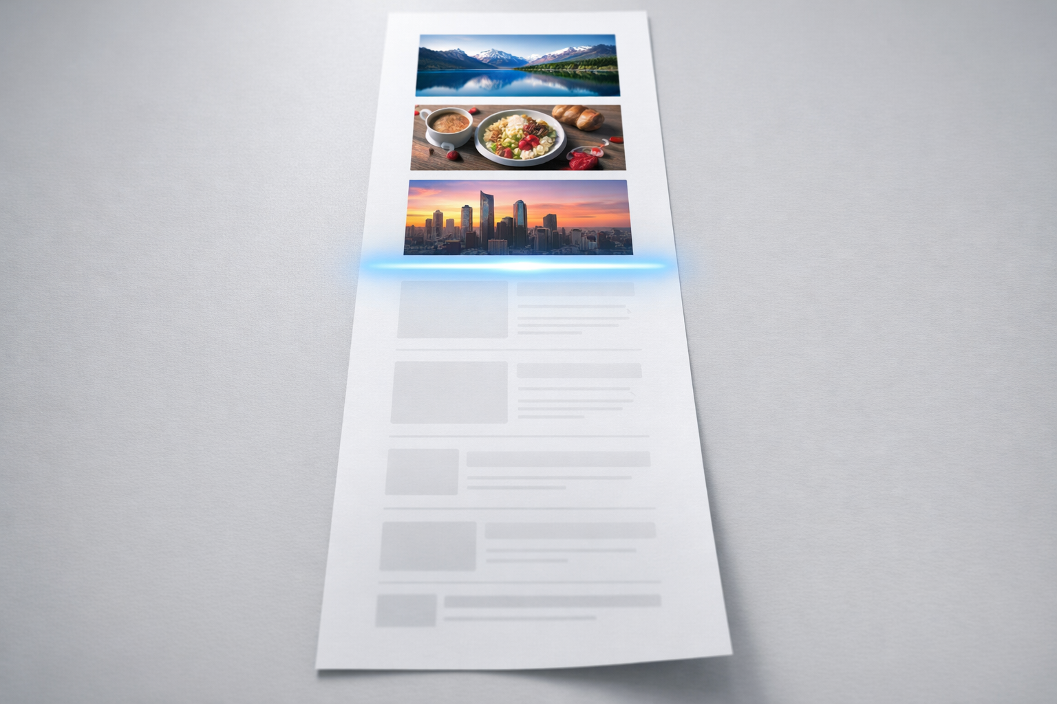
A mockup is a static, high-fidelity visual design. It looks like the final product, complete with brand colours, typography, imagery, and pixel-perfect spacing. But it’s still a picture. You can’t click it. You can’t experience how it feels to move through it.
A clickable prototype connects those static screens with interactive behaviour. Links work. Buttons trigger transitions. Dropdown menus open. Pages scroll. You experience the product as a user would, not as a designer describes it. The fidelity can range from rough wireframe-level screens linked together (sometimes called a low-fidelity clickable prototype) all the way up to something that’s visually indistinguishable from the finished site.
The critical distinction is interaction. If you can’t click through it and experience the journey, it’s not a prototype. It’s a picture.
Where Does a Coded Prototype Fit?
Some teams build prototypes in actual HTML and CSS rather than design tools. These coded prototypes are still prototypes because they’re not production-ready; they’re built quickly, without proper infrastructure, databases, or scalable architecture. They exist to test and validate, not to ship. In our experience, a coded prototype makes sense when the interaction you need to test is complex enough that design tools can’t simulate it convincingly, such as real-time filtering on a product listing page or a multi-step configuration tool.
What a Clickable Prototype Actually Contains
A well-built clickable prototype typically includes several layers of detail working together. Understanding what goes into one helps you evaluate whether what you’re being shown in a project is genuinely useful or just decorative.
Screen layouts form the foundation. Every key page or screen in the user journey is designed and placed into the prototype. For a B2B website redesign, this usually means the homepage, two or three service or product pages, a pricing or comparison page, a contact or enquiry flow, and perhaps a resource or blog listing page. You don’t need to prototype every page on the site. You need to prototype the pages that matter most to your conversion goals and your users’ decision-making process.
Navigation and linking connect those screens into realistic paths. The main menu works. Footer links connect where they should. Call-to-action buttons take you to the right destination. Breadcrumbs reflect where you are. This is where a clickable prototype starts revealing problems that static designs hide. A button labelled “Get Started” might seem perfectly clear on a mockup, but when you click it and land on a generic contact form with no context, you immediately feel the disconnect.
Micro-interactions and transitions add the layer of realism that makes stakeholder review sessions genuinely productive. Hover states on buttons, dropdown menus animating open, modal windows appearing for confirmation steps, accordion panels expanding on FAQ pages. These small behaviours shape how a site feels to use, and they’re almost impossible to evaluate from a flat design file.
Responsive behaviour is increasingly important to include. A prototype that only works at desktop width is only telling half the story, especially when 50-70% of your traffic is likely coming from mobile devices. The best clickable prototypes we build include at least desktop and mobile breakpoints so stakeholders can evaluate the experience on both.

Why Clickable Prototypes Save Money (Not Just Time)
The financial argument for clickable prototypes is straightforward, but it’s worth spelling out with specifics because the numbers are significant.
A typical mid-market website redesign involves four to eight weeks of design, eight to sixteen weeks of development, and several rounds of stakeholder review scattered throughout. When problems are discovered during development, fixing them is five to ten times more expensive than fixing them during design. When problems are discovered after launch, the cost multiplies again because you’re paying for developer time, QA, redeployment, and the opportunity cost of a suboptimal site sitting live.
A clickable prototype moves the discovery of problems forward to the cheapest possible moment. We’ve had clients catch issues during prototype testing that would have taken weeks to resolve in development. One recurring example: a B2B SaaS company approved a static homepage design that everyone loved visually. When we prototyped it and linked the full navigation together, the leadership team realised their product had six distinct audience segments, but the homepage journey only served two of them clearly. That insight took thirty minutes to surface in a prototype review session. Redesigning the navigation architecture at that stage took three days. If that same problem had been caught mid-development, the team estimated it would have cost them three to four weeks of rework across design and development.
The typical savings we see across client projects are three to six weeks of avoided rework and a significantly smoother development handoff, because the developers are building to a specification that’s already been tested and validated by real users and real stakeholders.
How Clickable Prototypes Align Stakeholders
If you’ve ever been in a website project where the CEO, the marketing director, and the head of product all had different mental models of what was being built, you already know why prototypes matter for alignment.
Static documents and slide decks are inherently ambiguous. When someone reads “the user clicks through to the product detail page,” every person in the room imagines something slightly different. They imagine a different layout, a different amount of content, a different path to get there. Everybody nods in agreement during the meeting because they’re each agreeing with the version in their own head.
A clickable prototype eliminates that ambiguity. When stakeholders sit down with something they can click through on their own laptop or phone, the conversation shifts from abstract preferences (“I think we need a cleaner look”) to specific, actionable feedback (“When I click this CTA, I expect to see our pricing options, not a generic contact form”). That shift in feedback quality is enormous. It turns unproductive review meetings into focused decision-making sessions.
For more detail on how this approach prevents misalignment from derailing projects, take a look at our prototype-first guide, which walks through the full methodology we use to get senior stakeholders aligned before design and development budgets are committed.
When You Need a Clickable Prototype (And When You Don’t)
Not every project requires a clickable prototype, though most benefit from one. Here’s how to think about when the investment pays off and when a simpler deliverable is enough.
You almost certainly need a clickable prototype when:
- Multiple stakeholders need to approve the direction, and they have different priorities or mental models of the project.
- The website has complex navigation, multiple audience segments, or non-linear user journeys (e.g., a product configurator, a gated resource library, a multi-step enquiry process).
- You’re redesigning an existing site and need to validate that the new structure improves on known usability problems.
- The development budget is significant enough that catching mistakes early saves meaningful money.
- You plan to run user testing before committing to the final build.
A clickable prototype might be overkill when:
- The project is a simple brochure site with five or fewer pages and a single decision-maker.
- You’re making incremental updates to an existing site rather than a structural redesign.
- The team has worked together on multiple similar projects and shares a strong mental model of the output.
Even in simpler cases, a lightweight clickable prototype (wireframe-level screens linked together in Figma) can be produced in a day or two and still catches issues that static deliverables miss. The cost-benefit ratio is almost always favourable.
Tools Used to Build Clickable Prototypes
The tooling landscape has matured significantly over the past few years. The good news is that you don’t need to understand the tools deeply as a business decision-maker. You do, however, need to know enough to evaluate what your team or consultancy is proposing.
Figma is the dominant tool for clickable prototypes in 2024 and beyond. It’s browser-based, so stakeholders can view and comment on prototypes without installing anything. Its prototyping features handle page transitions, hover states, overlays, scrolling regions, and component-level interactions. For the vast majority of website prototypes, Figma handles everything needed. Our team uses Figma as the primary prototyping tool across nearly all client projects because the collaboration features make stakeholder review frictionless.
Axure RP remains the go-to for highly complex, logic-driven prototypes. If you need conditional interactions (e.g., “if the user selects Option A, show Panel X; if they select Option B, show Panel Y”), Axure handles this better than any design tool. It’s less visually refined than Figma, and the learning curve is steeper, but for enterprise products with complex form logic or multi-branch user journeys, it’s hard to beat.
Framer sits in an interesting middle ground. It produces prototypes that can actually be published as live websites, blurring the line between prototype and production. For marketing sites where the interactions are primarily scroll-based animations and page transitions, Framer can take you from prototype to live site in one step. The trade-off is that it’s less suitable for complex web applications or sites that need a traditional CMS.
Adobe XD still exists but has seen declining adoption since Adobe shifted its focus. If your team is already embedded in the Adobe ecosystem, it works. But for new projects, Figma offers a more capable and future-proof option.

What to Look for When Reviewing a Clickable Prototype
If you’re the stakeholder reviewing a clickable prototype rather than the person building it, knowing what to focus on makes your feedback dramatically more useful. Too many review sessions devolve into colour preference debates when the real value of a prototype is in validating structure, flow, and functionality.
Focus on the Journey, Not the Pixels
Start by using the prototype the way a real visitor would. Don’t start by inspecting the homepage. Start by asking yourself: “I’m a potential customer. I’ve landed on this site from a Google search. Can I find what I need?” Click through as that person would. Note where you get stuck, confused, or frustrated. That’s the most valuable feedback you can give.
Test Your Assumptions
Every website project carries assumptions about user behaviour. “People will click the pricing link first.” “Users will understand that our three service tiers map to company size.” “The case studies section will build enough trust to drive enquiry form submissions.” A clickable prototype lets you test those assumptions before they’re baked into code. As you review, actively try to break your own assumptions. Click the paths you think nobody will take. Try to complete a task using a non-obvious route. The prototype should handle those paths gracefully.
Check the Content Hierarchy
One of the most common issues we see in prototype reviews is that the visual hierarchy doesn’t match the business priority. The thing you most want users to do (request a demo, compare plans, download a resource) should be the most prominent element on the page and the easiest path to follow. If you find yourself hunting for the primary action, the hierarchy needs reworking.
Evaluate Mobile Separately
Don’t just shrink the browser window and squint. If the prototype includes a mobile version, review it on an actual phone. The experience of tapping targets with your thumb on a 6-inch screen is fundamentally different from clicking with a mouse on a 27-inch monitor. Navigation patterns that work beautifully on desktop can become frustrating on mobile. Mega menus, hover-triggered dropdowns, and wide comparison tables all need different solutions at smaller screen sizes.
Common Mistakes Teams Make with Clickable Prototypes
Even teams that commit to building a clickable prototype can undermine its value through a few predictable mistakes.
Over-investing in visual polish too early. A prototype’s primary job is to validate structure, navigation, and user flow. If the team spends three weeks making the prototype look pixel-perfect before anyone has tested the journey, they’ve defeated the purpose. We typically recommend starting with a mid-fidelity prototype: enough visual detail to feel realistic, but rough enough that nobody confuses it with the final design. This keeps the focus on interaction quality rather than colour choices.
Prototyping every page instead of every journey. You don’t need fifty screens in a prototype. You need the five to eight screens that represent your core user journeys, fully linked and interactive. A prototype with twelve well-connected screens that cover the three most important conversion paths is far more valuable than forty disconnected page designs.
Skipping user testing. A clickable prototype is the perfect artefact for moderated usability testing. You sit someone from your target audience in front of it, give them a task (“Find the pricing for our enterprise plan and request a demo”), and watch what happens. Five users will surface 80% of major usability issues. If you build a prototype and only show it to internal stakeholders, you’re getting alignment but missing validation. Both matter.
Treating the prototype as the final specification. A prototype demonstrates intent, not implementation detail. It shows what the experience should feel like, not how the database should be structured or how the API should handle form submissions. Development teams still need technical specifications, content matrices, and functional requirements alongside the prototype. The prototype is the anchor point for those documents, not a replacement for them.
From Prototype to Production: What Happens Next
Once a clickable prototype has been reviewed, tested, and refined, it becomes the single source of truth for the design and development phases that follow. Here’s what a healthy handoff looks like.
The design team takes the validated prototype and produces final visual designs with full brand treatment, finalised typography, real imagery, and production-ready component specifications. Because the structure and interactions have already been validated, the design phase is faster and produces far fewer surprises. Designers aren’t solving structural problems and visual problems simultaneously; the structural questions have already been answered.
The development team receives both the visual designs and the prototype. The prototype gives developers something they can interact with to understand intended behaviour, rather than relying on annotated screenshots and written specifications alone. Transitions, hover states, loading sequences, and responsive behaviour are all visible in the prototype. This typically reduces the number of “is this how it’s supposed to work?” questions by half or more.
QA and testing teams use the prototype as a behavioural benchmark. When testing the built site, they can compare actual behaviour against prototype behaviour and flag discrepancies. This is far more effective than testing against a written specification document, because the prototype captures nuances that written specs inevitably miss.
Putting This into Practice
A clickable prototype is not a luxury deliverable for big-budget projects. It’s a practical risk-reduction tool that pays for itself on virtually any website project with meaningful complexity or multiple stakeholders. If you’re planning a redesign, a new build, or a digital product, building a clickable prototype before committing to full development is the simplest way to ensure that what gets built is what you actually need. Start by identifying your three most important user journeys, prototype those journeys at mid-fidelity, test them with real users and internal stakeholders, and then move into visual design and development with the confidence that comes from having already validated the foundation.