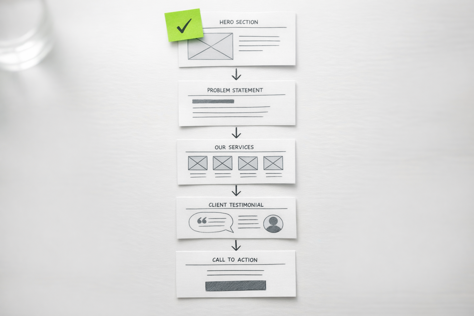
The Page Most Companies Get Wrong
A high-converting services page does three things in sequence: it names the problem the visitor is trying to solve, presents your service as a credible path to solving it, and gives them a clear, low-friction way to take the next step. Most services pages fail because they reverse this order, leading with what the company does rather than what the visitor needs. The result is a page that reads like an internal capabilities document instead of a persuasive business case.
In our projects at NexusBond, the services page is consistently one of the highest-traffic, highest-exit pages we audit. Visitors arrive with intent. They already know they have a problem; they want to know whether you understand it and can fix it. When the page dumps a list of deliverables on them instead of demonstrating understanding, they leave. Structuring this page well typically improves conversion rates by 40-80% without changing the underlying service offering at all.
This article walks through the specific structure, section by section, that we use and recommend to clients. It covers what goes where, why each section exists, and the common mistakes that quietly kill performance.
Start With the Visitor’s Problem, Not Your Service Name
The first screen of your services page, what’s visible before anyone scrolls, determines whether the visitor stays or bounces. You have roughly five seconds. The instinct for most companies is to put their service name in a large heading and follow it with a paragraph about their approach. This is backwards.
Your hero section should articulate the problem or desired outcome that brought the visitor to this page. If you offer supply chain consulting, the heading shouldn’t be “Supply Chain Consulting.” It should be something like “Stop Losing Margin to Inventory Waste and Fulfilment Delays.” The visitor should feel recognised. They should think: “Yes, that’s exactly what’s happening to us.”
Below the heading, include a single subheading of one to two sentences that bridges from the problem to your service. This is where you name what you do, but only in the context of solving what they care about. Something like: “We help mid-market manufacturers redesign their supply chain operations to cut waste by 15-30% within 12 months.” That sentence does a lot of work. It names the audience, the service, the outcome, and a timeframe.
The hero section should also include a primary call to action and, ideally, a piece of supporting proof. A single line like “Trusted by 40+ manufacturers across the UK” or a recognisable client logo bar gives the visitor just enough confidence to keep scrolling rather than clicking back.
The Problem Narrative Section
Immediately below the hero, dedicate a section to expanding on the problem your service addresses. This is the section most companies skip entirely, and it’s the one that does the heaviest conversion lifting.
Think of it as a mirror. You’re describing the visitor’s current situation back to them in enough detail that they feel understood. This isn’t about being negative or fear-mongering. It’s about demonstrating that you’ve worked with companies like theirs before and you know what the symptoms look like.
A good problem narrative section might include three to four specific pain points described in the visitor’s language, not your internal terminology. If you’re selling website redesign services, you wouldn’t write “suboptimal information architecture.” You’d write “visitors can’t find what they’re looking for, so they call your sales team with basic questions instead of requesting a quote.” The more concrete and situational you make these, the more the visitor trusts that you actually understand their world.
What we’ve found in our work at NexusBond is that this section is where content specificity separates high-performing pages from mediocre ones. Generic problem statements like “struggling to grow?” do nothing. Specific ones like “your sales team is spending 30% of their time answering questions that your website should handle” make people lean forward.

How You Solve It: Structuring Your Service Description
Now the visitor knows you understand their problem. This is where you explain your approach. The mistake here is dumping everything you do into a long block of text or, worse, a sprawling bullet list of 20 deliverables. Neither format helps the visitor evaluate whether your service is right for them.
Use a Phased or Step-Based Framework
The most effective format we’ve seen for mid-market B2B services is a three to five step process overview. This doesn’t need to be your literal project plan. It’s a simplified narrative that shows the visitor what working with you looks like from start to finish. Each step should have a short name, a two to three sentence description, and ideally a note about what the client gets or experiences at that stage.
For example, a managed IT services company might structure this as:
- Audit: We assess your current infrastructure, identify vulnerabilities, and benchmark your setup against industry standards.
- Plan: We design a migration and improvement roadmap with clear priorities, timelines, and budget expectations.
- Implement: Our team handles the technical migration with minimal disruption to your daily operations.
- Support: Ongoing monitoring, maintenance, and a dedicated account manager who knows your environment.
This format works because it reduces perceived risk. The visitor can see that there’s a structured approach, that you’ve done this before, and that they won’t be left figuring things out on their own. It also helps them imagine themselves in the process, which is a crucial psychological step toward conversion.
Distinguish Between Service Tiers or Variants
If you offer multiple service levels or distinct sub-services, present them as clearly differentiated options rather than blurring them together. A comparison table or a set of cards with clear labels (“Essentials,” “Growth,” “Enterprise,” for instance) lets visitors self-select quickly. Each option should name who it’s for, what’s included, and what outcome it delivers.
Avoid the temptation to make every option sound equally appealing. Guide the visitor toward the option that fits most of your ideal clients. Visually highlighting your recommended tier (often the middle one) reduces decision fatigue and increases the likelihood that the visitor takes action rather than deferring the decision.
Proof: The Section That Does the Actual Convincing
Everything above this point on the page has been your claim. The proof section is where you substantiate it. Without credible proof on your services page, your conversion rate will always underperform, regardless of how good the copy is.
There are several types of proof, and the strongest services pages use multiple types in combination.
Case Studies and Outcome Summaries
Case studies are the single most persuasive proof asset for B2B services. But they don’t need to be 2,000-word PDF downloads to work on a services page. What you need here is a brief outcome summary: the client’s starting situation, what you did, and the measurable result. Two to three of these, presented as compact cards or short paragraphs with a “Read the full case study” link, give the visitor enough evidence to believe your claims without requiring them to leave the page.
The key is specificity. “We helped a client improve their marketing” is worthless. “We restructured the content strategy for a 120-person SaaS company, reducing their sales cycle by 22 days and increasing qualified inbound leads by 35% in six months” is proof that makes people pick up the phone.
Testimonials That Reference Specific Outcomes
A testimonial that says “Great team, would recommend” adds almost nothing. A testimonial that says “They identified £180,000 in annual savings we didn’t know we were leaving on the table, and helped us capture it within the first quarter” adds a lot. When collecting testimonials, guide your clients toward specificity. Ask them what the situation was before, what changed, and what the impact was. Then use those quotes verbatim on your services page.
Place testimonials near the sections they support. A testimonial about your audit process works best near your process overview. One about results belongs near your case studies. Contextual placement outperforms a generic testimonial carousel at the bottom of the page every time.
Data Points and Trust Signals
Alongside narrative proof, include hard numbers that convey scale and reliability. These might include years in business, number of clients served, industry certifications, average client retention rate, or aggregate outcome metrics (“Our clients have saved a combined £12M in operational costs”). Present these as a simple stat bar or a set of highlighted figures. They work as a quick-scan trust layer for visitors who aren’t ready to read case studies yet.
For a deeper look at how to build and organise these proof assets systematically, especially if you’re in the middle of a website project, take a look at our content and proof systems guide, which covers the full methodology we use with clients.
Handling Objections Before They Become Exit Clicks
Every visitor on your services page has unspoken objections. Common ones include: “This is probably too expensive for us,” “This sounds good but I’m not sure it applies to our industry,” “We’ve tried something like this before and it didn’t work,” and “This seems like a big commitment.” If you don’t address these on the page, the visitor will leave with those doubts unresolved.
The most effective way to handle objections is through a well-crafted FAQ section placed after your proof. This isn’t a dumping ground for random questions. It’s a strategically selected set of four to eight questions that correspond to the real hesitations your sales team hears on calls.
Write the answers in a direct, confident tone that acknowledges the concern and resolves it. For a pricing objection, you might write: “Our engagements typically range from £15,000 to £50,000 depending on scope. We structure every project with a defined discovery phase so you know the full investment before committing. Most of our clients see a positive return within the first three to six months.” That answer does three things: it gives a range, it reduces risk by mentioning discovery, and it reframes cost as investment.
If your service requires a significant commitment, consider adding a short “Is this right for you?” section that lists the characteristics of companies that get the best results from your service. This qualifies visitors in a way that actually increases conversions. People who see themselves reflected in your ideal client description feel more confident reaching out, while those who don’t self-select out, saving your sales team time.

The Call to Action: Make It Specific and Low-Friction
Your services page should have multiple calls to action, but they should all point in the same direction. Having one CTA that says “Book a Call,” another that says “Download Our Guide,” and a third that says “Request a Quote” splits the visitor’s attention and reduces the chance they take any action at all.
Pick one primary action. For most B2B services, this is a consultation, assessment, or discovery call. Name it something specific to your process rather than something generic. “Book your free infrastructure assessment” converts better than “Contact us” because it tells the visitor exactly what they’ll get and implies there’s a structured process behind it.
Place your primary CTA in at least three locations on the page: in the hero section, after your process overview, and at the bottom after the FAQ. Each instance can use slightly different supporting text that relates to the section it follows. The hero CTA might say “See how we can help.” The post-process CTA might say “Ready to start with a discovery session?” The final CTA might be “Still have questions? Let’s talk through your specific situation.”
One practical tip: include a secondary, lower-commitment option for visitors who aren’t ready to speak with someone. This could be a short self-assessment tool, a relevant downloadable resource, or even just a clear email address. Some percentage of your visitors are in research mode, and giving them a path to stay engaged without committing to a call keeps them in your pipeline rather than losing them entirely.
Layout and Visual Hierarchy Decisions That Matter
Structure and copy do most of the conversion work, but layout choices can amplify or undermine them. A few practical principles that we consistently see making a difference:
Visual hierarchy should match the reading sequence. The visitor’s eye should flow naturally from problem to solution to proof to action. If your proof section is visually louder than your problem narrative (larger images, bolder colours), visitors may skip ahead without building the necessary context, which weakens the persuasive sequence.
White space is a conversion tool, not wasted space. Dense, text-heavy services pages feel overwhelming and signal complexity. Generous spacing between sections gives each argument room to breathe and makes the page feel more considered and professional. This is especially true on mobile, where cramped layouts are the primary reason for early exits.
Use imagery that demonstrates, not decorates. Stock photos of handshakes and smiling teams add nothing. Screenshots of your work, photos of your actual team in client settings, diagrams of your process, or before-and-after comparisons all reinforce your message. Every image on the page should answer the question: “Does this help the visitor understand or believe what we’re saying?”
If your service has a visual output (design work, software interfaces, physical installations), include real examples. Nothing builds confidence like seeing the actual quality of what you deliver. If your service is more abstract (consulting, strategy, training), use diagrams, frameworks, or data visualisations that represent your methodology.
Common Structural Mistakes to Avoid
Even with the right sections in place, several recurring mistakes can quietly kill a services page’s performance.
Trying to serve every audience on one page. If you sell to both mid-market companies and enterprise organisations, or to multiple distinct industries, one services page cannot effectively speak to all of them. The problem narratives are different, the proof needs to be different, and the objections are different. Consider whether you need audience-specific or industry-specific landing pages that branch off from a central services overview.
Burying the outcome under the methodology. Some companies, especially those with sophisticated or proprietary approaches, spend so much space explaining how they work that they forget to make clear what the client actually gets. Visitors care about outcomes first, process second. Lead with results and let the methodology serve as supporting evidence of your rigour.
Writing for internal stakeholders instead of buyers. Services pages frequently go through internal review cycles where technical team members add jargon, compliance teams add caveats, and leadership adds aspirational language that doesn’t mean anything to a prospect. The test for every sentence is simple: would a prospective client who has never heard of your company understand this and find it useful? If not, rewrite it.
Neglecting the page after launch. Your services page should evolve as you gather new case studies, refine your messaging based on sales conversations, and learn what questions prospects actually ask. We recommend to our clients that they review and update their services page quarterly, treating it as a living sales asset rather than a static brochure page.
Putting This Into Practice
If you’re building or rebuilding a services page, start by mapping out the seven core sections covered in this article: hero with problem-focused headline, problem narrative, service description with process steps, proof assets, objection-handling FAQ, clear CTAs, and supporting visuals. Draft the content for each section separately, then assemble them in sequence.
Before you write a single word of copy, talk to your sales team. Ask them what questions prospects ask most often, what objections come up repeatedly, and what specific outcomes close deals. That conversation will give you 80% of the raw material you need for a services page that actually converts. The remaining 20% comes from reviewing your analytics to understand where visitors currently drop off and testing different approaches to those weak points over time.
A well-structured services page isn’t a one-time project. It’s a continuously refined sales tool that should reflect your best current understanding of what your clients need to hear, believe, and feel before they’re ready to start a conversation.