
The Short Answer: Format, Size, and Delivery
You optimise images by doing three things well: converting to modern formats like WebP or AVIF, resizing to the exact dimensions your layout needs, and delivering them intelligently using responsive markup and lazy loading. Done properly, you can reduce image file sizes by 60-80% with no perceptible loss in visual quality. The trick is understanding which techniques preserve quality and which ones quietly destroy it.
Images are typically the heaviest assets on any website. On the mid-market B2B sites we work on at NexusBond, images account for 40-70% of total page weight before optimisation. That means a 4MB page often carries 2-3MB of images that could be 400-600KB without anyone noticing the difference. The performance impact is enormous: faster Largest Contentful Paint scores, better Core Web Vitals, lower bounce rates, and improved search rankings. But the reason most teams haven’t done this well isn’t laziness. It’s that the process feels risky. Nobody wants to make their site look cheap. So let’s walk through exactly how to compress, resize, and serve images without degrading what your visitors actually see.
Why Most Website Images Are Dramatically Oversized
Before getting into the how, it helps to understand why the problem exists in the first place. The typical workflow goes something like this: a marketing team member downloads a photo from a stock library or receives one from a photographer. That image is 5000 x 3500 pixels, saved as a high-quality JPEG at 4-8MB. They upload it to the CMS. The CMS might generate a few thumbnail sizes, but the original stays on the server, and depending on how the theme or page builder works, the full-size original gets served to visitors on laptops and phones alike.
The core issue is that the image was prepared for print or maximum flexibility, not for screen display. A typical desktop browser window is roughly 1440 pixels wide. A hero image spanning the full width needs, at most, about 1600-1800 pixels wide to look sharp on a high-density Retina display. Serving a 5000-pixel-wide image for that slot wastes bandwidth on pixels the browser immediately discards. Multiply that by every image on the page and you’ve got a serious performance problem that has nothing to do with your hosting or code quality.
The second issue is format. JPEG was designed in 1992. PNG, while excellent for graphics with transparency, produces enormous files for photographs. Both formats are still widely used by default, even though modern alternatives deliver the same visual result at a fraction of the file size.
Choosing the Right Image Format
Format selection is the single biggest lever you have for reducing file size without touching visual quality. The difference between a well-compressed JPEG and the same image in WebP or AVIF can be 25-50% in file size, with identical perceptual quality.
WebP: The Practical Default
WebP is the format we recommend as the default for most website images. Developed by Google, it supports both lossy and lossless compression, handles transparency (replacing PNG in many cases), and even supports animation (replacing GIF). Browser support is now effectively universal: Chrome, Firefox, Safari, Edge, and all modern mobile browsers handle WebP natively. The only holdouts are very old browser versions that represent a negligible share of traffic for most B2B sites.
In practical terms, converting a 300KB JPEG to WebP at equivalent visual quality typically produces a file between 150-200KB. For photographs, that’s significant. For pages with ten or more images, it’s transformative.
AVIF: The Next Step
AVIF offers even better compression than WebP, often delivering files 30-50% smaller than WebP at the same quality level. It’s based on the AV1 video codec and excels particularly with photographs and complex imagery. The catch is that browser support, while growing rapidly, isn’t quite universal yet. Safari added support in version 16.4, and older versions won’t render AVIF images at all.
The solution is straightforward: use AVIF as your primary format with WebP as a fallback and JPEG as a final safety net. HTML’s picture element makes this trivially easy, and we’ll cover the exact markup shortly.
When to Use PNG, SVG, or JPEG
PNG still has a role for simple graphics, icons, and screenshots where you need pixel-perfect lossless rendering with transparency. But for photographs, it’s almost never the right choice. A photograph saved as PNG can easily be 5-10x larger than the same image in WebP.
SVG is ideal for logos, icons, and simple illustrations. Because it’s a vector format, SVGs scale to any size without quality loss and typically weigh just 1-5KB. If you’re serving a logo as a PNG or JPEG, switching to SVG is an immediate win for both quality and performance.
JPEG remains a reasonable fallback format for photographs when modern format support isn’t available. At quality level 80-85 in most compression tools, JPEG delivers good visual results. Below 75, you start to see compression artefacts, particularly around text, sharp edges, and areas of high contrast.

Compression: Finding the Quality Threshold
This is where most people get nervous, and understandably so. Lossy compression discards data that cannot be recovered. Compress too aggressively and you get visible artefacts: blocky gradients, smeared details, halos around text. But the reality is that modern compression algorithms are remarkably good at identifying which data humans won’t miss.
The key concept is the perceptual quality threshold. For most photographic images displayed on screens, there’s a quality setting below which you can see degradation, and above which the image looks identical to the original. That threshold varies by format:
- JPEG: Quality 80-85 is the sweet spot for most photographs. Quality 90+ adds significant file size with no visible benefit on screen.
- WebP: Quality 75-82 typically matches JPEG quality 85 at a smaller file size.
- AVIF: Quality 60-70 often matches or exceeds what JPEG delivers at 85.
These numbers aren’t absolute. An image with large areas of smooth gradient (a sky, a product shot with a clean background) will show compression artefacts sooner than a busy, detailed photograph. The only reliable method is to compare the compressed output against the original at the actual display size, not zoomed in to 300%. Your visitors will never view images zoomed in pixel-by-pixel. They’ll see them at the size your layout renders them, often on a phone screen. At that scale, the difference between quality 80 and quality 95 is invisible, but the file size difference can be 3-4x.
Lossless Optimisation: Free File Size Reduction
Before you even touch quality settings, lossless optimisation can strip unnecessary metadata from image files without altering a single pixel. Photographs from cameras and stock libraries carry EXIF data (camera settings, GPS coordinates, colour profiles, thumbnail previews) that adds 50-200KB per file. Stripping this data is completely safe and entirely free in terms of quality impact.
Tools like Squoosh (Google’s open-source image compression app), ImageOptim (macOS), and Sharp (a Node.js library our team uses in build pipelines) all handle metadata stripping as part of their default workflow. If you do nothing else, running every image through a lossless optimisation pass before upload will trim 10-20% from file sizes across your site.
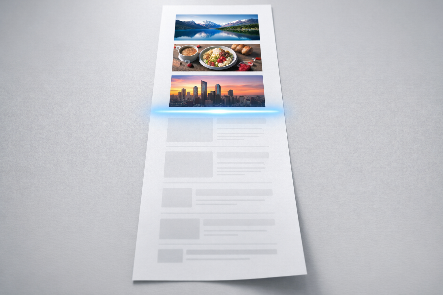
Resizing Images to Match Your Layout
Compression gets the headlines, but serving correctly sized images is often where the biggest gains hide. A 4000-pixel-wide image displayed at 800 pixels wide in the browser is transmitting roughly 25 times more pixels than needed (since area scales quadratically). No amount of format conversion or compression makes up for that kind of waste.
The process starts with understanding what sizes your layout actually requires. Audit your key page templates and note the maximum rendered width of each image slot. A blog post featured image might display at 720 pixels wide on desktop and 360 pixels on mobile. A team headshot might never exceed 300 pixels. A hero banner might span the full viewport at up to 1440 pixels.
For each slot, you want to generate images at 1x and 2x the display size. The 2x version serves high-density (Retina) screens, which have become the norm on laptops and phones. So a 720-pixel display slot needs a 720px image for standard screens and a 1440px image for Retina displays. That 1440px version is dramatically smaller than the original 4000px upload, and it will look perfectly sharp on every screen your visitors use.
Responsive Images with srcset
HTML gives you a built-in mechanism for serving different image sizes to different devices. The srcset attribute lets you list multiple versions of an image with their widths, and the browser automatically selects the most appropriate one based on the visitor’s screen size and pixel density.
A practical implementation looks like this: you generate three or four sizes of each image (say 400px, 800px, 1200px, and 1600px wide), convert each to WebP, and reference them all in a single img tag with srcset. The browser picks the smallest version that still looks sharp at the current viewport width. A visitor on a phone gets the 400px version. A visitor on a large desktop monitor gets the 1200px or 1600px version. Nobody downloads pixels they don’t need.
For even more control, the picture element lets you combine format negotiation with responsive sizing. You can serve AVIF to browsers that support it, WebP to those that don’t, and JPEG as a final fallback, all while providing multiple sizes of each format. It sounds complex, but modern CMS platforms and build tools can automate the markup generation entirely.
Lazy Loading and Delivery Optimisation
Once your images are properly formatted and sized, how and when they’re delivered matters just as much. Lazy loading defers the download of images that aren’t visible in the initial viewport until the visitor scrolls toward them. This directly improves Largest Contentful Paint and reduces the amount of data transferred on initial page load.
Native lazy loading is now supported in all major browsers. Adding loading="lazy" to your img tags is the simplest implementation, and it works well for the majority of cases. The critical nuance is that you should not lazy load images that appear in the initial viewport, particularly your hero image or above-the-fold content images. Lazy loading these will actually hurt your LCP score because the browser waits for a scroll event that never comes before it starts fetching the most important visual element on the page.
What we typically recommend at NexusBond is a clear split: eagerly load the first one or two images (hero, primary product shot, above-the-fold feature graphic) and lazy load everything else. For the eagerly loaded images, consider adding a fetchpriority=”high” attribute to signal to the browser that this image is critical and should be fetched early in the loading sequence.
Content Delivery Networks and Image CDNs
A CDN serves your images from edge servers geographically close to each visitor, reducing latency. If your hosting is in London and a visitor is in Sydney, serving images through a CDN can cut hundreds of milliseconds off load times. Most quality hosting providers include CDN integration, and standalone CDN services are straightforward to configure.
A step beyond general CDNs are image CDNs like Cloudflare Image Resizing, Imgix, or Cloudinary. These services transform images on the fly: you request a specific size, format, and quality via URL parameters, and the CDN generates, caches, and serves the optimised version. This approach eliminates the need to pre-generate multiple sizes locally. It’s particularly powerful for sites with large image libraries or frequently changing content, where managing multiple pre-generated versions becomes impractical.
The trade-off is cost and dependency. Image CDN pricing is typically based on transformations or bandwidth, and you’re adding a third-party service to your critical rendering path. For sites with a manageable number of images, pre-generating optimised versions during the build or upload process is often simpler and more cost-effective.

Integrating Image Optimisation Into Your Workflow
The techniques above work brilliantly in isolation. The challenge is making them stick as ongoing practice, not a one-time cleanup. We’ve seen plenty of sites where someone carefully optimised every image at launch, only for the marketing team to start uploading unoptimised 5MB stock photos three months later because the workflow didn’t account for ongoing content updates.
Build optimisation into the upload process, not after it. The most reliable approaches we’ve implemented on NexusBond projects fall into three categories:
- CMS-level automation: WordPress plugins like ShortPixel or Imagify can automatically compress and convert images on upload. This is the lowest-friction option for marketing teams who manage content daily. Configure them once with sensible quality settings and every future upload gets optimised without anyone thinking about it.
- Build pipeline processing: For sites built with static site generators or custom frameworks, integrating Sharp or similar libraries into the build process means every image is optimised, resized, and converted to modern formats as part of deployment. This gives you maximum control and consistency.
- Image CDN integration: As mentioned above, this offloads the entire problem to a service that handles format negotiation, resizing, and compression automatically based on each visitor’s browser and device.
Whichever approach you choose, the important thing is that optimisation happens automatically. Relying on individual team members to remember to run images through a compression tool before uploading is a process that degrades within weeks. We cover the broader principle of building performance into your workflow rather than bolting it on afterward in our performance architecture guide, and image handling is one of the clearest examples of why that approach matters.
Measuring the Impact
After implementing image optimisation, you need to verify it’s actually working. The most practical tools for this are Google PageSpeed Insights and Chrome DevTools.
PageSpeed Insights will flag specific issues: images that could be served in next-gen formats, images that aren’t appropriately sized, and offscreen images that aren’t being lazy loaded. It quantifies the potential savings in kilobytes and estimated time improvement, which makes it easy to prioritise which images to address first.
In Chrome DevTools, the Network tab filtered to images gives you a clear picture of what’s being transferred. Sort by size to find the heaviest offenders. Check the “Type” column to verify that WebP or AVIF is being served rather than JPEG or PNG. Compare the image’s intrinsic dimensions (the actual pixel dimensions of the file) against its rendered dimensions on the page. If an image is 3000px wide but rendering at 600px, you’ve found an easy win.
The metrics to watch are Largest Contentful Paint (LCP) and total page weight. LCP is directly affected by your hero or primary content image, and it’s a Core Web Vital that Google uses as a ranking signal. Total page weight affects overall load time and data usage, which matters particularly for mobile visitors. On a well-optimised mid-market B2B site, we typically see total image weight per page under 500KB, with LCP images under 150KB.
Common Mistakes That Silently Undo Your Work
Even teams that optimise images well can undermine their own efforts through a few common oversights.
Not specifying width and height attributes. When the browser doesn’t know an image’s dimensions before it loads, the layout shifts as images appear. This causes Cumulative Layout Shift (CLS), another Core Web Vital. Always include explicit width and height attributes on your img tags so the browser can reserve the correct space. This is separate from CSS sizing and doesn’t prevent responsive behaviour; it simply tells the browser the image’s aspect ratio.
Over-compressing logos and UI elements. While photographs tolerate aggressive lossy compression well, images with sharp edges, text, or flat colours show artefacts much sooner. Logos, screenshots, and diagrams often look better as lossless WebP or SVG rather than lossy JPEG or lossy WebP. Apply different compression strategies to different image types.
Ignoring CSS background images. The picture element and srcset only work for images in HTML markup. If your hero banner is set as a CSS background image, you lose the browser’s automatic format and size negotiation. Where possible, move important content images into HTML and use the picture element. Reserve CSS backgrounds for decorative elements that don’t need responsive optimisation.
Forgetting about third-party images. Embedded content from social media, review platforms, or partner widgets often loads unoptimised images from external servers you don’t control. These can be heavier than all your own images combined. Audit third-party embeds and consider replacing them with lighter alternatives, such as static screenshots that link to the original content, or facades that load the full embed only when a visitor interacts.
What to Do This Week
If you’re looking at a site full of unoptimised images and feeling overwhelmed, start with the pages that matter most. Run your top five landing pages through PageSpeed Insights. Note which images it flags and how much potential savings each one represents. Convert those specific images to WebP at quality 80, resize them to match the maximum display dimensions on your layout (remembering 2x for Retina), and re-upload. That focused effort on five pages will likely cut hundreds of kilobytes per page and visibly improve your Core Web Vitals scores within days.
Then set up automated optimisation for future uploads so the problem doesn’t creep back. Whether that’s a CMS plugin, a build step, or an image CDN, the mechanism matters less than the fact that it runs without human intervention. Image optimisation isn’t a project. It’s a permanent part of how your site handles content. Get the automation right once and you’ll never have to think about bloated images again.


