Mobile First Was Never Meant to Mean Desktop Last
Mobile first is a design principle, not a design religion. When Luke Wroblewski coined the term in 2009, he was making a specific argument: that starting with the constraints of small screens forces you to prioritise content and strip away clutter. It was never a mandate to design exclusively for mobile and then stretch things sideways until they fill a monitor. Yet that is exactly what has happened across thousands of B2B websites over the past decade, and the results on desktop are genuinely terrible.
We see this pattern constantly in our client projects. A company invests significantly in a redesign, the agency delivers something that looks sharp on a phone, and then the marketing team realises that 78% of their actual traffic comes from desktop browsers. The homepage feels like a mobile layout with too much white space. The navigation hides behind a hamburger menu on a 27-inch screen. Product pages stack single columns of content that force users to scroll endlessly through what could have been a well-structured, scannable layout. The irony is thick: a methodology designed to improve user experience has, through misapplication, degraded it for the majority of visitors.
This article unpacks how we got here, what the actual damage looks like, and what a more rational approach to responsive design involves when your audience primarily sits at desks.
How Mobile First Became a Dogma
The original mobile-first argument had real merit. In 2010, mobile web usage was exploding but most sites were built for desktop and then awkwardly crammed onto phones. Wroblewski’s insight was that designing for the smallest screen first forced clarity of purpose. You couldn’t hide behind twelve-column layouts and sidebar widgets. You had to decide what mattered most.
The problem is what happened next. Mobile first became an industry default, applied without examining whether it was appropriate for a given project. Design tools shifted to mobile-width artboards as the starting canvas. Frameworks like Bootstrap adopted a mobile-first grid system. Agencies began pitching mobile-first as a universal best practice, partly because it sounds progressive and partly because it simplified their internal workflow.
None of these developments were inherently wrong. But they created a gravitational pull. When every designer starts at 375 pixels wide and works upward, the mobile experience gets the most creative energy, the most iteration, and the most testing. Desktop becomes an afterthought, something you address at the end of the sprint when you’re running low on time and budget. Patterns that work beautifully in a single-column mobile flow get lazily scaled up rather than genuinely reconsidered for a different context.
What we see across client projects is that teams rarely choose mobile first after analysing their analytics. They adopt it because someone told them it was the right way to do things. That uncritical adoption is where the problems begin.
The Real Damage to Desktop Experiences
The effects of dogmatic mobile-first design on desktop aren’t subtle. They are specific, identifiable problems that hurt usability and conversion rates in measurable ways.
Content that drowns in whitespace
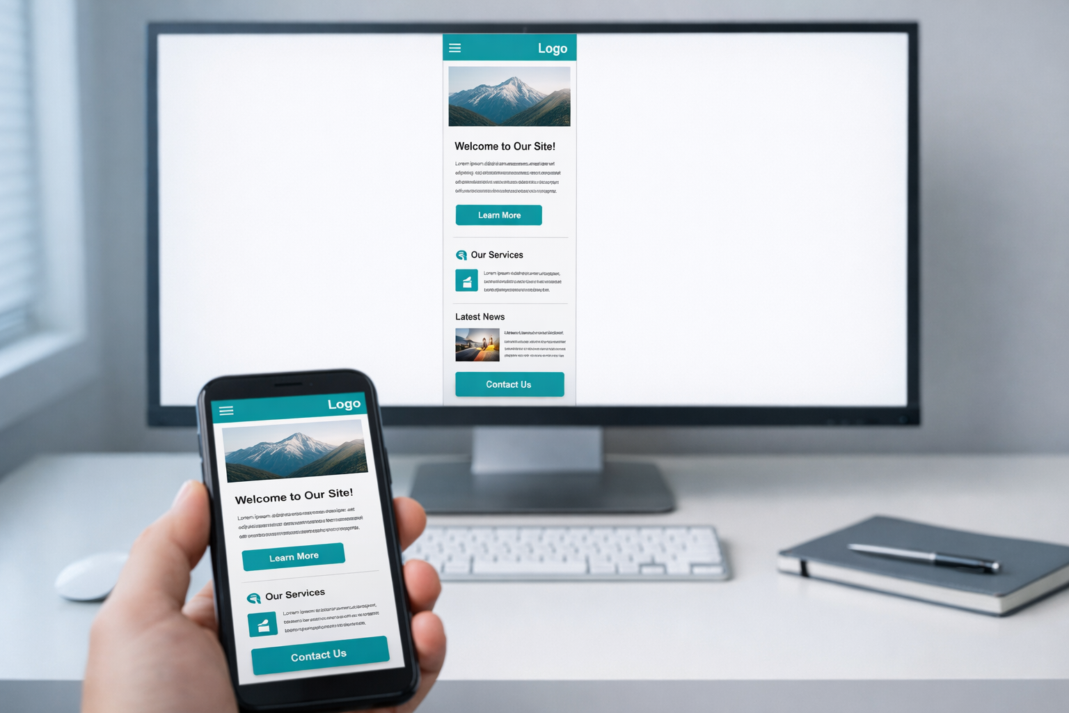
A single-column layout on mobile is essential. A single-column layout on a 1440-pixel-wide monitor is wasteful. When designers scale up from mobile without rethinking the layout, you get text blocks sitting in a narrow channel down the centre of the screen, flanked by vast expanses of nothing. This isn’t elegant minimalism. It’s a failure to use the available real estate.
For B2B companies, where visitors often need to compare features, review pricing tiers, or evaluate technical specifications, this wasted space is actively harmful. Information that could sit side by side in a comparison table instead requires scrolling through sequential blocks. A visitor who could have grasped your three service tiers in a single glance now has to scroll through three separate sections and hold the first two in memory while reading the third.
Navigation that hides when it shouldn’t
The hamburger menu made sense on a 320-pixel-wide screen where horizontal space was precious. On desktop, hiding your entire navigation behind an icon reduces discoverability by roughly 50%, according to research by the Nielsen Norman Group. Yet we routinely audit B2B sites where the desktop navigation is a hamburger icon in the top-right corner, because that’s what the mobile design used and nobody thought to change it for larger screens.
Your desktop visitors have 1200 or more pixels of horizontal space. They can see eight to ten navigation items at a glance. Hiding that behind an icon doesn’t create a cleaner experience; it creates an extra click between your visitor and the page they want. For a B2B site where the buyer journey involves visiting multiple pages across several sessions, every unnecessary click is friction you are adding to your own pipeline.
Interactions designed for thumbs, not cursors
Mobile interactions rely on tapping, swiping, and scrolling. Desktop interactions add hover states, right-clicking, keyboard navigation, and precise cursor targeting. When you design mobile first and scale up, you tend to carry the mobile interaction model with you. The result is desktop interfaces that feel like blown-up phone apps.
Buttons are oversized. Links have enormous touch targets that waste space. Carousels replace content that could be displayed all at once. Accordions hide information that a desktop user has plenty of room to see. Interactive elements that could respond to hover (preview cards, dropdown menus, tooltip explanations) instead require clicks, because the mobile version didn’t have hover and nobody added it during the desktop pass.
Typography that doesn’t scale intelligently
A 16-pixel body font that reads well on a phone at arm’s length can feel cramped on a large monitor at desk distance. Mobile-first projects often set typography for small screens and then apply minor adjustments for larger breakpoints, rather than genuinely reconsidering the typographic hierarchy for each context. Line lengths regularly exceed 80 characters on desktop, which research consistently shows reduces readability. The fix isn’t complicated: constrain the content width or increase font size. But it requires someone to actually design for the desktop context rather than just letting the responsive grid stretch.

When Mobile First Actually Makes Sense
To be clear, mobile first is not wrong as a concept. It is wrong as a blanket rule. There are specific situations where starting with mobile genuinely produces better outcomes.
If your analytics show that 70% or more of your traffic comes from mobile devices, mobile first is sensible. Consumer-facing e-commerce, restaurant websites, local service businesses, and social-media-driven brands typically fall into this category. Their visitors are literally on phones, so designing for that context first is both logical and practical.
Mobile first also works well for content-heavy editorial sites where the primary action is reading. A news article or blog post has a fundamentally linear structure that maps naturally to a single column, and the mobile-to-desktop scaling challenge is less severe.
But B2B companies, SaaS platforms, professional services firms, and enterprise software vendors? Their visitors overwhelmingly use desktop or laptop browsers during working hours. Gartner’s research on B2B buying behaviour consistently shows that complex purchasing decisions happen at desks, often with multiple browser tabs open. For these organisations, mobile first is solving the wrong problem first.
A Better Approach: Context-First Design
What we advocate at NexusBond is not “desktop first” as a replacement dogma. It is context-first design, where the starting point of your design process is determined by your actual users and their actual behaviour, not by an industry trend.
Start with your analytics, not your assumptions
Before a single wireframe gets drawn, pull your device breakdown from the last 12 months. Not just overall traffic, but traffic by page type and by stage in the buyer journey. You may find that your blog attracts significant mobile traffic from social media, while your pricing page and product pages are 85% desktop. This is common in B2B, and it means different parts of your site may warrant different starting points.
We typically build a simple matrix for clients: page type, device split, primary user action, and conversion importance. This takes about an hour with Google Analytics and gives you a far more rational basis for design decisions than any universal methodology.
Design for your primary context first, then adapt
If desktop accounts for 75% of your traffic on your most commercially important pages, design those pages at desktop width first. Give your designer the full canvas to work with. Let them use multi-column layouts, horizontal navigation, hover interactions, and side-by-side comparisons. Then adapt that design downward for tablet and mobile, making deliberate decisions about what stacks, what collapses, and what gets reorganised.
This is not the same as the old approach of building a desktop site and hoping it works on mobile. Modern responsive frameworks make the adaptation straightforward. The key difference is where the creative energy goes. You want your best thinking applied to the context where most of your revenue-generating visitors will experience it.
Prototype both breakpoints early
One of the biggest advantages of prototyping before committing to visual design is that you can test layouts at multiple breakpoints before anyone writes a line of production code. In our projects, we build interactive prototypes at both desktop and mobile widths and put them in front of stakeholders and real users within the first few weeks. This surfaces problems that static mockups miss entirely.
For example, a client in the logistics software space recently discovered through prototype testing that their mobile navigation structure, which worked fine in isolation, completely broke the mental model their desktop users relied on. The desktop prototype revealed that users expected to see all four product categories simultaneously in the top navigation, and when they tested the mobile version’s collapsed menu, they consistently missed the category they were looking for. We restructured both versions independently rather than forcing one to mirror the other. This is exactly the kind of issue our prototype-first guide addresses in detail: catching structural problems before they become expensive development rework.
Treat breakpoints as different design problems
The most important mindset shift is this: a desktop layout and a mobile layout are not the same design at different sizes. They are different solutions to different problems. A desktop user has a large viewport, a precise pointing device, access to keyboard shortcuts, and typically more focused attention (they’re at work, at a desk). A mobile user has a small viewport, an imprecise input method, possibly intermittent connectivity, and often divided attention.
These are fundamentally different contexts that deserve genuinely different design responses. A pricing comparison table might be a three-column grid on desktop and a swipeable card interface on mobile. A case study page might use a two-column layout with a sticky sidebar on desktop and a straightforward linear flow on mobile. A product demo request form might show all fields at once on desktop and use a stepped wizard on mobile. Each of these is the right solution for its context, and you only arrive at them if you treat each breakpoint as its own design challenge.
What to Look for in Your Current Site
If you suspect your desktop experience has been compromised by overzealous mobile-first thinking, here are specific things to audit.
Check your content width. Open your homepage on a large monitor and look at how much of the screen the actual content occupies. If your text content sits in a column that’s less than 60% of the viewport width, you’re wasting space. Compare this to sites you personally find useful at desktop; you’ll notice they use the available width more aggressively.
Count your clicks to key pages. From your homepage, how many clicks does it take to reach your pricing page, your most important product page, and your contact form? If any of these require more than two clicks because navigation is hidden or simplified for mobile conventions, your desktop users are being underserved.
Look for mobile patterns on desktop. Specifically watch for these:
- Hamburger menus on screens wider than 1024 pixels
- Full-width single-column layouts where multi-column would serve better
- Carousels or sliders where all items could be shown simultaneously
- Accordions hiding content that could be visible by default
- Oversized tap targets that create excessive spacing between interactive elements
- Absence of hover states on cards, buttons, or navigation items
Check your scroll depth on key pages. If desktop users have to scroll four or five full viewport heights to see all the content on a page, ask whether the same information could be presented more efficiently with a layout that uses horizontal space. Long scrolling pages feel natural on mobile where swiping is effortless. On desktop, they can feel exhausting, especially for information-dense B2B content.

The Performance Angle People Miss
There’s a subtler problem with mobile-first that rarely gets discussed: performance optimisation bias. When you design mobile first, your performance testing and optimisation naturally focuses on mobile network conditions. Teams spend significant effort compressing images, lazy-loading content, and minimising JavaScript payload for 4G connections.
This is valuable work. But it sometimes leads to desktop experiences that are under-delivering on what they could provide. Desktop users on fast broadband connections can handle richer interactions, larger images, more sophisticated animations, and more complex layouts without any performance penalty. A site that’s been aggressively optimised for mobile constraints might be serving desktop users a diminished experience not because it needs to, but because nobody thought to serve them something better.
Modern responsive techniques, including the picture element, CSS container queries, and conditional JavaScript loading, make it entirely practical to serve genuinely different experiences based on device capability. The question is whether your team is actually using these capabilities or just scaling up the mobile version and calling it done.
Why This Matters More for B2B Than B2C
The stakes of getting this wrong are particularly high for B2B companies, and here’s why. B2B buying decisions involve multiple stakeholders, longer evaluation periods, and higher contract values. Your website isn’t a quick impulse-purchase mechanism; it’s a research tool that buying committees use over weeks or months to build confidence in your solution.
Those stakeholders are sitting at desks, usually on company-issued laptops with large external monitors. They’re comparing your product to two or three competitors, often with multiple tabs open simultaneously. They need to find specific information quickly, understand complex feature sets, and share relevant pages with colleagues. A desktop experience that wastes screen real estate, hides navigation, and forces excessive scrolling directly impedes this process.
We’ve measured the impact on several client projects. One SaaS company we worked with saw a 23% increase in demo requests within three months after we redesigned their key product pages with desktop-optimised layouts that presented feature comparisons in scannable grids rather than stacked mobile-style cards. The mobile experience was designed separately and performed well on its own terms. But the revenue impact came overwhelmingly from the desktop improvements, because that’s where their buyers were.
Getting Your Team Aligned on This
The hardest part of shifting away from mobile-first dogma is often internal. Designers have been trained in mobile-first workflows. Developers use mobile-first CSS frameworks. Stakeholders have heard “mobile first” so many times that questioning it feels retrograde.
The most effective way to reframe this conversation is with data. Show your team the device breakdown for your highest-value pages. Not your blog, not your careers page, but the pages that directly influence revenue: product pages, pricing, case studies, and demo request flows. When the numbers show 70-80% desktop traffic on these pages, the argument for mobile-first as a starting point collapses under its own weight.
Then reframe the conversation around user outcomes rather than design methodology. Nobody on your team wants to deliver a worse experience for your primary audience. They’ve just been following a process that inadvertently produces that result. Position context-first design not as a rejection of mobile considerations but as a more sophisticated, data-informed approach that gives every user the best possible experience for their specific situation.
Building Responsive Design That Actually Responds
True responsive design was always supposed to be about responding intelligently to context, not about starting small and hoping for the best as screens get bigger. The original vision articulated by Ethan Marcotte was about fluid, adaptive layouts that made the most of whatever viewport they found themselves in.
Somewhere along the way, the industry collapsed “responsive” into “mobile first,” as though they were synonyms. They aren’t. A genuinely responsive site treats every breakpoint as an opportunity to optimise the experience for that specific context. It doesn’t privilege one screen size over another. It takes the time to consider what each user needs, what capabilities their device offers, and how to present information in the most effective way for that situation.
That takes more design effort. It means creating distinct layout strategies for at least three breakpoints rather than designing one and stretching it. It means testing at desktop widths with the same rigour you apply to mobile testing. It means treating your desktop visitors, who in B2B are often your most commercially valuable audience, as worthy of dedicated design attention rather than an afterthought.
The mobile-first principle gave us something valuable: a reminder to design with constraints and prioritise ruthlessly. Take that lesson and apply it everywhere. Just stop pretending that a methodology invented for the mobile explosion of 2010 is the only way to build websites in a world where your actual buyers are sitting at desks with large, beautiful screens that deserve better than a stretched phone layout.


