The Page Has Everything. Nobody Converts. Here’s Why.
Most underperforming website pages don’t have a content problem. They have a content hierarchy problem. The information is there, the proof is there, the offer is there, but it’s all presented with equal visual and structural weight, which means the visitor’s brain has to do the sorting work your page should have done for them. When that happens, people leave. Not because they weren’t interested, but because making sense of the page required more cognitive effort than they were willing to spend.
Content hierarchy is the deliberate sequencing and visual weighting of information on a page so that the most important message lands first, supporting evidence builds confidence in the right order, and the desired action feels like the obvious next step. Get this right and conversion rates shift materially. We’ve seen pages go from 1.2% to 4.8% conversion with zero new content, just by restructuring what was already there. The words didn’t change. The order and emphasis did.
If you’re investing in website projects and wondering why pages with good content still underperform, this is almost certainly where the problem lives.
What Content Hierarchy Actually Means (And What It Doesn’t)
Content hierarchy is not the same as visual hierarchy, though the two are related. Visual hierarchy is about size, colour, contrast, and whitespace. It’s a design discipline. Content hierarchy is about what you say first, what you say second, what you prove, and when you make the ask. It’s a strategic discipline that should be resolved before anyone opens a design tool.
Think of it this way. Visual hierarchy is how loudly each element speaks. Content hierarchy is the order of the conversation itself. You can have beautiful visual hierarchy applied to a badly sequenced argument, and the page will still underperform because it’s answering questions in the wrong order or burying the most compelling proof beneath three paragraphs of company history.
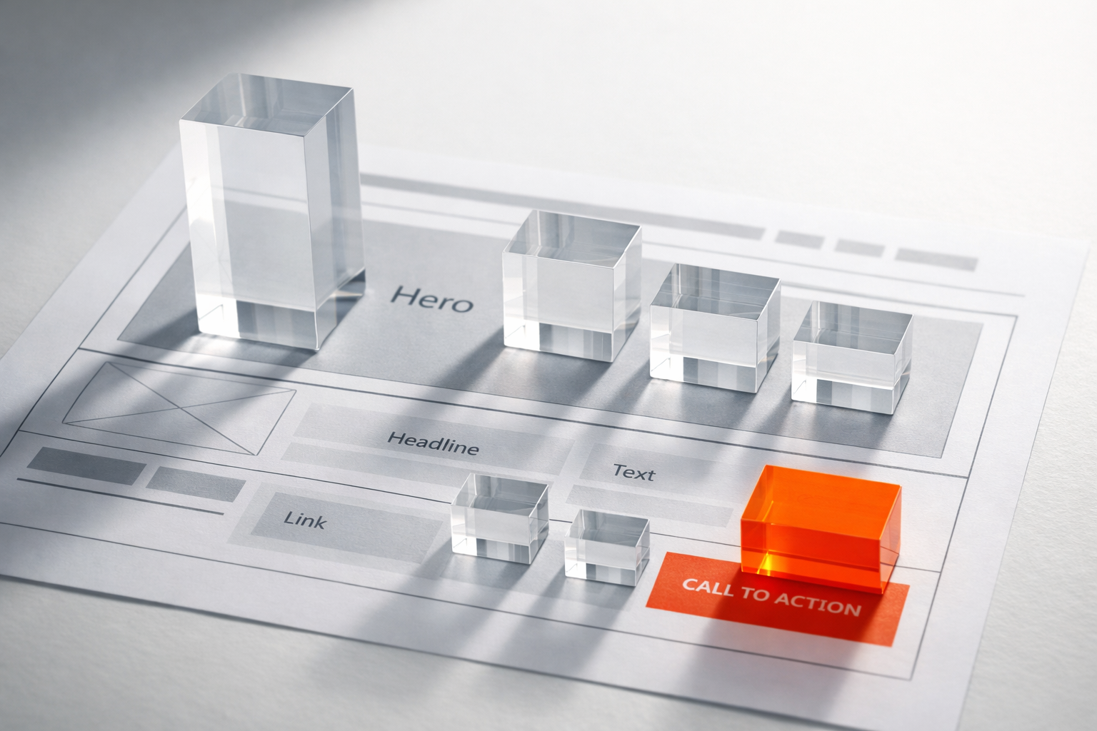
When we audit pages in client projects, we frequently find that every element on the page is treated as equally important. There are five bold headings, four call-to-action buttons, two competing value propositions, and a testimonial shoved into the footer. The page is structurally flat. It doesn’t guide. It presents. And presenting is not persuading.
The Newspaper Analogy Still Holds
Newspaper editors understood content hierarchy instinctively. The most important story gets the largest headline above the fold. The second story gets a smaller headline. Supporting details come lower. You could scan a broadsheet in 10 seconds and understand what mattered most that day.
Your service page, landing page, or homepage needs to work the same way. A visitor scanning for 5 to 8 seconds should be able to extract three things: what you do, who it’s for, and why they should care. If those three signals don’t land in the first viewport, your hierarchy has failed before the visitor scrolls.
Why Flat Content Kills Conversion
There’s a well-documented psychological principle at work here. Cognitive load theory tells us that when people are presented with too many pieces of information at equal weight, their working memory gets overwhelmed, and they default to the easiest decision available: leaving.
This is not a matter of attention spans getting shorter (that narrative is overblown). It’s about the brain’s natural triage process. When everything on a page looks equally important, nothing registers as important. The visitor has no foothold, no clear starting point, no sense of where the argument is going. So they bounce. Not out of disinterest, but out of confusion.
Here’s what flat content typically looks like on a B2B services page:
- A generic headline that describes the company rather than the visitor’s problem
- Three or four feature blocks given identical visual treatment
- A paragraph of company background placed above the core value proposition
- Testimonials and case study links scattered across the page with no relationship to the claims they should be supporting
- Multiple CTAs competing for attention (“Book a demo”, “Download the guide”, “See pricing”, “Read our blog”)
Every one of those elements might be good content on its own. But arranged without hierarchy, they create a page that talks at the visitor without taking them anywhere. Contrast that with a page where the primary message is unmistakable, supporting proof appears exactly where doubt would arise, and a single primary action is given clear dominance. That page converts because it thinks for the visitor instead of making them think.

The Five Layers of Effective Content Hierarchy
When we structure pages for clients, we work through five layers of hierarchy. Each layer has a specific job, and the order matters. Getting these layers right typically saves 3 to 6 weeks of rework later in the project because the design team receives content that already has a built-in logic to it.
Layer 1: The Primary Assertion
This is your single most important statement, usually your headline and supporting subhead. It must communicate the core value you deliver, framed around the visitor’s problem or desired outcome. Not your company name. Not your tagline. Not a clever play on words. The primary assertion should pass a brutal test: if a stranger read only this one line, would they understand what you do and why it matters to them?
A weak primary assertion: “Innovative Solutions for Modern Businesses.” A strong one: “We build content systems that prevent your website project from stalling at the content stage.” The second one is specific, addresses a real pain point, and makes it clear who the page is for.
Layer 2: The Supporting Argument
Directly below the primary assertion, you need 2 to 4 supporting points that explain how you deliver on the promise. These are not feature lists. They are the structural pillars of your argument. Each one should make a distinct claim and be ordered by what matters most to the visitor, not by what you’re most proud of internally.
The mistake we see constantly is companies ordering their supporting arguments by internal priority (“we do strategy, then design, then build”) rather than by visitor priority (“here’s the outcome you get, here’s the risk we eliminate, here’s what makes us different”). Visitor-centric ordering converts better because it mirrors the questions the buyer is already asking themselves.
Layer 3: Proof and Evidence
This is where most pages fall apart. Proof exists on the site somewhere, but it’s disconnected from the claims it’s supposed to validate. A testimonial about your responsiveness sits next to a section about your methodology. A case study link about a healthcare client appears on a page targeting financial services.
Proof must be positioned immediately adjacent to the claim it supports. If you claim you reduce project timelines by 40%, the case study proving that claim should appear within the same scroll. If you claim your approach eliminates content delays, the client quote confirming that should sit right beneath the relevant paragraph. This is what we call contextual proof placement, and it’s covered in depth in our content and proof systems guide.
Layer 4: Objection Handling
By the time a visitor has read your primary assertion, understood your supporting argument, and seen proof that it works, they will have objections. Every buyer does. “This sounds expensive.” “We’ve tried something similar before.” “Our situation is different.” “How long does this take?”
Strong content hierarchy anticipates these objections and addresses them in the right position on the page, after the value has been established but before the call to action. FAQs can work here, but a better approach is weaving objection handling into the narrative itself. A well-placed sentence like “Most of our clients come to us after a previous project stalled at the content stage, so we’ve designed our process specifically to prevent that from happening again” neutralises the “we’ve been burned before” objection without drawing attention to it as a formal FAQ.
Layer 5: The Primary Action
Your call to action should appear only after the argument is complete. Placing a CTA in the hero section is fine as a convenience for returning visitors who already know what they want, but the conversion-driving CTA is the one that appears after layers 1 through 4 have done their work. This CTA should be singular and dominant. One clear action, one clear button, one clear next step. If you offer a secondary action (like downloading a resource for people who aren’t ready to talk), it should be visually subordinate. Smaller, less prominent, clearly positioned as the alternative rather than the default.
How to Diagnose Hierarchy Problems on Your Existing Pages
You don’t need a full redesign to fix content hierarchy. In fact, some of the most impactful changes we make in client projects are structural rearrangements of existing content. Here’s a practical diagnostic you can run on any page in about 15 minutes.
The squint test. Lean back from your screen and squint at the page. What stands out? If more than two elements compete for attention, you have a weighting problem. The primary assertion should dominate visually. Everything else should clearly be subordinate.
The first-viewport audit. Look at what appears before the visitor scrolls. Does it communicate what you do, who it’s for, and why it matters? If the first viewport contains a stock photo, your logo, a navigation menu, and a vague headline, you’ve wasted the most valuable real estate on the page.
The claim-proof proximity check. Go through the page and identify every claim you make. Then find the nearest piece of proof for each claim. If the proof is more than one scroll away, or if it doesn’t exist at all, that’s a hierarchy gap. Claims without adjacent proof are just assertions. And visitors don’t trust assertions from companies trying to sell them something.
The CTA count. Count every call to action on the page, including text links, buttons, and embedded forms. If you have more than two distinct actions available (one primary, one secondary), you’re splitting the visitor’s decision and reducing the likelihood they take any action at all. This is the paradox of choice applied to page design, and it’s remarkably common on B2B sites that have accumulated CTAs over time without anyone auditing the whole page.
Content Hierarchy Is a Strategy Decision, Not a Design Decision
One of the most persistent misconceptions in website projects is that hierarchy is something the designer figures out. It’s not. Hierarchy is a content strategy decision that should be locked in before design begins. The designer’s job is to express the hierarchy visually, but the hierarchy itself must come from the people who understand the buyer, the sales process, and the competitive landscape.
In our projects, we resolve content hierarchy during the content planning phase, well before wireframes. This means the team agrees on the primary assertion, the order of supporting arguments, the proof assets that will be used and where, the objections that need handling, and the primary action, all in a structured document. When the designer receives this, they’re not guessing at what matters most. They’re making an already-clear argument look and feel compelling.
When hierarchy is left to the design phase, what happens is predictable. The designer creates a visually appealing layout. The client fills it in with whatever content is available. Nobody has thought carefully about sequencing, so the page ends up structured around the template rather than around the buyer’s decision-making process. It looks professional but converts poorly. And then everyone blames the design, when the real problem was that the argument was never structured properly in the first place.

Real-World Patterns That Work
While every page is different, certain hierarchy patterns consistently outperform others for B2B companies. Here are three we use regularly.
The Problem-Solution-Proof Pattern
Open with the visitor’s problem (not your solution). Describe it specifically enough that they feel understood. Then introduce your solution as the direct answer to that problem. Immediately follow with proof: a case study excerpt, a specific metric, or a client quote that validates the claim. This pattern works exceptionally well for service pages because it mirrors the way B2B buyers actually think. They start with a problem, they look for a solution, and they need evidence before they engage.
The Outcome-Method-Evidence Pattern
Lead with the outcome the visitor wants (“Websites that launch on time with content that converts from day one”). Then explain the method you use to deliver that outcome, briefly and specifically. Follow with evidence that the method works. This pattern is particularly effective for companies whose process is genuinely differentiated, because it lets you showcase methodology without leading with it. The outcome earns the visitor’s attention. The method earns their respect. The evidence earns their trust.
The Before-After-Bridge Pattern
Describe the “before” state the visitor is likely in (struggling with content delays, misaligned messaging, a website that doesn’t generate leads). Paint the “after” state they want to reach. Then bridge the gap with your offering. This pattern works well for homepages and top-of-funnel landing pages because it’s emotionally resonant without being manipulative. You’re simply describing a transformation the visitor already wants.
Common Mistakes That Undermine Good Hierarchy
Even teams that understand hierarchy conceptually often make implementation mistakes that undo the benefits. Watch for these.
Leading with credentials instead of value. Award logos, partnership badges, and “established in 2003” statements are proof elements, not primary assertions. When they appear above your value proposition, they signal that you care more about your reputation than the visitor’s problem. Move them to Layer 3 where they function as evidence, not as an introduction.
Using identical visual treatment for all sections. If every section of your page uses the same heading size, the same card layout, and the same amount of whitespace, you’ve created visual monotony. The visitor’s eye has no guidance. Vary the visual weight of sections to match their strategic importance. Your primary assertion should look and feel different from your supporting arguments, which should look and feel different from your objection handling section.
Burying the most compelling proof. Your best case study, your most impressive metric, your most credible client quote: these should appear early and prominently. Too often, the strongest proof is buried in a case study page that requires three clicks to reach. Pull it forward. Place it where it can do the most conversion work.
Treating mobile as an afterthought. Content hierarchy is even more critical on mobile because the visitor sees only one element at a time. The sequencing of your content literally becomes a linear narrative. If that narrative isn’t compelling from top to bottom, mobile visitors will drop off fast. Test your hierarchy by reading the mobile version of your page aloud. If the argument doesn’t build logically as a spoken narrative, the hierarchy needs reworking.
Measuring Whether Your Hierarchy Is Working
You can’t improve what you don’t measure, and content hierarchy has very specific metrics you should track. Scroll depth tells you whether people are progressing through your argument or abandoning it partway. If 70% of visitors don’t scroll past the second section, your Layer 1 and Layer 2 aren’t compelling enough to earn continued attention.
Click maps and heatmaps reveal whether visitors are engaging with the elements you’ve prioritised. If your primary CTA gets fewer clicks than a secondary navigation link, your visual weighting doesn’t match your strategic intent. Time on page segmented by scroll depth shows whether visitors are reading or just scrolling. A visitor who reaches the bottom in 8 seconds hasn’t read anything; they were scanning for something they didn’t find.
The most telling metric, though, is conversion rate by page section. Tools that track which CTA converts most effectively will show you exactly where in your hierarchy the decision happens. If your mid-page CTA (after proof) converts at three times the rate of your hero CTA, that confirms your hierarchy is doing its job: building the argument before making the ask.
Making This Practical
If you take one thing from this article, let it be this: before you redesign, rewrite, or rebuild any page, restructure its argument first. Map the five layers. Identify which claims lack adjacent proof. Audit the first viewport for clarity. Count your competing CTAs. These are changes you can make in a day, and they will almost always produce measurable conversion improvements within weeks.
Content hierarchy isn’t glamorous. It doesn’t produce the kind of dramatic before-and-after screenshots that win design awards. But it is the structural foundation that determines whether a page persuades or merely presents. The companies that treat it as a deliberate strategic discipline, resolved early in the project and validated with data afterward, consistently outperform those that leave it to chance. And in a market where most of your competitors are still building pages that look good but convert poorly, getting your hierarchy right is one of the most reliable advantages you can create.