I’ll research current data on About page behaviour, user attention, and trust signals before writing.I have strong data. Let me do one more search specifically on About page behaviour and what visitors actually look for on them.I have enough strong, varied data to write a credible, sourced article. Here it is.
The About page is a credibility checkpoint, not a brochure
Open your analytics and look at who visits your About page. It is rarely a casual browser killing time. It is someone who has already decided your product or service might be worth their attention, and now they want to know whether you are real, competent, and safe to bet on. That is the actual job of the page. Not storytelling for its own sake. Not your founding myth. A verdict on whether you can be trusted with money and risk.
Most companies get this backwards. They treat the About page as a place to talk about themselves, when the visitor is there to find out something about themselves: am I making a smart decision by considering this company? The page that answers that question well does quiet, heavy lifting in the background. The page that rambles about passion and journeys gets skimmed and abandoned, and the visitor leaves with their doubt intact.
The reason this matters more than it used to comes down to how buying has changed. The decision is mostly made before anyone talks to you. The widely cited figure began with a CEB study from 2015 that found B2B buyers had completed 57% of their purchase decision before speaking with a vendor, Forrester found 70% in 2019, and current Gartner data shows buyers spend only 17% of their total buying time in direct contact with potential vendors, meaning roughly 80% of the journey is self-directed. Your website is doing the convincing while you are asleep. The About page is one of the rooms where that happens.
Who actually lands there, and what they are really checking
Picture a typical mid-market evaluation. A marketing manager found you through a search and liked a service page. Before they recommend you internally, they click About to sanity-check who they would be putting their name behind. A few days later a procurement lead opens the same page looking for entirely different things: company size, longevity, anything that signals you will still exist in two years. Then a department head skims it to prepare a shortlist conversation.
That is not one reader. It is a committee, arriving at different moments with different fears. Multiple people are usually involved in the decision; ten years ago the typical B2B buyer’s journey involved just 5 people, and today it involves an average of 11 to 20 stakeholders. Your About page has to reassure several of them at once, and they are not reading for pleasure. They are reading for risk.
This is where the credibility test gets concrete. On these pages, visitors are looking to find out if you’re trustworthy and competent, and the page needs to answer the credibility questions a potential client might have about you. Awards, track record, who runs the place, where you operate, how long you have done this. Boring on the surface. Decisive underneath.
The trust gap is widening, and your own page is one of the few channels you control
Here is the uncomfortable backdrop. Buyers increasingly distrust the sources companies lean on. Only 14% of buyers now consult analyst reports during purchase processes, representing a 60% decline since 2022. Meanwhile they trust people they already know far more than anything a vendor says. The most trusted sources for B2B buyers are coworkers and management within an organisation, with 82% of buyers saying they are trusted, and close behind are vendors they currently work with, trusted by 79% of respondents. Salespeople sit much lower on that list.
So a buyer arrives at your About page already sceptical, already cross-checking. 72% of buyers now encounter Google’s AI Overviews during research, with 90% clicking through to source materials for verification. They are not taking your word for anything. The About page that survives this scrutiny is the one that gives them verifiable, specific, human evidence rather than adjectives.

Why most About pages fail the test
The standard About page reads like it was written to make the founder feel good. It opens with a sentence about a vision. It uses the word passionate. It describes a journey. None of that answers the question the visitor came with, and the clock is brutal. An average user forms an impression of a website in just 0.5 seconds, according to Google Research. If the top of your page is a soft-focus narrative, you have spent that half-second on nothing.
The second failure is vagueness dressed up as confidence. “Thousands of satisfied customers” is the classic. It sounds like proof and contains none. “Thousands of satisfied customers” tells visitors nothing useful, whereas “increased conversion rates by 47% in 60 days using our email segmentation feature” tells visitors exactly what to expect. A specific, attributable claim does work that a round number of happy faces never will.
The third failure is hiding. Plenty of B2B companies bury their team, their location, and any sense of scale because they think mystery reads as premium. It reads as evasive. Easily accessible contact information is a priority for website visitors according to the Komarketing study, with over half of respondents saying it was important for contact information to be easy to find and readily available. If a buyer cannot work out who you are and how to reach you, the absence becomes the message.
Decoration is not the same as proof
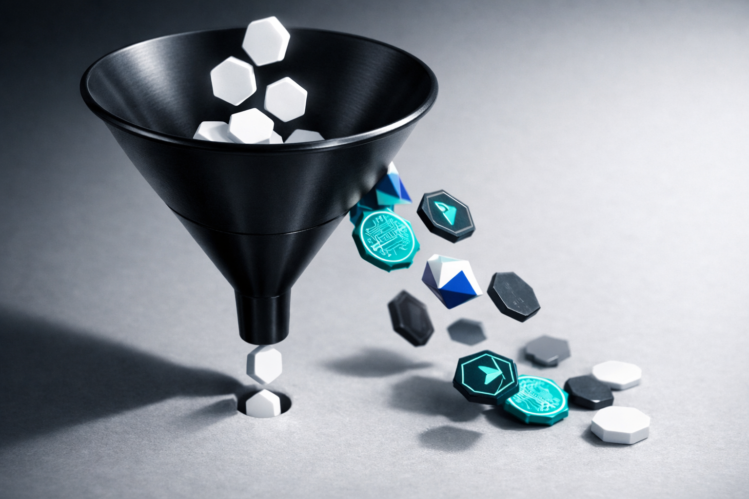
There is a tempting fix that backfires: cram the page with badges, logos, and certifications until it looks impressive. More is not safer. Irrelevant certifications confuse visitors, and if a badge doesn’t mean anything to your target audience, including it just adds visual noise; when trust signals feel excessive they can backfire, because a company confident in its reputation doesn’t need to prove itself on every square inch of the website, so strategic placement of meaningful credentials beats comprehensive coverage of every possible trust marker. The enemy here is the marketer who treats a wall of logos as a substitute for actually telling the visitor what they need to decide.
What a credibility-first About page actually contains
Strip away the vanity and the page has a clear job: confirm legitimacy, demonstrate competence, and reduce the perceived risk of choosing you. In our projects, the About page is treated as a proof asset, not a personality piece. It is built from the same proof library that feeds case studies and sales decks, so the evidence is consistent across the whole site rather than reinvented page by page.
Here is what earns its place near the top:
- A plain statement of what you do and who you do it for. Not a mission. A description specific enough that the wrong-fit visitor self-selects out and the right-fit one leans in.
- Proof of scale and longevity. Years operating, number of clients served, markets covered. Procurement is checking whether you will survive the contract.
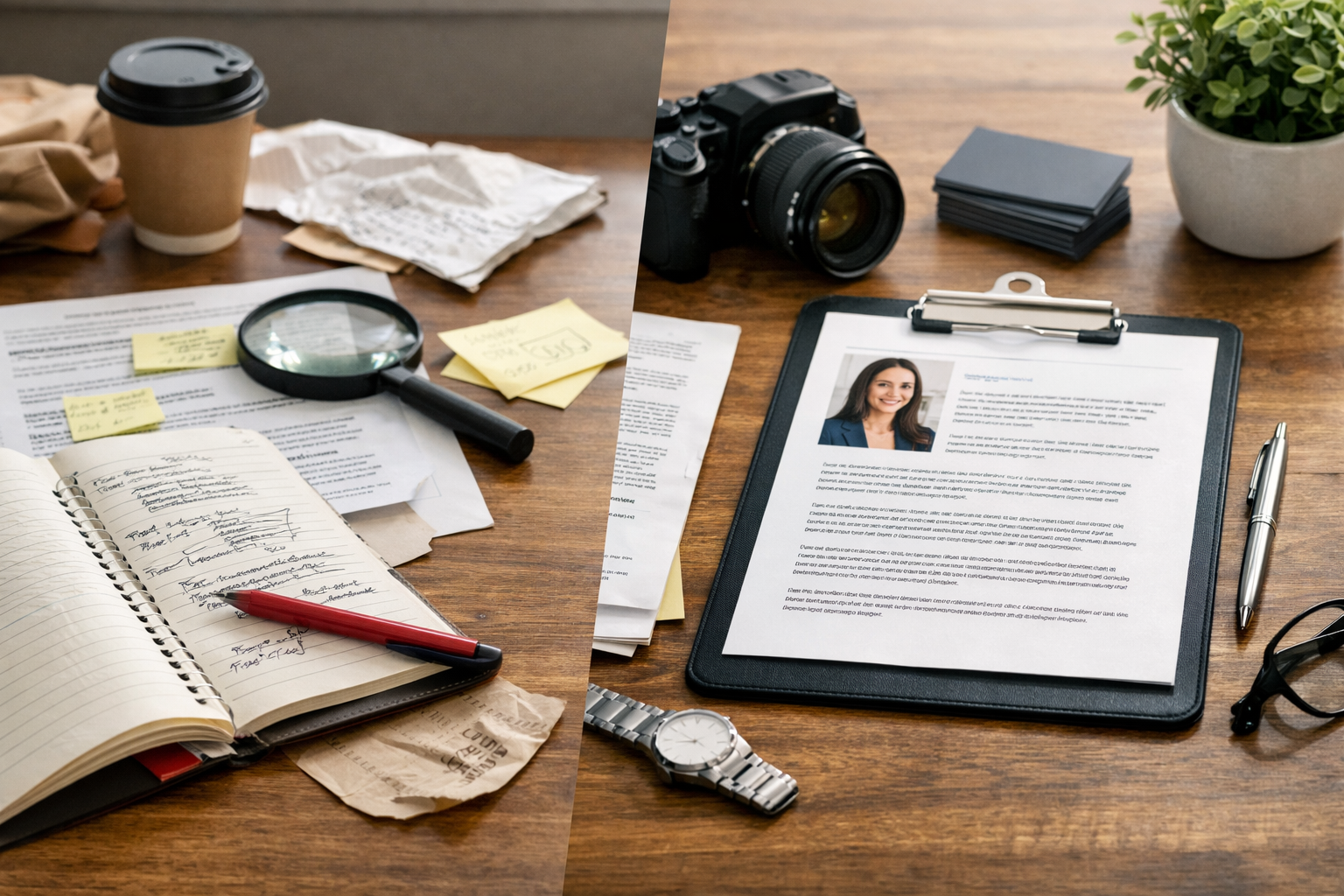
- Named, photographed humans. Real people with real titles. This is the single fastest way to convert abstraction into trust.
- Specific, attributed results. One quantified outcome with a name attached beats a paragraph of adjectives.
- Relevant credentials, curated hard. The two or three certifications your buyers actually recognise, ideally linked so they can be verified.
- An obvious way to get in touch and a clear next step. The page should hand the ready buyer a door, not a dead end.
Notice what is missing from the top of that list: the origin story. It can stay, lower down, for the minority who want it. The best About pages understand that a visitor might not want to read through the whole story, but still offer it. Give the skimmer their verdict first and the romantic their narrative second.
Put the human evidence to work
The team section is the part companies most often waste. Stock-photo silhouettes or, worse, no faces at all. People buy from people, and the visitor is trying to imagine working with you. Making yourself relatable by including a headshot and a few personal facts matters, and an image of the entire firm on the general About page helps visitors relate to you as a team. When a buyer can see who they will deal with, the abstract company becomes a set of accountable individuals. That shift is what lowers risk in their mind.
The same logic applies to testimonials, if you place them here. Generic praise is worthless. Collect testimonials with specific, quantified results, and require full names, professional photos, and job titles. A named VP describing a measurable outcome does more than ten anonymous five-star quotes, because the buyer can picture themselves as that person.
The mistake of treating the page as static
An About page is not a monument you build once and admire. It decays. The team changes, the client count grows, the certifications renew, and the page quietly drifts out of date until it actively undermines you. A buyer who spots a “founded 2018, team of 6” line on a company that clearly has thirty people will wonder what else is stale.
This is content operations, not copywriting. In our work, the number one cause of website project delays is content readiness, and About pages are a repeat offender precisely because nobody owns them. They get drafted in a rush near launch, approved by committee, and then abandoned. What we recommend to clients is a structured proof library with a single owner, where every claim, headshot, logo, and number has a review date. The About page then pulls from that library instead of being a one-off artefact that rots.
The stakes are higher than they look because the page is fighting against a sceptical, self-directed reader. In 2024, about 95% of B2B buyers research online before making a purchase, underscoring the dominance of digital channels in commercial decision-making. If they are doing the research alone and your page contributes doubt rather than confidence, you may never even learn you lost them. There is no enquiry to follow up. They just leave.
Do not let the page become a leak in your funnel
Clutter kills conversion, and About pages tend to accumulate it: long histories, mission statements, awards from 2014, three competing buttons. Conversions can drop by as much as 95% if a webpage is cluttered or has too many elements, according to Crucible. The page should feel calm and certain. Every element should either build trust or point the visitor toward the next step. Anything that does neither is taking up space that a credibility signal could occupy.
What to do this week
Open your About page and read it as a sceptical buyer who has never heard of you and is about to recommend you to their boss. Then run it through a short, honest audit:
- Does the first screen tell me what you do, for whom, and why you are credible? If the first thing I read is a feeling rather than a fact, rewrite it.
- Can I see real people? If your team is invisible or fake, fix that before anything else. It is the cheapest trust win available.
- Is there one specific, attributed result? Replace the next “trusted by many” line with a named outcome you can stand behind.
- Are the badges relevant, or are they noise? Cut any certification your actual buyers would not recognise.
- Is every fact current? Check the dates, the headcount, the client numbers. Assign one person to own them.
- Is the next step obvious? A ready buyer should never have to hunt for how to talk to you.
Make the cheap fixes immediately: add the faces, correct the stale numbers, swap one vague claim for a specific one. The deeper work, deciding what proof you have and building a system to keep it fresh, takes a little more structure. If you want a second set of eyes on your own page and the proof assets behind it, you can book your free discovery call and we will walk through where the credibility gaps are.
Your About page is not where people learn your story. It is where they decide whether to trust you with theirs. Write it for the verdict, not the vanity, and it will quietly close deals you will never see it close.
Ready to get started?