The Short Answer
A wireframe is a static, low-fidelity layout that shows where elements sit on a page. A prototype is an interactive, clickable representation that shows how those elements behave when a user engages with them. The wireframe answers “what goes where?” while the prototype answers “what happens when someone uses this?” They serve different purposes at different stages of a project, and confusing the two is one of the most common reasons website projects run into expensive misalignment later on.
That sounds simple enough, but in practice the distinction gets muddied. Designers sometimes call interactive wireframes “prototypes.” Stakeholders review a static mockup and assume it’s a wireframe. Tools like Figma blur the lines by letting you create both in the same file. If you’re making decisions about a website redesign or new build, understanding where each fits in the process will save you weeks of rework and prevent the kind of late-stage surprises that blow budgets.
What a Wireframe Actually Is
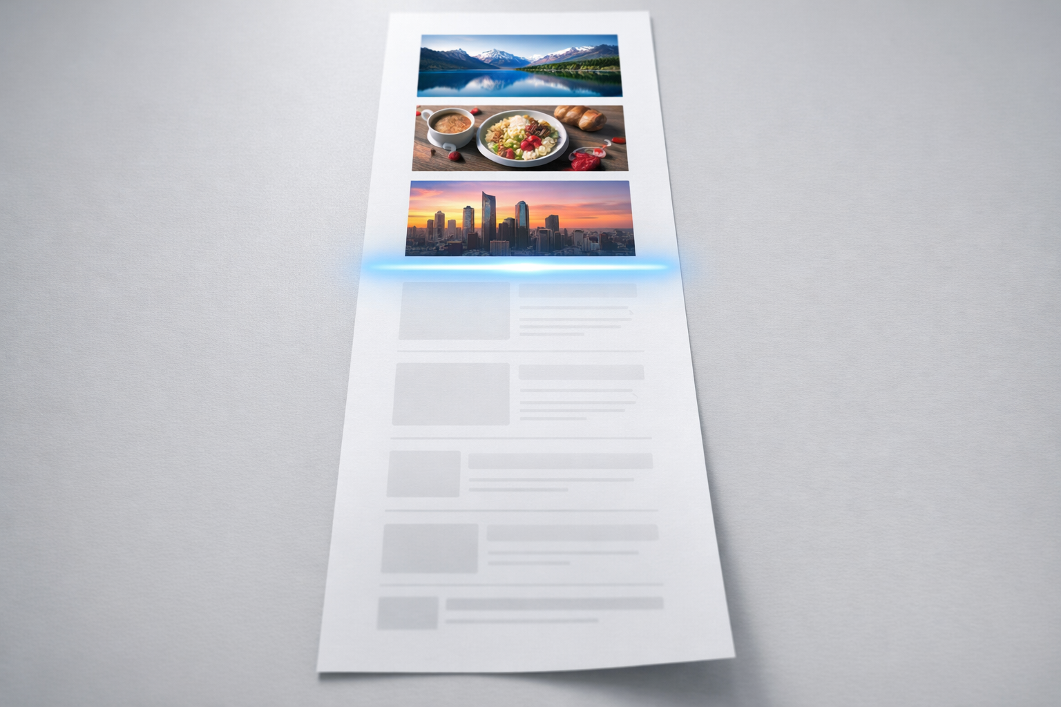
A wireframe is a structural blueprint of a web page. Think of it like the floor plan of a house before anyone has chosen paint colours or furniture. It shows the arrangement of elements: where the navigation sits, how content blocks are ordered, where calls to action appear, and how the page hierarchy flows from top to bottom. Wireframes are deliberately stripped of visual design. No brand colours, no photography, no final copy. They use grey boxes, placeholder text, and simple labels.
The purpose of this austerity is focus. When you put a wireframe in front of a stakeholder group, the conversation stays on structure and content priority rather than drifting into debates about whether the blue is the right shade. We’ve seen countless review sessions derail because someone mocked up a page with real imagery, and the entire meeting became a discussion about stock photo choices instead of whether the page architecture actually served the user’s goal.
What wireframes typically include
- Page layout and element positioning
- Content hierarchy (headings, body text blocks, image placeholders)
- Navigation structure and labelling
- Approximate sizing and proportions of sections
- Annotations explaining the purpose of each element
What wireframes deliberately exclude
- Brand colours, typography, and visual styling
- Real photography or illustrations
- Interactive behaviour (hover states, transitions, animations)
- Final copywriting
Wireframes come in varying levels of fidelity. A low-fidelity wireframe might be a rough sketch on paper or a whiteboard drawing created in a 30-minute working session. A mid-fidelity wireframe is typically created in a tool like Figma, Sketch, or Balsamiq and includes more precise spacing, realistic content block sizes, and clear annotations. In our projects, we usually start with low-fidelity sketches during discovery workshops with clients, then move to mid-fidelity wireframes that the wider team can review asynchronously.
The key characteristic of any wireframe, regardless of fidelity, is that it’s static. You look at it. You don’t click through it. This is the fundamental dividing line.
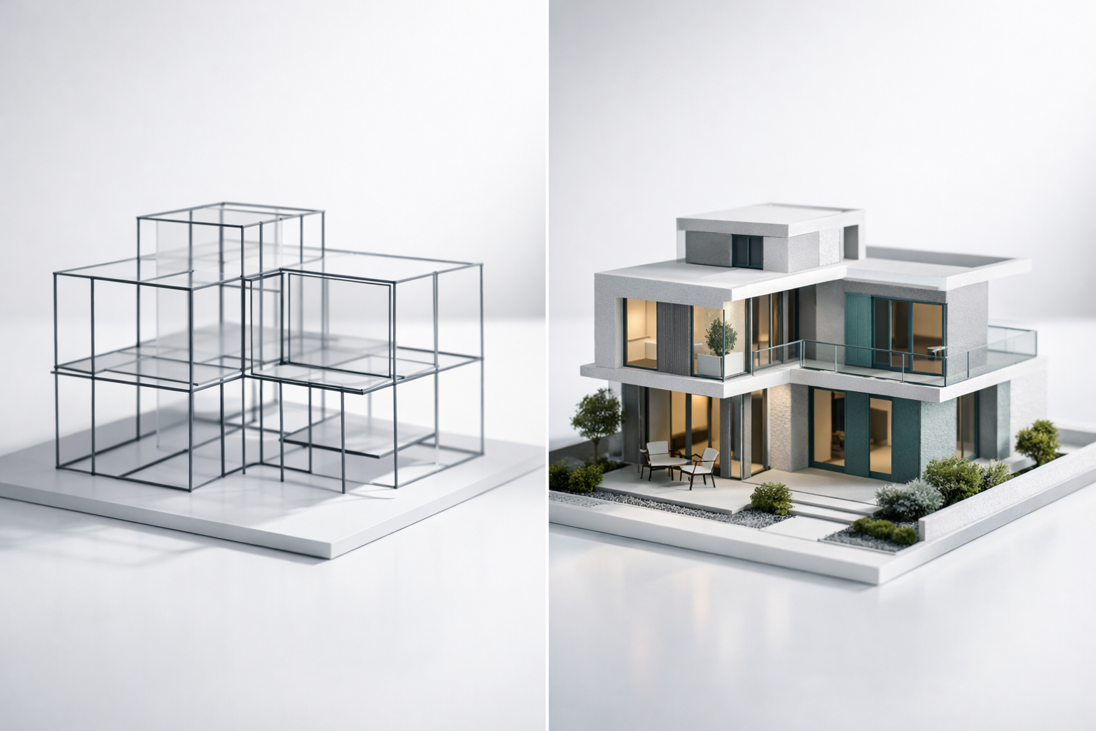
What a Prototype Actually Is
A prototype is an interactive model that simulates the experience of using the website or product. At its simplest, a prototype might be a series of wireframe screens linked together so you can click a button and see the next page. At its most sophisticated, a prototype can feel almost indistinguishable from a finished website, complete with animations, form validation, conditional logic, and responsive behaviour across devices.
The defining quality of a prototype is interaction. It responds to user input. You click a menu item and it opens. You fill in a form field and something happens. You scroll and content animates into view. This interactivity is what makes prototypes uniquely valuable for testing and stakeholder alignment, because humans are surprisingly bad at imagining how a static layout will feel once it’s alive in a browser.
Prototypes also exist on a fidelity spectrum. A low-fidelity prototype (sometimes called a clickable wireframe) links static wireframe screens together with basic click interactions. A high-fidelity prototype incorporates visual design, real content, micro-interactions, and sometimes even functional logic. What we typically build for clients sits in the middle to high range: enough visual polish and interaction to feel real, but built in a prototyping environment rather than production code, so changes take hours instead of days.
What prototypes typically include
- Clickable navigation and page-to-page flows
- Interactive elements: buttons, forms, dropdowns, modals
- User journey simulation (e.g., “find a product, add to cart, check out”)
- Responsive behaviour across screen sizes
- Hover states, transitions, and scroll-based interactions
What prototypes are not
A prototype is not a finished website. It’s not built on a CMS, it doesn’t connect to databases, and it doesn’t process real transactions. This is a distinction worth emphasising because we regularly encounter stakeholders who see a polished prototype and assume development is nearly complete. In reality, a prototype is a testing and alignment tool. Its purpose is to surface problems and build consensus before the expensive development phase begins. A good prototype might represent 15-20% of the total project effort but prevent 40-60% of the rework that typically happens when teams skip this step.

Why the Distinction Matters for Your Project
If you’re planning a website redesign or new build, the practical difference between wireframes and prototypes directly affects your budget, timeline, and the quality of decisions your team makes along the way. Here’s why.
Wireframes are efficient for early-stage alignment on structure. They’re quick to produce, easy to modify, and excellent for getting a diverse stakeholder group to agree on content priorities and page architecture without getting bogged down in aesthetics. If your leadership team, marketing department, and product team all need to agree on what information appears on the homepage and in what order, wireframes are the right tool. They keep everyone focused on the same question.
Prototypes are essential for validating user experience. Structure on paper and structure in practice are different things. A wireframe might show a beautifully logical page layout, but once users interact with it, you discover the navigation model is confusing, the form is too long, or the journey from landing page to conversion has too many steps. You can only discover these problems by watching real behaviour, and that requires something people can actually use. A prototype gives you that.
The mistake we see most often is teams that skip straight from wireframes to development, assuming that approved wireframes mean the design is validated. They’re not. Wireframes validate layout. Prototypes validate experience. These are fundamentally different things. A page can have perfect structure and still deliver a frustrating user experience because of how interactions unfold, how navigation responds, or how content reveals itself over time.
When to Use Each (And When to Combine Them)
The question isn’t really wireframe or prototype. It’s about understanding which tool earns its keep at each stage of your project.
Use wireframes when you need to:
Align stakeholders on content and structure early. During discovery and planning, wireframes help translate abstract strategy discussions into tangible page layouts. When your brand team says “we need to lead with our value proposition” and your product team says “users need to see pricing immediately,” a wireframe makes that tension visible and resolvable.
Map out the full sitemap visually. For projects with complex information architecture (think B2B companies with multiple product lines, audience segments, and resource libraries), wireframing key page templates helps everyone see how the site will organise information before anyone invests in detailed design.
Move fast and explore options. A skilled designer can produce three wireframe variations of a page layout in a single afternoon. That same exploration in prototype form would take three to four times as long. Wireframes earn their place when you’re still diverging and exploring possibilities rather than converging on a final direction.
Use prototypes when you need to:
Test user journeys before committing to development. If you’re redesigning a website and the core business goal is to improve lead generation, you need to prototype the entire journey from first landing to form submission and test it with real users. No amount of static wireframe review will tell you whether that journey works.
Get meaningful stakeholder approval. In our experience, the single biggest accelerator for stakeholder sign-off is putting an interactive prototype in someone’s hands. When a managing director can click through the new site on their phone and experience it as a user would, they give faster, more confident, and more specific feedback than they would reviewing a deck of static wireframes. As we detail in our prototype-first guide, this approach typically collapses approval cycles from weeks to days.
De-risk complex interactions. If your site includes configurators, multi-step forms, dynamic filtering, personalised content, or any interaction more complex than clicking a link, you should prototype it. These are exactly the features that generate the most development rework when the team discovers the designed interaction doesn’t work as expected once it’s built.
Combining both in a single project
On most of our projects, wireframes and prototypes are sequential steps in the same process rather than either/or choices. The typical flow looks like this: discovery workshops produce rough wireframe sketches; those sketches become mid-fidelity wireframes for structural review; approved wireframes feed into an interactive prototype that incorporates visual design and real content; the prototype is tested with users and reviewed by stakeholders; validated prototypes become the specification for development.
This sequence works because each step builds on the confidence established by the previous one. By the time you’re in development, the big questions have already been answered, tested, and approved. The development team isn’t interpreting static layouts and guessing how interactions should work. They’re implementing something that’s already been experienced and validated.

Common Misconceptions That Cost Time and Money
Several persistent misunderstandings about wireframes and prototypes lead to poor project decisions. Here are the ones we encounter most frequently.
“A wireframe with some clickable links is a prototype.” Technically, yes, linking wireframe screens together creates a basic prototype. But calling this a prototype and presenting it as a tool for user testing or stakeholder validation is misleading. A linked set of grey boxes tells you almost nothing about how users will experience the real site. When we talk about prototyping, we mean something with enough fidelity and interactivity to simulate a genuine user experience. The bar for “prototype” should be: can someone who has never seen this before use it without being told what to imagine?
“We don’t need wireframes if we’re going straight to prototype.” Some teams, particularly those working in agile sprints with experienced designers, do skip formal wireframes. This can work when the designer is essentially wireframing in their head and moving directly to interactive layouts. But for projects with multiple stakeholders who need to review and approve, skipping the wireframe stage often means structural disagreements surface later, when they’re more expensive to fix. The 2-3 days spent on wireframe review almost always pays for itself in faster prototype approval.
“A high-fidelity mockup is basically a prototype.” A beautifully designed static mockup in Figma, with all the right colours, typography, and imagery, is still just a picture. It’s a high-fidelity wireframe, if you want to be precise. Until it’s interactive, it can’t test the things that matter most: user flows, interaction patterns, and the cumulative experience of moving through a multi-page journey. We’ve seen projects where the team spent eight weeks perfecting static mockups, only to discover during development that the user flow was fundamentally broken. Interactivity would have revealed that problem in week two.
“Prototypes take too long and cost too much.” This perception comes from an era when prototyping meant building things in code. Modern prototyping tools have collapsed the effort dramatically. A skilled designer using Figma’s prototyping features can build an interactive prototype of a 15-page website in 5-8 working days. That investment typically saves 3-6 weeks of development rework because issues are caught before a single line of production code is written. The maths works heavily in favour of prototyping for any project above approximately £30,000 in total budget.
How the Tools Have Blurred the Lines
Part of the confusion around wireframes and prototypes comes from the tools themselves. Ten years ago, wireframing and prototyping were done in completely different applications. You’d wireframe in Balsamiq or Axure, design in Photoshop, and prototype in InVision or Marvel. Each tool enforced a clear boundary between stages.
Today, Figma dominates the market and handles wireframing, visual design, and prototyping in a single environment. A designer can start with a grey-box wireframe, layer visual design on top, and add interactive prototyping links without ever switching tools. This is efficient, but it means the boundaries between stages become process decisions rather than tool-imposed constraints.
For project managers and business stakeholders, this matters because you need to be deliberate about what you’re reviewing at each stage. When a designer shares a Figma link, is it a wireframe for structural feedback or a prototype for experience testing? Establish this explicitly before each review cycle. We label our shared files clearly and include a brief cover note explaining what kind of feedback we’re seeking. It sounds simple, but this small habit prevents the most common type of review-stage confusion.
Other tools worth understanding: Balsamiq remains excellent for low-fidelity wireframing because its deliberately rough visual style keeps conversations focused on structure. Axure is powerful for complex interactive prototypes, particularly for enterprise applications with conditional logic and dynamic content. Webflow occupies an interesting middle ground, allowing designers to build prototypes that can become production websites, though this approach introduces different trade-offs around maintainability and CMS flexibility.
A Practical Framework for Deciding What Your Project Needs
Rather than debating wireframe versus prototype in the abstract, consider these four factors to determine the right approach for your specific project.
Stakeholder complexity. How many people need to review and approve the website? If it’s a small team of 2-3 people who work together daily, you can often move quickly from rough wireframes to interactive prototypes. If approval requires sign-off from executives, marketing, product, sales, and compliance, invest in formal wireframes first to resolve structural debates, then prototype to secure final approval.
Interaction complexity. A brochure-style marketing site with standard navigation and content pages needs less prototyping than a site with product configurators, interactive tools, gated content journeys, or personalised user experiences. The more complex your interactions, the more value prototyping delivers, because complex interactions are where the gap between “designed” and “actually works for users” is widest.
Risk tolerance. What happens if you get the website wrong? For a campaign landing page with a three-month lifespan, the risk is low and a quick wireframe-to-build process is fine. For a complete brand platform redesign that needs to serve the business for three to five years, the risk of getting core user journeys wrong justifies a thorough wireframe and prototype process.
Budget and timeline. Wireframing a key template page takes roughly half a day to a day. Prototyping that same page with meaningful interactivity takes two to three days. For a project with ten key templates, that’s the difference between 5-10 days and 20-30 days of design effort. Both are typically worthwhile, but if you’re genuinely constrained, prioritise prototyping the pages and journeys with the highest business impact and wireframe the rest.
What to Take Away
Wireframes and prototypes are complementary tools that serve different purposes at different moments in a website project. Wireframes define structure. They’re your blueprint for content priority, page hierarchy, and information architecture. Prototypes validate experience. They let you test, refine, and approve how the website actually feels to use before development begins.
The most successful website projects we deliver use both, in sequence, with clear expectations about what each stage is meant to achieve. Wireframes keep early-stage conversations focused and productive. Prototypes convert those structural decisions into something tangible that stakeholders can experience, users can test, and developers can implement with confidence. If you’re planning a significant website investment, budget for both. The cost of skipping either is almost always higher than the cost of including them.