The Page That Quietly Bleeds Revenue
Most pricing pages lose between 40% and 60% of visitors who arrive with genuine buying intent. That’s not a traffic problem or a product problem. It’s a structural problem with how the page presents, frames, and organises purchasing decisions. The pricing page is one of the highest-intent pages on any B2B website, yet it’s routinely treated as a simple table of features and numbers, built once and never revisited.
In our conversion audits at NexusBond, the pricing page is almost always the single biggest source of lost revenue. Not because the pricing itself is wrong, but because the way it’s presented creates confusion, hesitation, and friction at the exact moment a visitor is ready to act. What follows is a detailed breakdown of why this happens and what you can do about it.
The Intent Gap: Who Actually Visits Your Pricing Page
Understanding why pricing pages fail starts with understanding who visits them. A visitor who clicks through to your pricing page has already cleared several mental hurdles. They’ve identified a problem, found your site, consumed enough content to believe you might solve it, and now want to know what it costs. This is not a casual browser. This is someone actively evaluating whether to buy from you or someone else.
The data backs this up. Pricing pages typically have the highest exit-to-conversion ratio of any page on a B2B site. Visitors arrive with intent, scan the page for 15 to 30 seconds, and leave. When we analyse session recordings on client sites, the pattern is remarkably consistent: the visitor scrolls down the pricing table, pauses, scrolls back up, and then leaves. They came in ready. Something on the page stopped them.
The critical mistake most teams make is designing the pricing page for information delivery when it should be designed for decision facilitation. There’s an enormous difference between showing someone three columns of features and actually helping them choose. One is a spreadsheet. The other is a conversion system.
Too Many Options Without a Clear Recommendation
The most common structural flaw we see is presenting three to five pricing tiers with no clear guidance on which one the visitor should choose. This triggers what psychologists call choice paralysis, and it’s devastating on a page where you need people to take a single, clear action.
Here’s the typical setup: a “Basic” plan on the left, a “Professional” plan in the middle, and an “Enterprise” plan on the right. Maybe with a subtle “Most Popular” badge on the middle tier. The visitor is expected to scan each column, compare 15 to 25 feature rows, work out which features matter to them, and make a selection. For a complex B2B product, this cognitive load is enormous.
What actually works is opinionated design. Your pricing page should make a recommendation. Not a half-hearted “Most Popular” tag, but genuine guidance. “If you’re a marketing team of 5-15 people running campaigns across multiple channels, this is the plan built for you.” That kind of specificity does two things: it reduces the number of options the visitor needs to evaluate, and it signals that you understand their situation well enough to advise them.
When our team rebuilds pricing pages, we typically find that adding a clear, specific recommendation to one tier increases click-through to the next step by 20% to 35%. That’s not a redesign. It’s a few sentences of copy and a visual hierarchy change.
Feature Grids That Confuse Instead of Clarify
The feature comparison grid is perhaps the single most overused and underperforming element in B2B web design. It feels logical: list everything each plan includes, let the buyer compare. But the way most teams build these grids actively works against conversion.
The Problem With Checkmarks
A wall of green checkmarks and grey crosses tells the visitor almost nothing useful. What it communicates is: “The expensive plan has more stuff.” But the visitor doesn’t want more stuff. They want to know whether their specific problem gets solved at a price they can justify. A checkmark next to “Advanced Analytics” doesn’t answer the question “Will this show me which campaigns are driving pipeline?”
Feature names are not value propositions. “SSO Integration” means nothing to a VP of Marketing evaluating your tool. “Your team logs in once, securely, through your existing company credentials” tells them something useful. Every row in your feature grid is an opportunity to either build confidence or create confusion, and most pricing pages choose confusion by default.
The Scrolling Problem
We regularly see feature grids with 30, 40, even 50 rows. On a laptop screen, this means the column headers scroll out of view almost immediately. The visitor is now comparing features across tiers without being able to see which tier they’re looking at. They have to scroll back up, re-orient, scroll back down, and try to remember where they were. Most people do this once, maybe twice, and then leave.
The fix is straightforward but requires discipline: limit your comparison grid to 8 to 12 of the most decision-relevant differences between tiers. Not features. Differences. If all three plans include something, it doesn’t belong in the comparison grid. It belongs in a “What’s included in every plan” section below. This alone can cut bounce rates on pricing pages significantly because visitors can actually absorb what they’re seeing.

Hiding the Price Doesn’t Build Intrigue. It Builds Suspicion.
A surprising number of B2B companies still hide their pricing entirely behind a “Contact Sales” button. The logic is usually some combination of “our pricing is complex,” “we customise for every client,” and “we don’t want competitors to see our rates.” All three reasons prioritise the company’s comfort over the buyer’s experience.
Here’s what actually happens when you hide pricing: the visitor assumes you’re expensive. Research from Gong and other sales intelligence platforms consistently shows that when pricing isn’t visible, prospects anchor to a higher number than your actual price. You’re not creating a negotiation advantage. You’re creating sticker shock that happens in the prospect’s imagination before your sales team ever gets involved.
If your pricing genuinely varies by customer, you still have options that don’t involve a blank wall with a form. You can show starting prices (“Plans from £500/month”). You can show price ranges per tier. You can use a calculator that lets visitors input their team size or usage volume and see an estimate. Each of these approaches gives the visitor something to anchor to, which reduces anxiety and keeps them moving forward.
The companies that see the best results from their pricing pages are the ones that treat transparency as a competitive advantage rather than a vulnerability. When our team recommends showing pricing to clients who’ve historically hidden it, the most common reaction after implementation is surprise at how much it shortens the sales cycle. Prospects arrive at the first call already knowing the ballpark, which means the conversation starts at solution fit rather than budget qualification.
The Trust Deficit at the Point of Decision
Your homepage probably has logos, testimonials, case studies, and social proof scattered throughout. Your product pages likely include customer quotes. But what about your pricing page? In our experience, roughly 70% of B2B pricing pages contain zero social proof. This is a critical oversight.
The pricing page is where the visitor transitions from “this looks interesting” to “am I willing to commit money to this?” That transition requires trust, and trust needs to be present at the moment of decision, not two clicks away on a case studies page the visitor may never reach.
The most effective pricing page proof elements are:
- Tier-specific testimonials placed next to or beneath each pricing plan, from a customer who actually uses that plan and can speak to its value
- Aggregate numbers like “Trusted by 2,400 marketing teams” or “Processing £4.2M in client invoices monthly”
- Risk reversal statements near the call-to-action: money-back guarantees, free trial terms, cancellation policies
- Recognisable logos of customers in the visitor’s industry or of comparable company size
These elements don’t just make the page look more credible. They directly address the fear that drives most pricing page exits: “What if I make the wrong choice?” A testimonial from someone in a similar role, at a similar company, who chose the plan the visitor is considering, is extraordinarily powerful at reducing that fear.
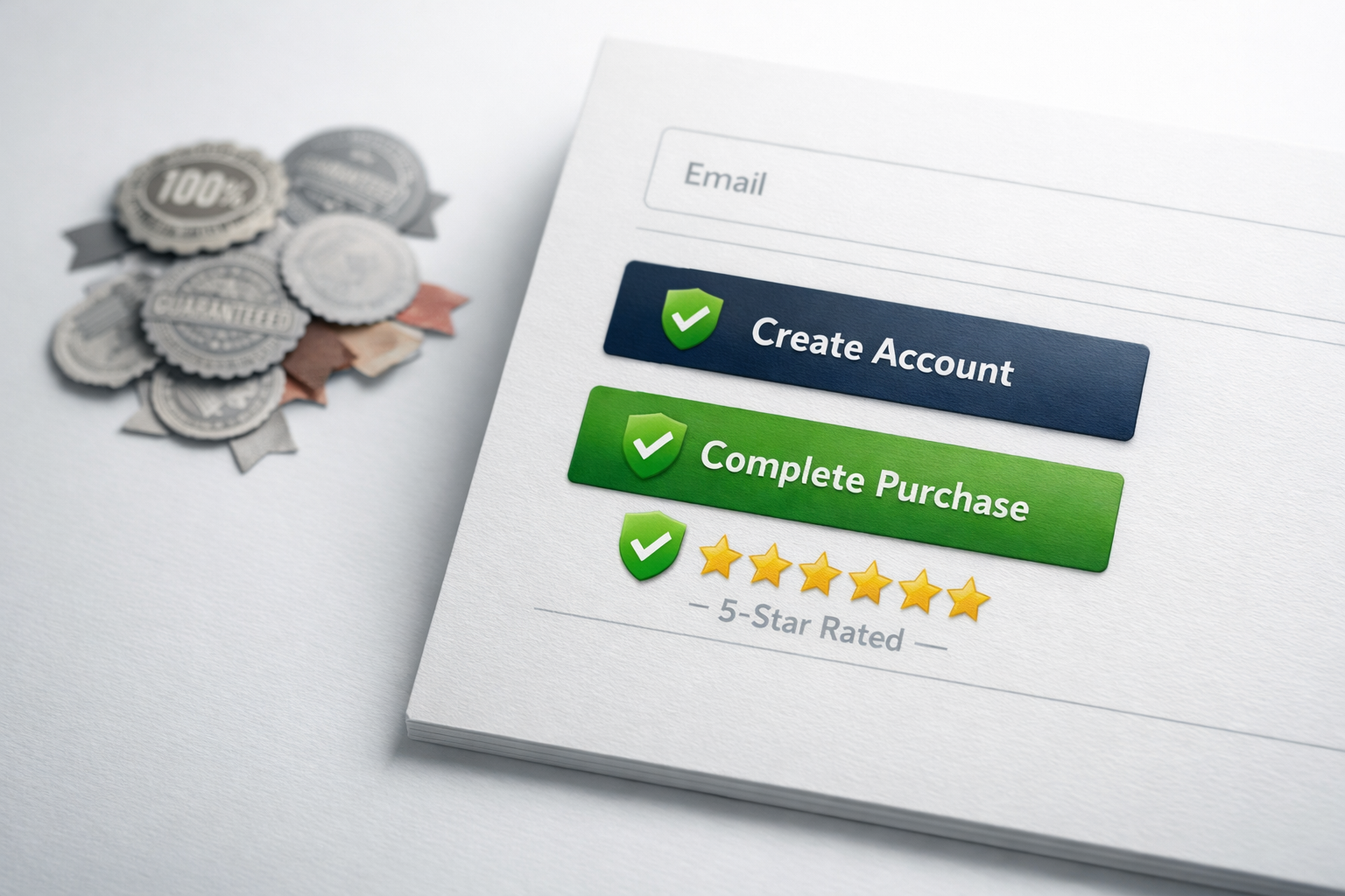
The CTA That Asks Too Much, Too Soon
There’s a pattern we see on pricing pages that illustrates a fundamental misunderstanding of how B2B buying works. The visitor sees a plan they’re interested in, clicks the CTA button, and is immediately dumped into an account creation flow or, worse, a payment form. For a £50/month tool, this might be acceptable. For a £5,000/month platform, it’s absurd.
The commitment level of your CTA must match the commitment level of your price point. This is a principle we cover extensively in our conversion systems guide, and it applies with particular force on pricing pages. A high-value B2B purchase involves multiple stakeholders, budget approval, and sometimes procurement review. Your pricing page CTA should acknowledge this reality rather than pretend the visitor is buying a pair of shoes.
Effective CTAs for different price points typically follow this pattern:
- Under £100/month: “Start free trial” or “Get started” with immediate access
- £100 to £1,000/month: “Start free trial” or “Book a demo” with a clear next step
- Over £1,000/month: “Talk to our team” or “Get a custom quote” with a short qualification form
The label on the button matters more than most teams realise. “Buy Now” on an enterprise tier creates resistance. “See How It Works for Your Team” creates curiosity. The CTA should describe the next step, not the final outcome. Nobody is buying your enterprise platform in the next 30 seconds, and pretending otherwise just creates a disconnect that makes the visitor hesitate.
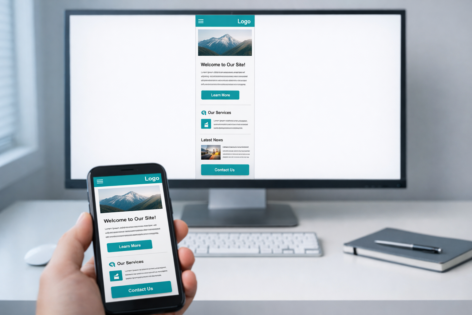
Mobile Pricing Pages Are Usually an Afterthought
Even in B2B, 30% to 50% of pricing page views now come from mobile devices. Senior decision-makers check their phones in meetings, on commutes, and between calls. When someone forwards a link to your pricing page in Slack or Teams, the recipient often opens it on their phone first.
The standard three-column pricing layout completely falls apart on mobile. Columns stack vertically, which means the visitor sees Plan 1 in full, then has to scroll past it entirely to see Plan 2, and then scroll again for Plan 3. Comparing plans becomes physically impossible because they can never see two plans side by side.
The solution isn’t just making the columns stack responsively. It’s rethinking the mobile layout entirely. The most effective mobile pricing pages we’ve built use a tab-based interface where the visitor taps between plans, with the key differences highlighted at the top and the full feature list expandable below. This keeps the comparison fast and gives the visitor control over what they see.
Another common mobile problem: buttons and form fields that are too small, too close together, or require horizontal scrolling. These seem like minor UX issues, but on a page with high buying intent, every fraction of a second of frustration compounds. A visitor who can’t easily tap “Start Free Trial” on their phone is a visitor who decides to “come back later” and never does.

Annual vs Monthly Pricing: The Toggle Trap
Almost every SaaS pricing page includes a toggle between monthly and annual pricing. This seems like a simple, helpful feature. In practice, it introduces a secondary decision that delays the primary decision.
The visitor came to choose a plan. Now, before they can do that, they need to decide on a billing cycle. Some visitors toggle back and forth, running mental calculations on the annual discount, trying to figure out if they’ll still need the tool in 12 months. This mental overhead is real, and it causes a measurable percentage of visitors to defer the decision entirely.
If you offer both billing cycles, the better approach is to default to the option you want most visitors to choose (usually annual) and show the monthly price as a secondary note. Something like “£299/month, billed annually” with a smaller note that says “or £349/month, billed monthly.” This presents one price clearly and treats the alternative as exactly that: an alternative, not an equal option requiring deliberation.
The toggle also creates a visual distraction at the top of the page. It draws the eye before the visitor has even read the plan names, which means they’re interacting with the page before understanding what they’re looking at. Removing the toggle and handling billing cycle selection later in the checkout flow is something we’ve tested on multiple client sites, and it consistently improves the rate at which visitors click through from the pricing page to the next step.
The FAQ Section Nobody Reads (Because It Answers the Wrong Questions)
Most pricing page FAQs are written to answer the questions the company wants to answer, not the questions the buyer actually has. You’ll see entries like “What payment methods do you accept?” and “Can I upgrade my plan later?” These are real questions, but they’re logistics questions that matter after the decision, not during it.
The FAQs that actually drive conversions address the fears and objections that prevent the decision from being made. Questions like:
- “What happens if I choose a plan and it turns out to be too small (or too large) for my team?”
- “How long does implementation actually take?”
- “Will I need to involve my IT team?”
- “What does onboarding look like?”
- “How is this different from [category competitor / doing it manually]?”
These are the questions rattling around in the visitor’s mind as they stare at your pricing tiers. Answering them on the same page, in the same session, removes the need for the visitor to leave, do more research, and (probably) forget to come back.
The best pricing page FAQs we’ve seen are informed directly by sales team conversations. Your salespeople hear the same objections and questions every week. Those objections should be on your pricing page, addressed proactively, in the buyer’s own language. If your sales team constantly hears “We tried something like this before and it was a nightmare to set up,” then your pricing page should have a FAQ entry that says exactly that and addresses it head-on.
The Real Cost of Getting This Wrong
A poorly structured pricing page doesn’t just lose one conversion. It loses conversions continuously, every day, compounding over months and years. Consider a mid-market B2B company with 3,000 monthly pricing page visitors and a 2% conversion rate. That’s 60 conversions a month. If structural fixes to the pricing page lift that rate to 3.5%, which is a realistic improvement based on the changes described above, that’s 105 conversions a month. 45 additional conversions every month from a page that already exists, with no additional spend on traffic.
The pricing page is also one of the few pages where changes can be isolated and measured cleanly. Unlike homepage redesigns that affect dozens of downstream metrics, pricing page improvements have a direct, measurable relationship with revenue. You can A/B test a new layout against the old one and see results within weeks.
What a High-Converting Pricing Page Actually Looks Like
After auditing hundreds of pricing pages, the pattern of what works is clear. A high-converting pricing page does five things well:
First, it opens with a clear, specific recommendation. Not just “Most Popular” but a sentence or two explaining who this plan is for and why. This immediately reduces the cognitive load from “evaluate everything” to “confirm this is right for me.”
Second, it shows real prices (or meaningful estimates) without requiring a sales conversation. Transparency builds trust, and trust converts.
Third, it limits the comparison to meaningful differences between tiers and communicates those differences in value language, not feature jargon. The grid is short, scannable, and useful.
Fourth, it surrounds the decision with proof: testimonials from actual plan users, customer counts, recognisable logos, and clear risk reversal. These elements appear on the pricing page itself, not buried elsewhere on the site.
Fifth, it offers a CTA that matches the commitment level of the purchase. A free trial for self-serve tiers, a demo or conversation for enterprise. The button tells the visitor what happens next, not what happens eventually.
Start With What You Can Measure
If your pricing page isn’t converting the way you think it should, don’t start with a redesign. Start with data. Install heatmapping on the page and watch 50 session recordings. You’ll see exactly where visitors hesitate, where they scroll back up in confusion, and where they abandon. That evidence will tell you whether the problem is choice overload, missing trust signals, a confusing feature grid, a CTA mismatch, or something else entirely.
From there, prioritise the fix that addresses the most common behaviour pattern. One focused change, tested properly, will teach you more about your buyers than six months of guessing. The pricing page is too important and too high-intent to leave unoptimised. Every week you delay is a week of revenue you’ve already paid to generate, walking out the door.