Most Trust Signals Are Wallpaper. Here’s How to Tell the Difference.
The trust signals that actually work are specific, relevant to the decision the visitor is making right now, and placed at the exact point where hesitation occurs. The ones that don’t work are generic badges, vague claims, and social proof dumped in a sidebar where nobody’s looking. The difference between these two categories is often the difference between a website that converts at 1% and one that converts at 4%.
We audit dozens of mid-market B2B websites every year, and trust signals are one of the most consistently misunderstood elements we encounter. Most teams know they need them. Almost nobody places them well. And a surprising number of companies are actively using trust signals that reduce credibility rather than build it. This article will walk you through what actually moves the needle, what’s wasting space on your pages, and how to think about trust as a system rather than a decoration.
Why Trust Signals Fail: The Placement Problem
Before we talk about which trust signals work, you need to understand why most of them don’t. The answer almost always comes down to placement and context, not the signal itself.
Think about how a visitor moves through your site. They land on a page with a specific question or need. They scan for relevance. They start reading or scrolling. At various points, they feel friction: “Is this company credible?” “Can they actually do what they claim?” “What happens if this doesn’t work out?” “Are they the right size for us?” These moments of hesitation are where trust signals need to appear. Not before the question arises. Not after the visitor has already left the page.
What we see on most mid-market sites is a cluster of logos in the header or a testimonial carousel buried at the bottom of the homepage. The logos appear before the visitor even knows what you do, so they carry no weight. The testimonials appear after the visitor has already decided whether to stay or leave. Both are technically trust signals. Neither is doing any work.
Trust signals work when they answer a specific objection at the moment that objection forms in the visitor’s mind. A client logo next to a case study about a similar company? That works. The same logo floating in a strip of 20 other logos at the top of your homepage? That’s wallpaper.

Trust Signals That Actually Convert
Specific, Named Testimonials With Context
A testimonial that says “Great company to work with! Highly recommend.” signed by “Sarah, Marketing Manager” does almost nothing. A testimonial that says “We’d been struggling with lead quality for 18 months. Within three months of launching the new site, our sales team reported that 40% more of their inbound leads were decision-makers rather than researchers” signed by “Sarah Mitchell, Head of Marketing, Acme Industrial Solutions” does a lot.
The difference is specificity. The second testimonial tells the reader what problem existed, what changed, and what the measurable outcome was. It includes a full name, a real job title, and a real company. It’s verifiable. It sounds like something a human actually said rather than something written by the marketing team and approved by legal.
In our conversion audits, we consistently find that replacing generic testimonials with specific, outcome-focused ones increases engagement with nearby calls to action by 15-30%. The testimonial doesn’t need to be long. It needs to be concrete.
One more thing: the testimonial needs to be relevant to the page it’s on. A testimonial about your excellent customer service belongs near your support or onboarding section. A testimonial about ROI belongs on your pricing page. A testimonial about ease of implementation belongs on your product or service page. Scattering them randomly is a missed opportunity.
Case Studies That Show the Before and After
Case studies are the single most underused trust signal in B2B. When they exist at all, they’re usually buried three clicks deep in a resource library where nobody goes. When they’re on the site, they tend to be written as self-congratulatory narratives rather than useful evidence.
A case study that works follows a simple structure: here’s where the client was, here’s what we did, here’s the measurable result. The “here’s where the client was” section is actually the most important part, because it’s where your prospect recognises themselves. If you’re selling to manufacturing companies and your case study opens with “Acme Manufacturing was generating 200 website visits per month but only 3 enquiries,” every manufacturing marketing manager reading that page is going to lean forward.
The case study doesn’t need to be 2,000 words. A 300-word summary with two or three hard numbers, placed directly on a relevant service page, outperforms a long-form PDF that requires a download every time. You can still have the long version available, but the summary should be visible without any clicks.
Specific Numbers and Data Points
Vague claims like “We’ve helped hundreds of companies grow” are so common that they register as noise. Your visitor has seen that sentence on the last five websites they looked at. It means nothing.
Compare that with: “We’ve delivered 147 website projects for B2B companies since 2018, with an average 2.4x increase in qualified lead volume within six months of launch.” That sentence is doing real work. It’s specific enough to be believable, it includes a timeframe, and it gives the reader a concrete expectation of what working with you might produce.
Specific numbers work because they’re falsifiable. Anyone can say “we’ve helped lots of companies.” Not everyone is willing to say “147 projects since 2018” because that’s a claim that can be checked. The willingness to be specific signals confidence, and visitors pick up on that even if they never actually verify the number.
Our team recommends placing at least one specific data point within the first screen of every key landing page. Not in a tiny footer stat. Not in an infographic. In the body copy, where the visitor is already reading.
Real Team Photos and Bios
Stock photography of smiling people in business suits actively damages trust. Your visitors know those aren’t your employees. Using them signals either that your team doesn’t exist or that you don’t think it’s worth showing them.
Real photos of real people, even if they’re not professionally shot, outperform stock images consistently. A team page with genuine photos and short bios that include something human (how long they’ve been in the industry, what they specialise in, even a personal detail) makes your company feel real. For B2B buyers who are about to enter a relationship that might last months or years, knowing who they’ll be working with matters enormously.
This doesn’t mean you need a professional photoshoot. A well-lit phone photo where the person looks natural and approachable will outperform a stock image of a model every single time.
Third-Party Validation That’s Relevant
Industry certifications, awards, and memberships can work as trust signals, but only when they’re relevant to the buyer’s concern. An ISO certification matters to a procurement manager evaluating vendors. A “Best Workplace” award matters to a candidate, not a buyer. A Google Partner badge matters if you’re selling Google Ads management. It doesn’t matter if you’re selling web design.
The test is simple: does this validation help answer a question the buyer actually has? If yes, place it near the point where that question arises. If no, leave it on your About page where it can serve as background credibility without cluttering your conversion pages.
Trust Signals That Don’t Work (and Can Hurt You)
Generic Trust Badges and Seals
Those little shield icons that say “Secure Site” or “Trusted Business” with no recognisable authority behind them? They’re the digital equivalent of a restaurant putting a “Best Food in Town” sign in its own window. Nobody believes them because there’s no independent authority backing the claim.
There are exceptions. SSL certificates matter for e-commerce checkout pages because browsers now flag non-HTTPS sites as insecure. Payment provider logos (Stripe, PayPal, major card brands) reduce anxiety during transactions. But a generic “Verified Safe” badge from a company nobody has heard of? It can actually reduce trust because it draws attention to the question of safety that the visitor might not have been thinking about.
This is a crucial principle: don’t raise an objection that doesn’t exist just so you can answer it. If your visitor wasn’t worried about site security, slapping a security badge on your services page can plant the seed of doubt. This is discussed in more detail in our conversion systems guide, where we explain how friction and reassurance need to be carefully balanced throughout the user journey.
Unattributed or Anonymous Testimonials
A testimonial from “J.S., London” or “Anonymous” carries almost zero weight. The reader has no way to verify it, no reason to believe it, and no context to make it relevant to their situation. In fact, anonymous testimonials can actively hurt you because they look fabricated. Even if they’re genuine, the perception is the same.
If a client won’t let you use their name, ask if you can use their job title and industry (“Head of Operations, UK logistics company with 120 employees”). That’s not as strong as a full attribution, but it at least gives the reader something to anchor the testimonial to their own situation. If they won’t allow even that, the testimonial isn’t worth publishing.
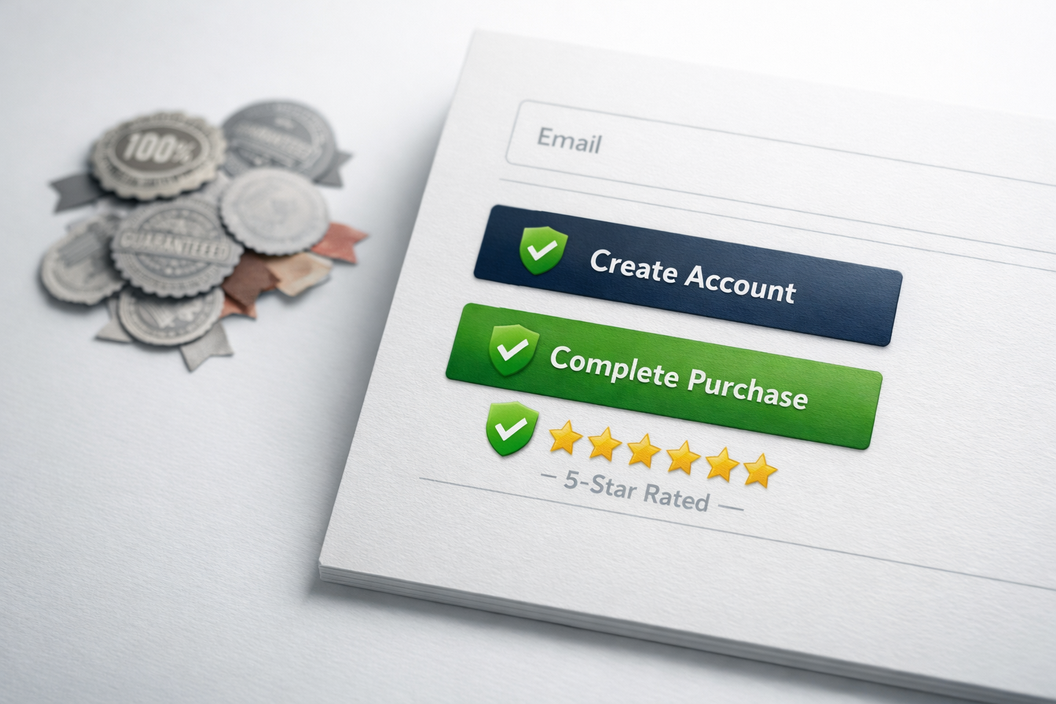
Logo Strips With No Context
The “trusted by” logo strip is one of the most common elements on B2B websites, and one of the most overused. A row of 15-20 small logos that the visitor doesn’t recognise doesn’t build trust. It just takes up space.
Logo strips work only under specific conditions: the logos are recognisable to your target audience, there are enough of them to signal volume but few enough to be distinct (five to eight is usually the sweet spot), and they’re placed in context. “These seven manufacturers chose us to redesign their lead generation systems” is far more powerful than an unlabelled strip of logos floating beneath your hero section.
If your client list includes household names, use them. If it doesn’t, your trust equity is better spent on detailed case studies and named testimonials than on a logo wall of companies nobody outside your industry would recognise.
Vanity Metrics
“Over 10,000 happy customers” sounds impressive until the visitor realises they have no way to verify it and no idea what “happy” means. Vanity metrics are numbers that sound big but don’t connect to the outcome the buyer cares about.
“10,000 customers” tells me nothing about whether you can solve my specific problem. “We’ve increased conversion rates for 83% of the clients we’ve worked with, with an average improvement of 2.1x” tells me something I can actually use in my decision-making process. The first is a boast. The second is evidence.
The same applies to social media follower counts, years in business (on their own), and “projects completed” numbers without context. Years in business can be relevant, but only when paired with something substantive: “We’ve spent 12 years specialising exclusively in B2B manufacturing websites” is meaningful because it signals deep domain expertise. “Established 2011” on its own is just a date.
Awards Nobody Has Heard Of
The web design and digital marketing industries are full of awards that exist primarily to generate revenue for the awarding body. Displaying a badge from an award your buyer has never heard of doesn’t build credibility. It can actually create a mild sense of doubt, because the visitor may wonder why you’re showcasing an obscure accolade rather than more substantive proof of your work.
If you’ve won a genuinely prestigious award in your industry, display it with context. Explain briefly what the award is and why it matters. If you’ve won a pay-to-enter award that most people wouldn’t recognise, save it for your About page or leave it off entirely.
The Trust Architecture Approach
The most effective way to think about trust signals is as a system that runs throughout the entire user journey, not as a collection of elements you scatter around the site and hope for the best.
Here’s how this works in practice. Map out the key pages a prospect visits before they convert (typically: homepage, a service or product page, maybe an about or pricing page, and then the contact or enquiry page). For each page, identify the primary objection or hesitation the visitor is likely to feel. Then select the trust signal that most directly addresses that specific objection and place it as close to the point of hesitation as possible.
On a homepage, the main question is “Are these people credible and relevant to me?” The right trust signals here are recognisable client logos (if you have them), a strong headline stat, and one or two short testimonials from your ideal client profile.
On a service page, the question shifts to “Can they actually deliver what they’re describing?” This is where case study summaries, specific outcome data, and process transparency (showing how you work) do their best work.
On a pricing or enquiry page, the question becomes “Is this going to be worth it, and what’s the risk?” Testimonials about ROI, satisfaction guarantees, and clear explanations of what happens after they submit the form all reduce friction at this critical stage.
This approach means the same visitor encounters different types of trust evidence as they move deeper into your site, each piece addressing the concern they’re feeling at that moment. It’s sequential and deliberate rather than random and repetitive.

How to Audit Your Current Trust Signals
You can evaluate your existing trust signals in about 30 minutes with a simple exercise. Pull up your five most important pages (the ones that get the most traffic or sit on the path to your main conversion action). For each trust signal on each page, ask three questions:
- Is this specific? Does it include real names, real numbers, or real outcomes? Or is it vague and generic?
- Is this relevant? Does it address a concern the visitor is likely feeling on this particular page? Or is it randomly placed?
- Is this verifiable? Could the visitor confirm this claim if they wanted to? Or does it feel like something you made up?
Any trust signal that fails all three tests is doing nothing for you and should be removed or replaced. Any trust signal that passes all three is probably in good shape. Most will fall somewhere in between, which means they need to be sharpened, better attributed, or moved to a more relevant location.
The single biggest improvement most sites can make is not adding more trust signals but making their existing ones more specific and placing them closer to the point of decision. A poorly placed testimonial that gets moved to the right spot on the right page can have more impact than creating three new ones.
Trust Signals by Industry: What B2B Buyers Actually Care About
The trust signals that matter vary significantly by industry and buyer type. What works for a SaaS product selling to startups is different from what works for a professional services firm selling to enterprise procurement teams.
For professional services (consulting, legal, financial), the most effective trust signals are named client testimonials from senior leaders, case studies with measurable outcomes, team credentials and bios, and industry-specific certifications. The buyer is purchasing expertise, so the trust signals need to demonstrate deep knowledge and reliable delivery.
For technology and SaaS companies, integration logos (showing compatibility with tools the buyer already uses), uptime statistics, security certifications, and user count data carry significant weight. The buyer is evaluating technical reliability, so the trust signals need to address implementation risk and ongoing performance.
For manufacturing and industrial companies, certifications (ISO, industry-specific standards), long client relationships (“we’ve supplied Acme Corp for 14 years”), and detailed technical specifications function as trust signals. The buyer is evaluating capability and compliance, so vague marketing language is particularly damaging in this context.
The common thread across all of these is specificity. Generic trust signals fail in every industry. Specific, relevant, well-placed trust signals work in every industry.
Making This Work on Your Site
Start with an audit of your five most important pages using the framework above. Remove anything generic, anonymous, or irrelevant. Then identify the one or two trust signals that are working and find ways to make them more specific. Add the client’s full name and company. Include a number. Move the signal closer to your call to action.
Next, look at what’s missing. If you have no case studies on your service pages, that’s your highest priority. If your testimonials are all generic praise with no outcomes, rewrite them or go back to your clients and ask better questions. If your “trusted by” section includes logos nobody recognises, replace it with a detailed example of one client relationship that demonstrates what you actually delivered.
Trust isn’t built by volume. It’s built by precision. Five carefully chosen, well-placed, specific trust signals will outperform fifty generic ones every time. The companies that understand this don’t just have better-looking websites. They have websites that do measurably more work.