Most Brands Break Before Page Three
Brand consistency across a website sounds straightforward until you actually try to maintain it across 40, 80, or 200 pages built by different people over different months. The homepage looks polished. The product pages feel like a different company. The blog uses a heading style nobody agreed on. The careers section was built by an intern using a template they found somewhere. This is not a rare problem. It is the default outcome for any company that has not deliberately engineered consistency into their web presence.
What makes this so difficult is not a lack of brand guidelines. Most mid-market companies have a PDF somewhere with their logo usage rules, colour palette, and approved fonts. The problem is that brand guidelines describe outcomes but rarely prescribe implementation. They tell you what the brand should look like in theory. They do not tell a developer what padding to use beneath a testimonial block, or a content editor which of five button styles to apply on a landing page, or a marketing manager whether a new campaign page should follow the product layout or the services layout.
The gap between brand intent and website execution is where consistency dies. And the cost is real: inconsistent experiences erode trust, confuse users, dilute conversion rates, and make every future update harder than it needs to be.
Why Brand Consistency Matters More Than Aesthetics
When people hear “brand consistency,” they tend to think about visual polish. Matching colours, correct logo placement, fonts that don’t clash. Those things matter, but they are actually the easiest part to get right. The harder and more valuable form of consistency is experiential consistency: the feeling a user gets as they move through your site, the predictability of interactions, the coherence of messaging, and the reliability of layout patterns from one section to the next.
Think about it from a user’s perspective. You land on a homepage with a calm, professional tone, generous white space, and a clear hierarchy. You click through to a service page and suddenly the layout is dense, the tone is aggressive, the call-to-action buttons are a different colour, and the spacing feels cramped. You have not left the website, but psychologically you have. Your brain registers a mismatch, and that mismatch triggers a small but measurable drop in confidence.
Research from the Baymard Institute consistently shows that users interpret visual and structural inconsistency as a signal of low credibility. They may not articulate it that way. They will just feel less comfortable filling in a form, requesting a demo, or making a purchase. For B2B companies where the sales cycle is long and trust is everything, this is particularly damaging. Your website is doing continuous trust-building work across multiple visits, and every inconsistency chips away at that accumulated trust.
There is also an internal cost. When your website lacks consistent patterns, every new page becomes a bespoke project. Your marketing team cannot self-serve because there is no predictable system to work within. Your developers spend time making one-off decisions instead of assembling from proven components. What should be a two-hour task to build a new landing page becomes a two-week debate about layout, styles, and content structure.
The Six Places Where Consistency Breaks Down
In our projects, we see the same failure points again and again. Understanding where consistency typically breaks is the first step toward preventing it.
1. Typography and Spacing
This is the most common and least visible offender. Your brand guidelines might specify “Heading: Inter Bold, 32px.” But what about the subheading beneath it? What about the body text spacing? What about the gap between a heading and the paragraph that follows it, or the line height on a bulleted list? Typography is a system, not a set of individual rules, and most brand guidelines only cover the individual rules. The result is that every page looks slightly different depending on who built it and what felt right to them at the time.
2. Component Variations Without Governance
Your site probably has multiple versions of the same component. Three styles of card. Two styles of testimonial block. Four button treatments. Some of these may be intentional design variations for specific contexts. But more often, they are accidental mutations that crept in when someone built a new page and did not realise a suitable component already existed. Over time, you end up with a sprawling library of slightly-different elements that collectively undermine the sense of a unified brand.
3. Tone and Messaging
Visual consistency gets all the attention, but tonal consistency is just as important and far harder to maintain. Your homepage might have been written by an agency during the last redesign. Your product pages were written by a product marketer. Your blog posts come from three different authors. Your support pages were written by your customer success team. Unless there is a clear, enforced voice guide with concrete examples (not just adjectives like “approachable” and “professional”), the written experience of your site will feel fragmented.
4. Page-Level Layout Decisions
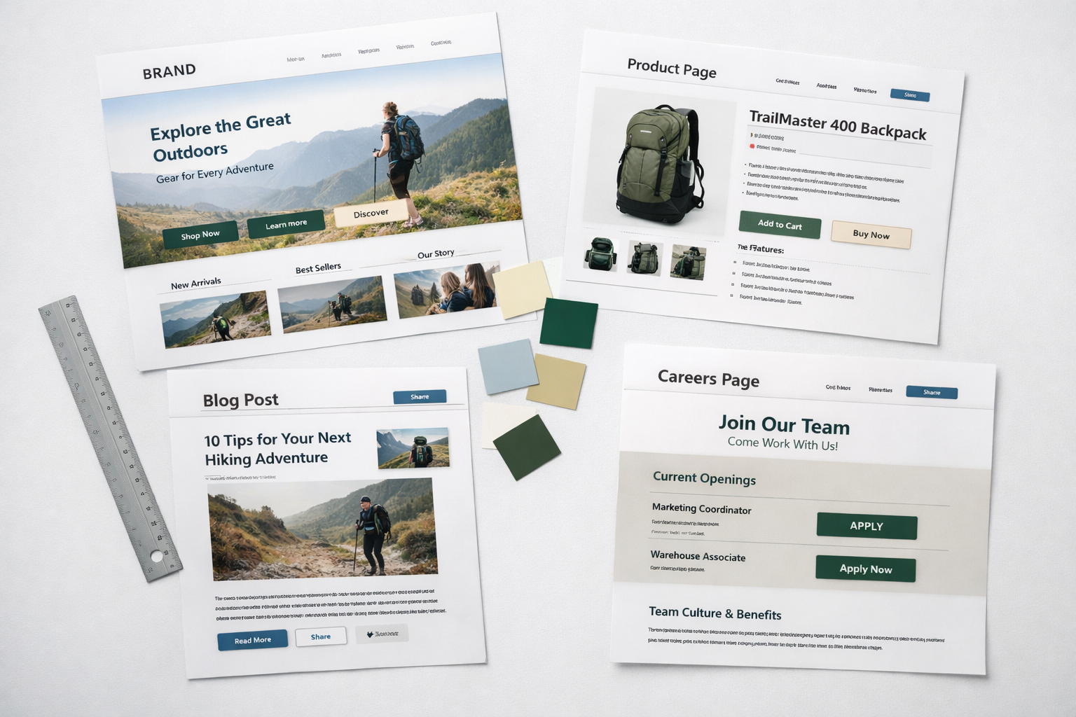
Even when individual components are consistent, the way they are arranged on a page can vary wildly. One product page leads with a hero image and feature grid. Another leads with a text block and testimonial. A third uses a video header. Each page might look fine in isolation, but a user who visits three product pages and encounters three different structures will feel disoriented. Consistent page-level patterns allow users to build a mental model of your site and navigate it with confidence.
5. Responsive Behaviour
A surprising number of brand inconsistencies only appear on mobile or tablet. Elements that align neatly on desktop collapse into awkward arrangements on smaller screens. A two-column section that looks balanced at 1200px wide becomes a single column with strange spacing at 375px. Responsive design is not just about making things fit; it is about preserving the brand experience at every viewport. This is an area where consistency often receives the least scrutiny because stakeholder reviews tend to happen on desktop.
6. Third-Party Integrations and Embedded Tools
Your website does not exist in isolation. It includes forms from your marketing automation platform, chat widgets, embedded video players, cookie consent banners, calendaring tools, and possibly gated content from a separate platform. Each of these arrives with its own default styling. Unless someone has specifically customised each integration to match your brand system, these touchpoints create visible seams in the user experience. The contact form that looks nothing like the rest of your site is a classic example.
Why Brand Guidelines Alone Do Not Solve This
If you have invested in brand guidelines, you have done something valuable. But brand guidelines are a reference document, not an implementation system. The distinction matters enormously.
A brand guidelines PDF tells a designer what the primary blue is. A design system tells a developer that the primary blue is used on CTA buttons in the “filled” variant, which has 16px vertical padding, 24px horizontal padding, a 6px border radius, and transitions to a darker shade on hover with a 200ms ease-in-out curve. One describes the brand. The other enforces it.
What we see across client projects is that companies invest in the description but not the enforcement. They create beautiful brand books, distribute them to stakeholders, and then wonder why the website still feels inconsistent six months later. The answer is that the people building and updating the website need opinionated, specific, and easy-to-use systems, not a 60-page PDF they will reference once and then forget about.
This is particularly true in mid-market organisations where the website is maintained by a mix of internal marketers, freelance developers, and occasional agency support. Each of these contributors brings their own interpretation of the brand unless a concrete system constrains their output.
Design Systems Are the Real Solution
A design system is the practical bridge between brand guidelines and a consistent website. It is a living library of components, patterns, rules, and documentation that defines exactly how your brand manifests in a digital product. Think of it as the difference between giving someone a recipe card and giving them a fully stocked, labelled kitchen with pre-measured ingredients.
An effective design system for a mid-market website typically includes:
- A component library with every UI element defined in its various states (default, hover, active, disabled, error) and responsive behaviours
- A spacing and layout system with defined scales (e.g., 8px base unit) that removes guesswork from padding, margins, and gaps
- Typography scales that define not just fonts and sizes but line heights, letter spacing, and the hierarchy relationship between heading levels
- Colour tokens that separate brand colours from functional colours (e.g., “primary-blue” is a brand colour; “action-colour” is a functional token that happens to reference primary-blue but could change independently)
- Content guidelines with concrete examples of voice, tone, and messaging patterns for different page types
- Page templates that define the approved structural patterns for common page types like product pages, landing pages, and resource pages
Building a design system does require upfront investment. For a typical B2B website with 50 to 150 pages, you might spend four to eight weeks establishing the core system before a single page goes live. But that investment pays for itself many times over. New pages take hours instead of days. Updates propagate automatically. Different contributors produce consistent output because they are assembling from the same parts rather than inventing from scratch.
Prototyping Catches Inconsistency Before It Gets Expensive
One of the reasons we advocate so strongly for prototyping before design is that inconsistency is vastly easier to spot in a functional prototype than in a static design file. When you click through a working prototype, moving from the homepage to a product page to a case study to a contact form, your brain naturally registers the moments where something feels off. A heading that is slightly larger than expected. A section that uses a different background treatment. A form layout that does not match the rest of the site’s input styling.
In static mockups, these inconsistencies hide. Each page is reviewed in isolation, often by different stakeholders at different times. Nobody experiences the transitions between pages, which is exactly where inconsistency becomes visible to real users. This is why we prototype before committing to full design and development. A clickable, navigable prototype lets stakeholders experience the site as a user would, and it surfaces alignment problems that would otherwise not appear until after launch. If you want to understand this approach in more depth, our prototype-first guide walks through the full methodology.
We have had client teams approve individual page designs with full confidence, only to realise during the prototype review that the approved pages felt incoherent when experienced as a connected journey. The prototype revealed what the static designs could not: that three different designers had made three slightly different interpretations of the same brand guidelines, and those differences, while subtle on any single page, were jarring in sequence.

Practical Steps to Audit and Improve Your Current Consistency
If your site is already live and you suspect consistency problems, you do not necessarily need a full redesign. A structured audit can identify the worst offenders, and targeted fixes can dramatically improve coherence without starting from zero.
Run a Visual Inventory
Open your website and screenshot every distinct UI element you encounter: buttons, headings, cards, forms, navigation states, footer layouts, image treatments, icon styles. Paste them all into a single document or design file. Group similar elements together. You will almost certainly discover that you have more variations than you thought. Three or four button styles where you expected one. Multiple heading sizes that do not follow a consistent scale. Card components with subtly different border radii. This inventory gives you a concrete picture of the problem’s scope.
Define Your Core Components
From the visual inventory, decide which variants are intentional and which are accidental. For each component type, define a single canonical version with clear rules about when variations are acceptable. A common example: you might legitimately need a primary button and a secondary button, but you probably do not need a primary button, a slightly-different primary button, and a third button that someone made for a campaign page two years ago and never removed.
Establish Spacing and Typography Scales
Pick a base unit (8px is the industry standard for a reason; it divides and multiplies cleanly) and define a spacing scale: 8, 16, 24, 32, 48, 64, 96. Do the same for typography: establish a clear hierarchy of heading and body text sizes with specified line heights. Document these scales and share them with everyone who touches the website. This single step eliminates an enormous amount of micro-inconsistency.
Create a Page Pattern Library
Beyond individual components, define approved page structures for your most common page types. A product page always follows this sequence: hero, feature overview, social proof, detailed features, FAQ, CTA. A case study always follows this sequence: summary, challenge, approach, results, testimonial. These patterns do not prevent creativity, but they provide a backbone that ensures structural consistency across the site. Users learn to expect certain information in certain places, which makes navigation intuitive.
Test the Experience as a Journey
The most revealing test is not looking at pages. It is completing tasks. Ask someone unfamiliar with your site to find specific information, compare two products, and submit a contact form. Watch their experience. Note every moment where the visual or structural language shifts. Task-based testing reveals experiential inconsistency that page-by-page review simply cannot.
Who Owns Consistency Long Term?
This is the question that determines whether your consistency efforts last or decay. In our experience, the single biggest predictor of long-term brand consistency on a website is whether someone has explicit ownership of the design system and the authority to enforce it.
In larger organisations, this might be a dedicated design system team or a senior designer. In mid-market companies, it is more often a marketing lead or web manager who serves as the gatekeeper. The specific title does not matter. What matters is that this person reviews every new page, template, or component before it goes live and has the authority to reject work that deviates from the system without a valid reason.
Without this governance, entropy wins every time. A freelancer adds a new component that almost matches but not quite. An executive requests a “special” layout for a campaign page. A developer takes a shortcut and hardcodes styles instead of using the design tokens. Each individual deviation seems harmless. Collectively, over 12 to 18 months, they dismantle whatever consistency you built.
The governance model does not need to be heavy. A simple checklist for new page reviews, a shared component library that makes it easier to use the system than to work around it, and a quarterly consistency audit where someone screenshots a cross-section of pages and checks them against the design system. Light, consistent governance beats heavy, occasional oversight every time.
The Compound Value of Getting This Right
When brand consistency is genuinely maintained across a website, the benefits compound in ways that are easy to underestimate. Your marketing team moves faster because building new pages is assembly, not invention. Your conversion rates improve because users develop trust more quickly when every touchpoint reinforces the same message. Your development costs decrease because consistent systems are cheaper to maintain, debug, and extend. And your brand perception strengthens because the cumulative effect of dozens of consistent interactions is a feeling of professionalism and reliability that no single page can create on its own.
We have seen companies cut their page production time by 60% after establishing a proper design system, simply because the decisions that used to consume hours of back-and-forth were already made. We have seen B2B firms improve their form completion rates by over 20% after unifying the look and feel of their conversion pages with the rest of their site, eliminating the subtle trust gap that had been suppressing submissions.
These are not theoretical benefits. They are the practical outcomes of treating your website as a system rather than a collection of individual pages. The work is not glamorous. Nobody wins design awards for consistent spacing and a well-governed component library. But the companies that get this right build websites that perform better, cost less to maintain, and create the kind of seamless experience that makes users feel confident doing business with you.
Where to Start
If you are reading this and recognising your own website in these descriptions, start with the visual inventory. It takes a few hours and it will give you undeniable evidence of where your consistency has drifted. Share that inventory with your team. The conversation that follows will naturally lead to decisions about which elements to standardise, what governance to put in place, and whether your current brand guidelines need to be translated into a proper design system.
Brand consistency is not a design problem. It is a systems problem. And like all systems problems, it is best solved with structure, ownership, and the discipline to maintain standards even when it is tempting to take shortcuts. The companies that treat their website as a cohesive system rather than a growing collection of pages are the ones whose brands feel trustworthy, professional, and worth doing business with.