The Short Answer: It Depends on What Your Website Actually Does
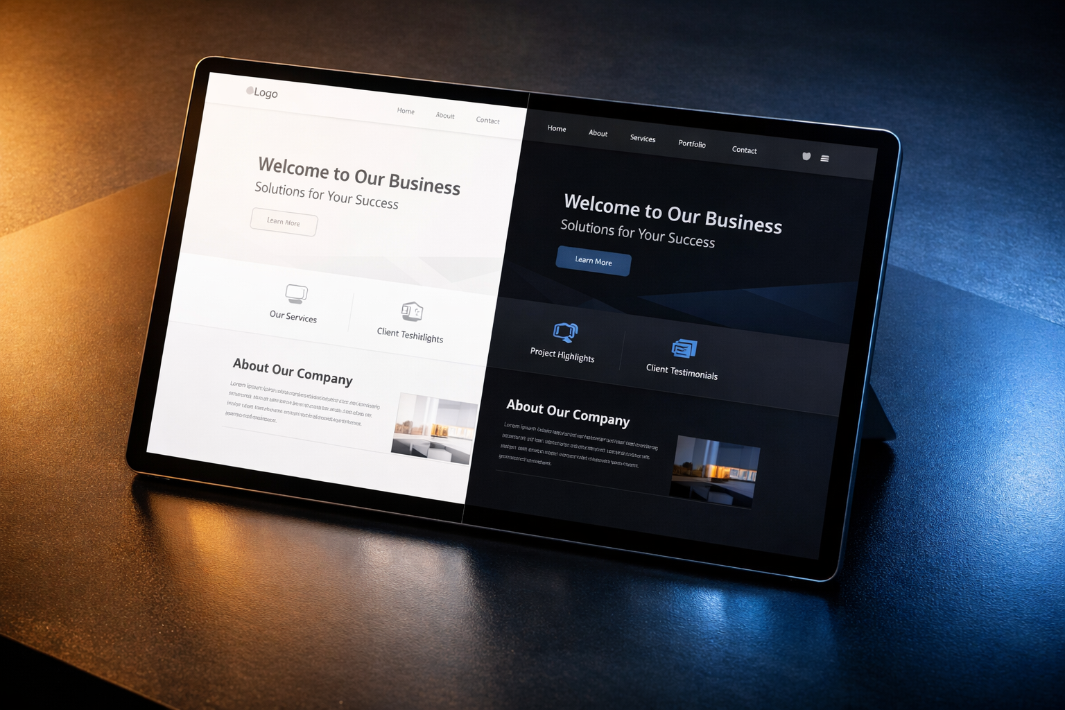
Dark mode is not inherently better or worse for business websites. Whether it helps or hurts depends on your audience, your content type, your brand positioning, and how well you implement it. A SaaS dashboard that users stare at for hours benefits enormously from a dark option. A healthcare provider’s website crammed with long-form medical content almost certainly does not. The real question is not “should we add dark mode?” but “does dark mode solve a genuine problem for our users, and can we implement it without creating new ones?”
What we see across client projects is that dark mode gets requested frequently during redesigns, usually because someone on the leadership team uses it on their phone and assumes it’s a universal preference. That instinct isn’t wrong, but it’s incomplete. This article walks through the legitimate advantages, the real drawbacks, the implementation costs most teams underestimate, and a practical framework for deciding whether dark mode belongs on your business website.
Why Dark Mode Became a Serious Conversation
Dark mode moved from developer preference to mainstream expectation between 2018 and 2020, when Apple, Google, and Microsoft all shipped system-level dark themes across their operating systems. Once users could flip their entire device to a dark colour scheme, they started noticing when individual websites didn’t follow suit. Browser-level dark mode detection (via the prefers-color-scheme CSS media query) made it technically possible for websites to automatically match the user’s system preference, and that shifted the conversation from “nice to have” to “why don’t we support this?”
For B2B companies, the pressure often comes from a specific direction. Your product team ships a dark mode for the application itself, and suddenly the marketing website feels disjointed when users toggle between the two. Or your design team adopts a modern design system with dark variants built in, and not using them feels like leaving value on the table. These are legitimate triggers, but they don’t automatically mean dark mode is the right call for your public-facing site.
The Case For Dark Mode
Reduced Eye Strain in Extended Sessions
The strongest argument for dark mode is visual comfort during prolonged use. When someone spends 30 minutes or more reading documentation, configuring settings, or browsing a product catalogue, a bright white background generates significant screen glare, particularly in dimly lit environments. Studies from the American Academy of Ophthalmology confirm that while dark mode doesn’t prevent eye damage, it does reduce the subjective feeling of eye fatigue in low-ambient-light conditions.
This matters most for application-style websites and documentation sites. If your website includes a knowledge base, API documentation, a client portal, or any interface where users spend extended time, dark mode offers a tangible comfort improvement. For a marketing homepage that visitors scan for 90 seconds before clicking a CTA, the benefit is negligible.
Better Emphasis on Visual Content
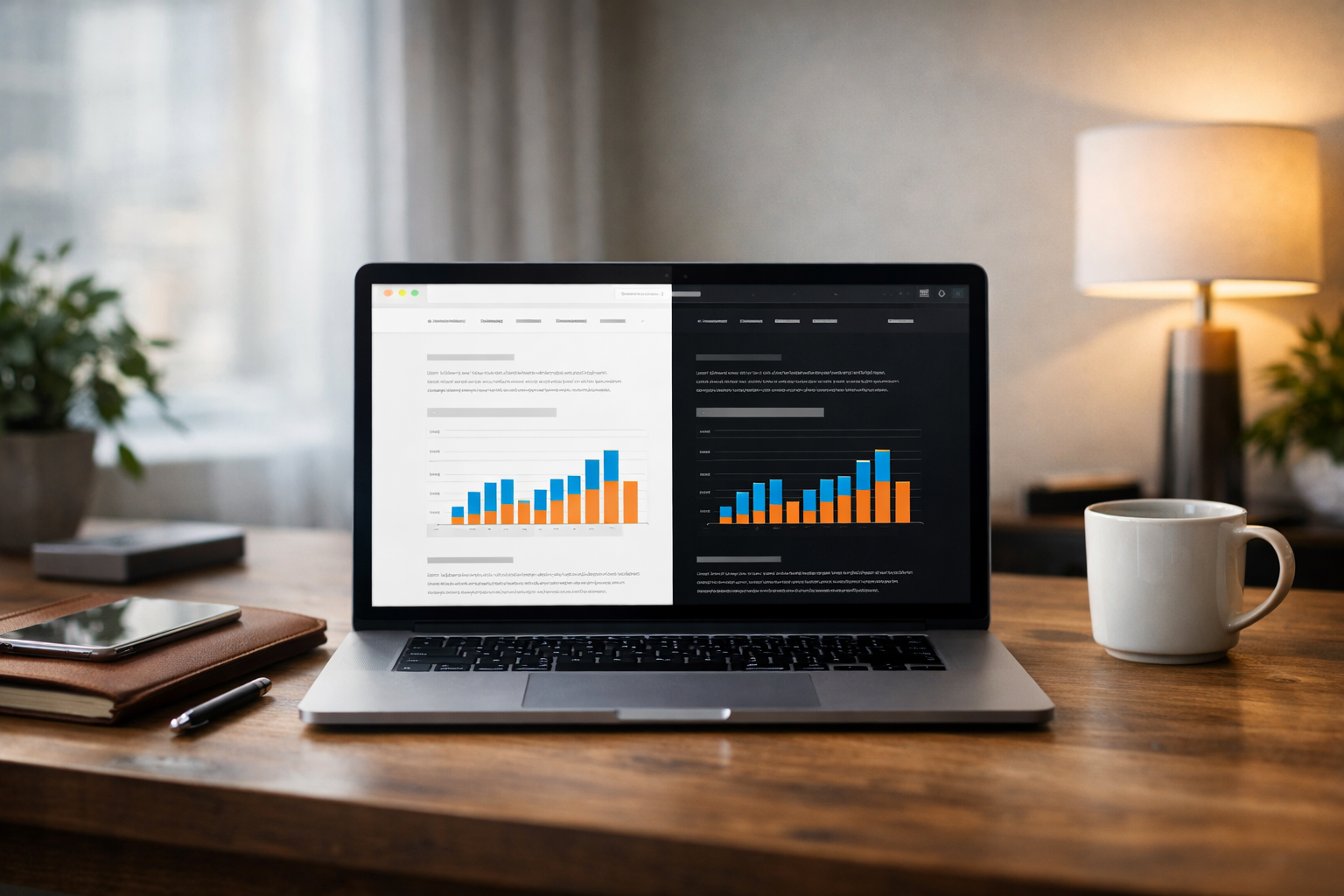
Dark backgrounds make certain types of content pop. Photography, video, data visualisations, and product imagery all gain visual prominence against a dark canvas because there’s more contrast between the content and its surroundings. Portfolio sites, media companies, and brands with strong visual identities often use dark mode as their primary theme for exactly this reason. If your business website is built around showcasing visual work, a dark theme can make your content feel more cinematic and immersive.
We’ve prototyped dark-first designs for clients in the creative technology and media production spaces, and the difference in how hero imagery lands is striking. The same photograph that feels flat on a white background can feel dramatic and intentional on a dark one. But this advantage evaporates quickly when the page is mostly text. You cannot have it both ways on the same layout without careful design thinking.
Modern Brand Perception
There’s a brand signalling effect that’s worth acknowledging honestly. Dark interfaces are associated with premium products, technical sophistication, and modern design sensibility. Companies like Linear, Vercel, and Stripe use dark or dark-optional themes in part because their audiences (developers and technical buyers) expect it and interpret it as a sign of product quality. If your target buyers are technical decision-makers, offering dark mode signals that you understand their world.
This is a real but fragile benefit. It only works if the execution is excellent. A poorly implemented dark mode signals the opposite of sophistication; it tells technically literate visitors that your team shipped something half-finished.
Accessibility for Specific Visual Conditions
Some users genuinely need dark mode. People with photophobia, certain types of astigmatism, and light-triggered migraines find bright interfaces physically painful. Offering a dark alternative is an accessibility accommodation for these users. While this group is a minority of your total traffic, accessibility improvements compound across your entire user base and demonstrate genuine care about inclusive design.
Battery Savings on OLED Screens
On devices with OLED or AMOLED displays (which now includes most flagship phones and an increasing number of laptops), dark pixels consume less power than light pixels. Google’s own testing showed that YouTube’s dark mode reduced screen power consumption by up to 60% at full brightness. For mobile users browsing your site on their commute, dark mode genuinely extends their battery life. It’s a small thing, but it contributes to a positive overall experience.

The Case Against Dark Mode
Long-Form Text Becomes Harder to Read
Here’s the counterintuitive finding that most dark mode advocates overlook: light text on dark backgrounds is measurably harder to read for extended passages. Research published in the journal Human Factors found that positive polarity (dark text on light background) produces better reading performance for most people, particularly for small text sizes and dense paragraphs. The effect is strongest in well-lit environments, which is where most business browsing happens (office desks, conference rooms, daytime mobile use).
If your website’s primary job is to communicate information through text, such as service descriptions, case studies, whitepapers, pricing explanations, or compliance documentation, dark mode will likely reduce readability for the majority of your visitors. This is not a minor trade-off. For B2B websites where the buying journey depends on understanding complex information, anything that adds friction to reading adds friction to conversion.
Colour Palette Complexity Doubles
This is the cost that design teams consistently underestimate. Supporting dark mode effectively means designing and maintaining two complete colour systems, not just inverting your existing colours. Colours that work beautifully on white backgrounds often look muddy, garish, or unreadable on dark ones. Your brand blue might be perfectly accessible against white but fail contrast requirements against dark grey. Your success green might clash with your dark background in ways that look amateurish.
In our projects, we prototype both modes early specifically because colour issues surface immediately once you see real content against real backgrounds. What looks fine in a design tool with placeholder text often falls apart with actual headlines, body copy, and UI components. Every colour in your palette needs to be tested and potentially adjusted for each mode, and those adjustments need to be systematic enough to maintain brand consistency.
Implementation Cost Is Higher Than Expected
Adding dark mode to a business website is not a weekend project. Here’s what’s actually involved:
- Design tokens for both themes: Every colour, shadow, border, and gradient needs a light and dark variant, stored as tokens in your design system.
- Component-level testing: Every UI component (buttons, forms, cards, navigation, footers, modals) must be reviewed and adjusted in both modes.
- Image and media handling: Logos, illustrations, screenshots, and icons may need separate light and dark versions. A dark logo on a dark background is invisible.
- Third-party embeds: Forms from HubSpot, videos from Wistia, chat widgets, analytics dashboards embedded on the page. These often don’t respect your dark mode and create jarring visual inconsistencies.
- Content editor training: Your marketing team needs to understand that every image and graphic they publish must work in both modes, or they need a system that handles the switching automatically.
- Ongoing QA burden: Every future update to the site needs to be checked in both modes. This effectively doubles your visual QA surface area permanently.
For a typical mid-market B2B site with 30 to 80 pages, adding a well-executed dark mode adds 15 to 25% to the total design and development budget and creates a permanent maintenance overhead. That’s not a reason to say no automatically, but it’s a reason to make sure the benefit justifies the cost.
Brand Inconsistency Risk
Your brand was almost certainly designed for light backgrounds. Your logo, your colour palette, your photography style, your illustration guidelines: all of these were developed with a light context in mind. Dark mode can subtly undermine brand recognition if not handled with the same rigour as your original brand system. Visitors who encounter your brand for the first time in dark mode form a different impression than those who see it in light mode, and if you haven’t carefully controlled that impression, you’re leaving brand perception to chance.
This is particularly problematic for companies in the early stages of brand building or those undergoing a rebrand. If your brand guidelines don’t already include dark mode specifications, you’re essentially creating a second brand expression during development, often under time pressure and without proper brand oversight.
User Preference Data Rarely Supports the Investment
When we dig into actual analytics for business websites, the usage pattern is revealing. System-level dark mode adoption sits at roughly 25 to 35% across most B2B audiences, based on data we’ve reviewed from client projects. But “having dark mode enabled on their device” and “wanting every website to be dark” are two different things. Many users enable dark mode for their phone’s OS and certain apps but are perfectly comfortable with light websites. The subset of your audience who would genuinely benefit from, and actively prefer, a dark version of your specific marketing site is typically smaller than the system-level adoption numbers suggest.
When Dark Mode Makes Strategic Sense
Based on patterns across dozens of website projects, dark mode is worth the investment when multiple of the following conditions are true:
- Your website includes application-like functionality (dashboards, portals, documentation) where users spend significant time.
- Your target audience is technically sophisticated and has strong dark mode preferences (developers, designers, IT professionals).
- Your brand identity is visually driven, relying heavily on photography, video, or data visualisation rather than dense text.
- Your product already offers dark mode, and brand consistency between product and marketing site matters to your user experience.
- Your design system is mature enough to support theming without creating maintenance chaos.
- Your team has the budget and discipline for ongoing dual-mode QA.
If only one or two of these apply, you’re probably better off investing that 15 to 25% budget increase into improving your light mode design, your content, or your conversion flows.
When Dark Mode Is a Distraction
Dark mode is likely the wrong investment for your website if your site is primarily text-based (service pages, long-form content, whitepapers), if your audience skews toward non-technical business buyers (HR directors, finance leaders, operations managers), or if your design resources are limited and you’re already struggling to maintain consistency in a single colour mode.
It’s also the wrong investment if you’re in the middle of a redesign and haven’t yet nailed the fundamentals. Getting your information architecture right, validating your page structures, and aligning stakeholders on the core user journey are all higher priorities than theme variants. As we outline in our prototype-first guide, testing the structural and functional decisions before committing to visual polish is what prevents expensive rework. Adding dark mode complexity to a project that hasn’t resolved its foundational UX questions is a recipe for scope creep and budget overruns.
The Middle Path: Respecting System Preferences Without Building a Full Dark Mode
There’s a pragmatic option that many teams overlook. Instead of building a complete dark theme with a manual toggle, you can implement subtle adjustments that respect the user’s system preference without overhauling your entire visual design. This might mean slightly reducing the brightness of your white backgrounds (shifting from pure #FFFFFF to a warm #F5F5F5 or cooler #F0F2F5), softening contrast ratios marginally, and ensuring that no UI element produces an uncomfortable flash of bright white when the rest of the device is in dark mode.
This approach costs a fraction of a full dark mode implementation and addresses the most common complaint (a blindingly bright website appearing when everything else on the device is dark) without requiring a complete parallel design system. It’s not dark mode. It’s brightness-aware design, and for many business websites, it’s the most pragmatic answer.
If You Do Build Dark Mode, Build It Right
For teams that decide the investment is justified, here are the implementation principles that separate professional dark modes from amateur ones:
Never Just Invert the Colours
Colour inversion produces ugly, inaccessible results. Dark mode requires a deliberately designed colour palette where background shades use very dark greys (not pure black, which creates excessive contrast and visual vibration) and text uses off-white tones. Pure black (#000000) backgrounds with pure white (#FFFFFF) text create a halation effect where the white text appears to bleed into the dark background, making it harder to read. Using #121212 to #1E1E1E for backgrounds and #E0E0E0 to #F0F0F0 for body text produces much more comfortable results.
Elevate Surfaces With Lightness, Not Shadows
In light mode, you create visual hierarchy by adding shadows to elevated elements (cards, modals, dropdowns). In dark mode, shadows are invisible against dark backgrounds. Instead, elevated surfaces should be lighter shades of your dark background. A card on a #121212 background might use #1E1E1E or #252525. This mimics how light works in the real world: surfaces closer to you catch more light.
Audit Every Image and Graphic
Transparent PNGs with dark elements disappear on dark backgrounds. Screenshots captured in light mode look jarring against a dark UI. Illustrations with light outlines vanish. Every visual asset needs to be reviewed in context, and many will need dark-mode-specific alternatives. Build this into your content workflow from day one, not as an afterthought.
Test With Real Content at Real Sizes
Dark mode issues rarely surface in design mockups with placeholder text. They appear when real headlines run long, when real body copy fills a section, when a real data table has 15 columns, or when a real form has 12 fields. Our team typically recommends prototyping dark mode with actual content from the client’s existing site or CMS before committing to the visual design, because that’s where the usability problems become obvious.
Provide a Manual Toggle and Remember the Choice
Auto-detecting system preference is a good default, but always give users a visible, easy-to-find toggle. Some users want dark mode on their device but not on your site. Some want it on your site but not system-wide. Store the preference in a cookie or local storage so it persists across sessions. Forcing users to re-select their preference on every visit is a small but genuine annoyance that accumulates over time.
How to Decide for Your Specific Project
Rather than debating dark mode in the abstract, run this quick evaluation against your actual website and audience:
Step one: Look at your content mix. Open your ten most-visited pages. How much of each page is text versus imagery, interactive elements, or video? If more than 70% of your high-traffic pages are text-dominant, dark mode’s readability trade-off works against you.
Step two: Check your analytics for device and platform data. What percentage of your traffic comes from devices where dark mode is common? Mobile Safari and Chrome on Android report the user’s colour scheme preference to your site. If you can instrument this (a simple JavaScript check), you’ll know what percentage of your actual visitors have dark mode enabled.
Step three: Ask your sales team. Do prospects ever mention your website’s appearance? Do they compare you to competitors with darker designs? If this has literally never come up in a sales conversation, dark mode is unlikely to move the needle on revenue.
Step four: Estimate the true cost. Get your design and development team to scope the work honestly, including the ongoing maintenance commitment. Compare that cost to other items on your website improvement roadmap. Would that same budget produce more impact if spent on page speed improvements, conversion rate optimisation, or better content?
Step five: Prototype before committing. If you’re still on the fence after the first four steps, build a quick prototype of your three most important pages in dark mode. Show it to five or six people from your target audience and ask them to complete a realistic task. Watch what they do. The answer will be obvious.
Making the Right Call
Dark mode is a design decision, not a trend to follow blindly. The business websites that benefit from it share common characteristics: visually rich content, technically sophisticated audiences, application-adjacent functionality, and teams with the resources to implement and maintain a parallel colour system properly. For the majority of mid-market B2B websites where the primary goal is to communicate value through text and convert visitors into leads, a well-designed light mode will outperform a mediocre dark mode every time.
If you’re planning a redesign and dark mode is on the wishlist, treat it as a scoping and prototyping question rather than a design philosophy debate. Build it. Test it. Measure whether it improves the metrics that matter. That approach takes the opinion out of the room and replaces it with evidence, which is the only reliable way to make design decisions that hold up after launch.